


Having created dozens of community designs and evaluated many more, I feel confident in saying that most community homepages today are terrible.
Or, to be more precise, they are targeted at people who don’t exist while trying to satisfy needs their audience doesn’t have.
Fortunately, by being pragmatic, learning the basics, and making a few small tweaks, you can drastically improve the community experience to be much, much, better.
Note: by homepage, I’m talking about the main introductory page of your community. Whatever you consider the single ‘home’ of your community, that’s what I’m talking about.
The Most Important Principle Of A Great Community Homepage
We can boil pretty much everything down to one principle;
Relevancy!
Is the majority of content in the community relevant to the majority of visitors?
If it’s not, people don’t visit.
If I visit a community that shows 20 discussions and 15 of them are within a topic that’s relevant to me; that’s good. I’m highly likely to keep coming back because most of the content is relevant to me. If only 1 in 20 are relevant, I probably won’t. The effort is too high for the reward.
The same is true of other features shown on the homepage too. If the majority of them aren’t relevant to the majority of visitors, they shouldn’t be on there.
This doesn’t mean they shouldn’t be on the community at all (although that’s often up for discussions), but they shouldn’t be on the homepage.
You can usually remove a lot of clutter from a homepage and improve the outcomes by following the relevancy principle.
But this raises the big question; relevant to whom?
Who Visits Community Homepages (and what they want to find)
How often do you casually visit a brand community homepage (that isn’t your own!)? Actually take a second to think about it.
If you’re like most people, your answer is probably fairly close to never.
We have to drop the idea that people are actively seeking to join brand communities. Believe me, the data is pretty clear that the majority of visitors to a community fall into one of three buckets. You can see these below:

(click here full image)
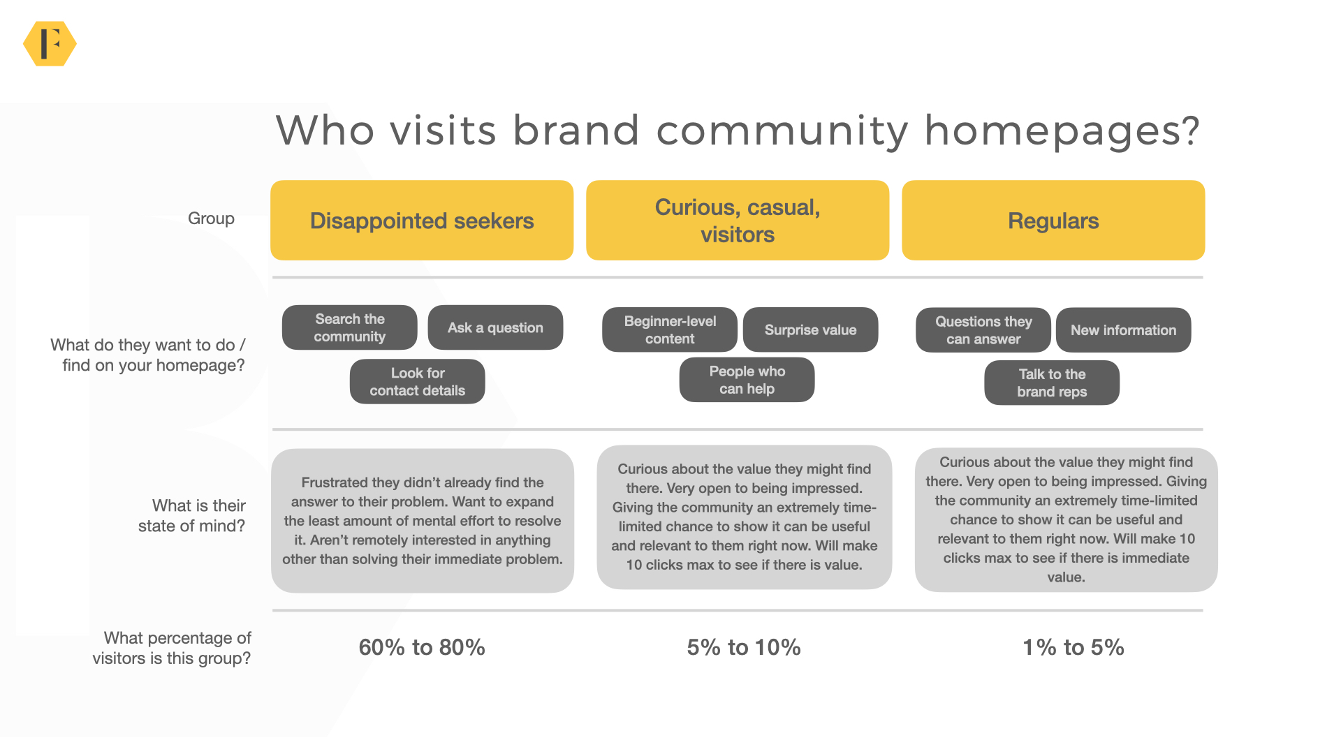
We can dive deeper into each group below:
Audience 1 – Disappointed Seekers (60% to 80%)
For most brand communities, the majority of people arrive at the community by searching for a topic on Google when they have a problem. This group skips straight past the homepage to the specific article/discussion itself.
They only visit the homepage when they don’t get the answer they need. Now they want to do one of three things:
1) Search the community for relevant terms to find the answer they need.
2) Ask a question to find the answer they need (this means they have to register).
3) Look for the contact details for customer support.
There are some important things to know about this group:
1) They’re frustrated with the problem and disappointed they haven’t gotten an answer yet.
2) They want to expand the least possible mental effort to resolve their problem. Every barrier you put in their way of doing any of the above increases the likelihood they will go elsewhere.
3) They aren’t remotely interested in anything other than solving their problem. They don’t want to belong to a group of peers, connect with others, or share their advice. Anything which isn’t aligned with their problem is redundant (or worse, annoying).
Perhaps the most important thing to know about this group is this comprises 60% to 80% of visitors to most community homepages.
In short, this is the primary audience you’re designing for.
p.s. If your community is private, you can skip this group.
Audience 2 – Curious, Casual, Visitors (5% to 10%)
Curious, casual, visitors comprise of everyone who clicked a link from somewhere else to visit your community. The most common examples are:
1) Clicked a link on your homepage.
2) Clicked a link from the product itself.
3) Clicked a link shared on social media or promoted in the newsletter.
In most cases, they are newcomers to the topic/product itself. They’re not looking to solve an immediate problem, but they are very open to being surprised.
This is a really interesting group.
These folks browsed to the community from your main site or clicked on a referral and are just curious to see what’s out there. They’re not looking to solve a problem, but they are usually receptive to the following:
1) Beginner-level help. The best beginner content is usually some combination of examples, breakdowns, how to get started, and equipment/configuration recommendations.
2) Surprise value. This is anything immediate and likely to be useful. It includes upcoming events, topical discussions, new articles.
3) Finding people who can help. They may not have a specific question, but they’re open to finding people who can help them on their journey in the future (or simply people like themselves).
When this group visits your homepage they are typically:
1) Curious. They’re open to being impressed and will pay more attention to the messaging and content of the page itself.
2) Time-limited. While you have a window to impress them, it’s relatively short. They will make 5 to 6 clicks in your community max. If they don’t find something in that time, they’re not going to come back again anytime soon.
They will register (and possibly even join groups/follow topics) if there is something valuable enough to get them to do so. Aligning your value proposition to their needs is critical.
Audience 3 – Regular Visitors (1% to 5%)
These are the people who know your community well, visit frequently, and like to share what they know. They’ve often been visiting your community for months – even years.
Their goals in visiting the community are usually looking to do the following:
1) Find questions they can answer (or share their knowledge and help others).
2) Learn something new. They often browse past answers to see if they can learn from the responses of others.
3) Talk directly to the brand. They want to engage directly with people who work for the organization.
In some communities (especially developer communities), this will look quite different.
The key thing to know about this group is they’re visiting because they believe the community will satisfy their desires, not their immediate needs. These include:
1) Feel important/useful. They want to feel like they matter and they are making unique, useful, contributions to the community.
2) Feel influential. They want to feel like they can influence the brand. If they don’t, they are far less likely to stay engaged.
3) Feel connected. Some even want to feel connected to each other. This is often a tiny group of a dozen people or so who engage in a private group.
The key factor on the homepage is to minimize the effort required for them to gain these benefits. For example, if they can’t easily find questions they can answer, they’re probably not going to participate much.
What Should Be On The Homepage?
We can match these profiles to very specific things which should be on a community homepage:
Disappointed Seekers
- Search box.
- CTA to ask a question.
- Registration form.
- Contact us option.
Curious, Casual, Visitors
- Beginner-content.
- Registration form.
- Most popular articles/discussions.
- Ability to browse back to the company homepage.
Regular Visitors
- Unanswered questions
- Recent questions
- Ability to reach a private group
The Key Features of A Community Homepage
I won’t dive too deep into taxonomy here. But we can turn these into some very specific feature requirements for a typical community homepage.
1) Tier one domain-level navigation bar. This lets people quickly navigate back to the homepage and other areas of the corporate site.
2) Tier two community-level navigation bar. This lets people quickly and easily navigate through and around the community.
3) Banner with a clear value proposition. This should convey the unique value of your community.
4) Search bar. This occupies a prominent position where people can search for and find everything they want. Ideally, it should be a cognitive search that retrieves information from both community content and other support articles.
5) Registration/login section. This should show for visitors who aren’t logged in only. Once logged in, this shouldn’t appear.
6) A clear CTA to ask a question. This should appear on the homepage (not buried within specific topic pages).
7) Liveliness statistics. If you’re a larger community, show the liveliness statistics. Some brands like total membership count, questions, answers etc. I prefer response rate, time to first response etc…This lets the casual visitor know the potential value of this community.
8) Upcoming activity. This is the ‘surprise value’ for casual visitors. It’s often promoted in the newsletter and other channels.
9) Popular topics. A list of popular topics within the community which people can easily find and browse through.
10) Latest activity. This shows the latest activity within the community where a regular visitor can browse and quickly respond.
11) Footer. Providing an easy means to navigate around the community.
What Might A Homepage Look Like?
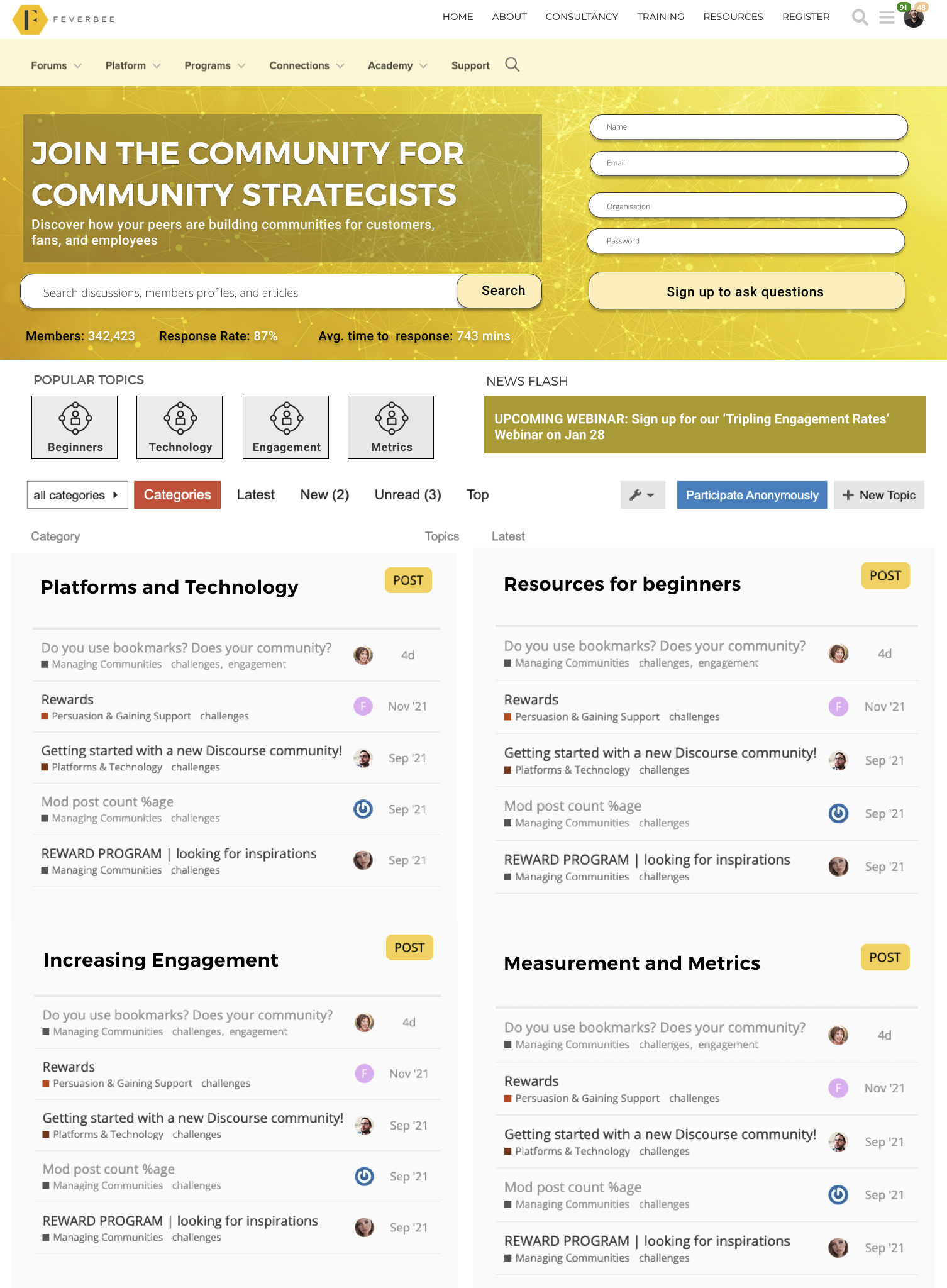
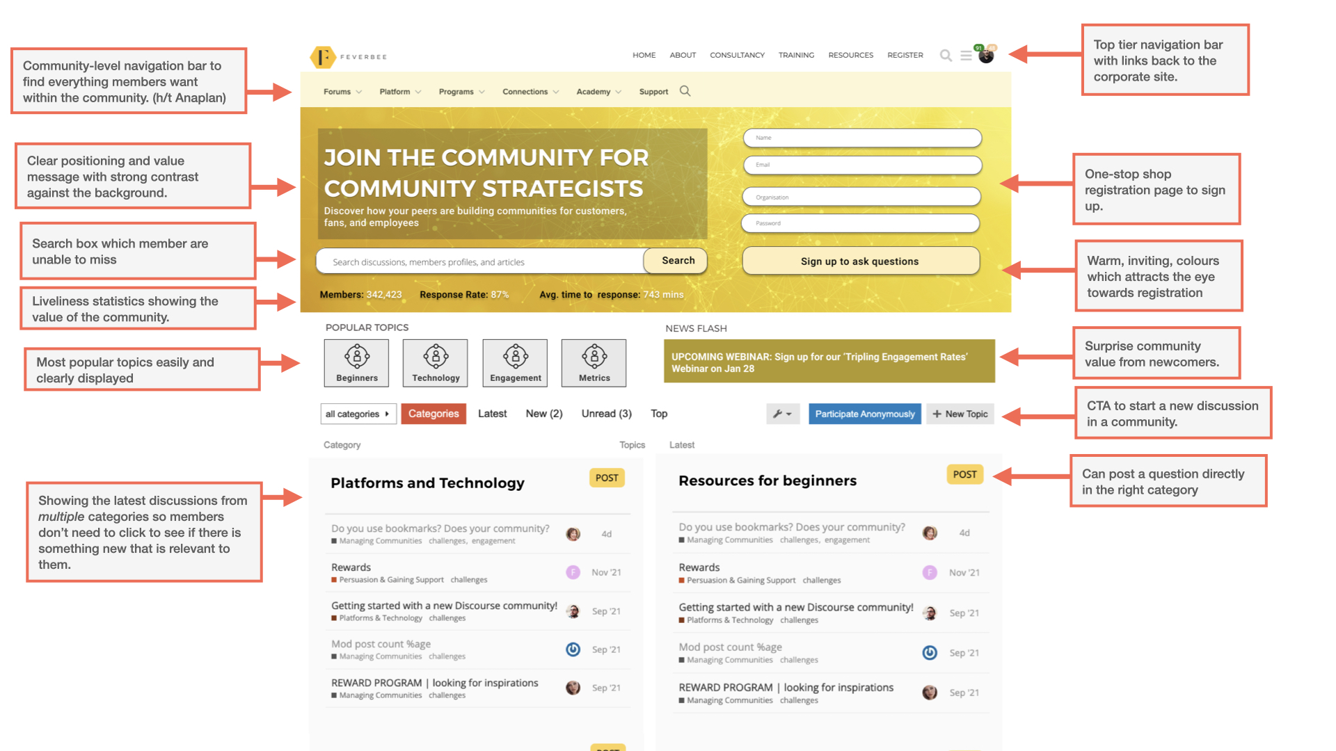
You can find some of our past work around the web. Here’s a redesign for FeverBee Experts we never got around to implementing which shows the principles well (forgive the resolution):
 (click here for full image)
 (click here for full image)
You can see most of the principles in place here, but it’s worth going into a little more depth as you can see below:
(click here for full image)
 (click here for full image)
If you’re using a sidebar, you can come up with a very different design. But using a Discourse template you can see all the elements in place here.
1) Top link-navigation bar.
2) Community-level navigation bar.
3) Clear positioning and value statement with strong contrast against the background.
4) Search box.
5) Registration form on the homepage.
6) A warm, inviting, background (most communities have really cold, sterile, corporate, backgrounds).
7) A list of popular topics members can quickly find.
8) Surprise value in the ‘news flash’ of an upcoming event.
9) Showing the latest discussions.
10) A clear CTA to start a new discussion (this could probably be stronger but we include them below as well).
11) Options to browse the latest/most popular topics.
12) Showing the latest discussions by category on the homepage.
This satisfies almost all the needs of the audiences we’ve mentioned above.
How Do We Make It Function Well On Mobile?
It’s staggering how often organisations try to condense the same information from a desktop screen into a million small boxes on mobile.
Most community mobile experiences are borderline usable as a result. No-one wants to spend hours endlessly scrolling down to find the content they want
On mobile you have to prioritise. This isn’t easy, but it’s not exactly difficult either. In the same example below, we’ve compressed this into a few calls to action while making it easy to browse the community.
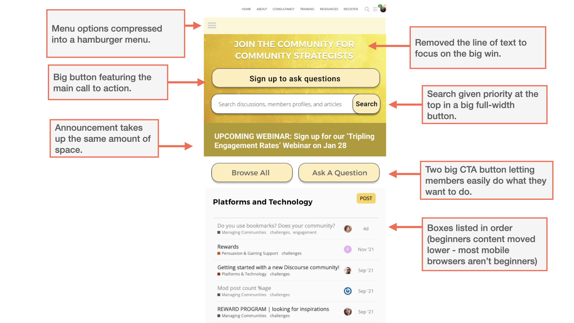
You can see the key things in place for a mobile site to work here.
1) Hamburger menu replaces countless navigation options.
2) Text is removed to make it easier to find the content members want.
3) Announcement takes up the full width of the page.
4) Search box takes full width of the page.
5) Two main calls to action are clearly highlighted.
6) The boxes of content are listed one after the other.
7) Beginner content is moved down (most mobile visitors are not beginners).
What Should A Homepage NOT Look Like?
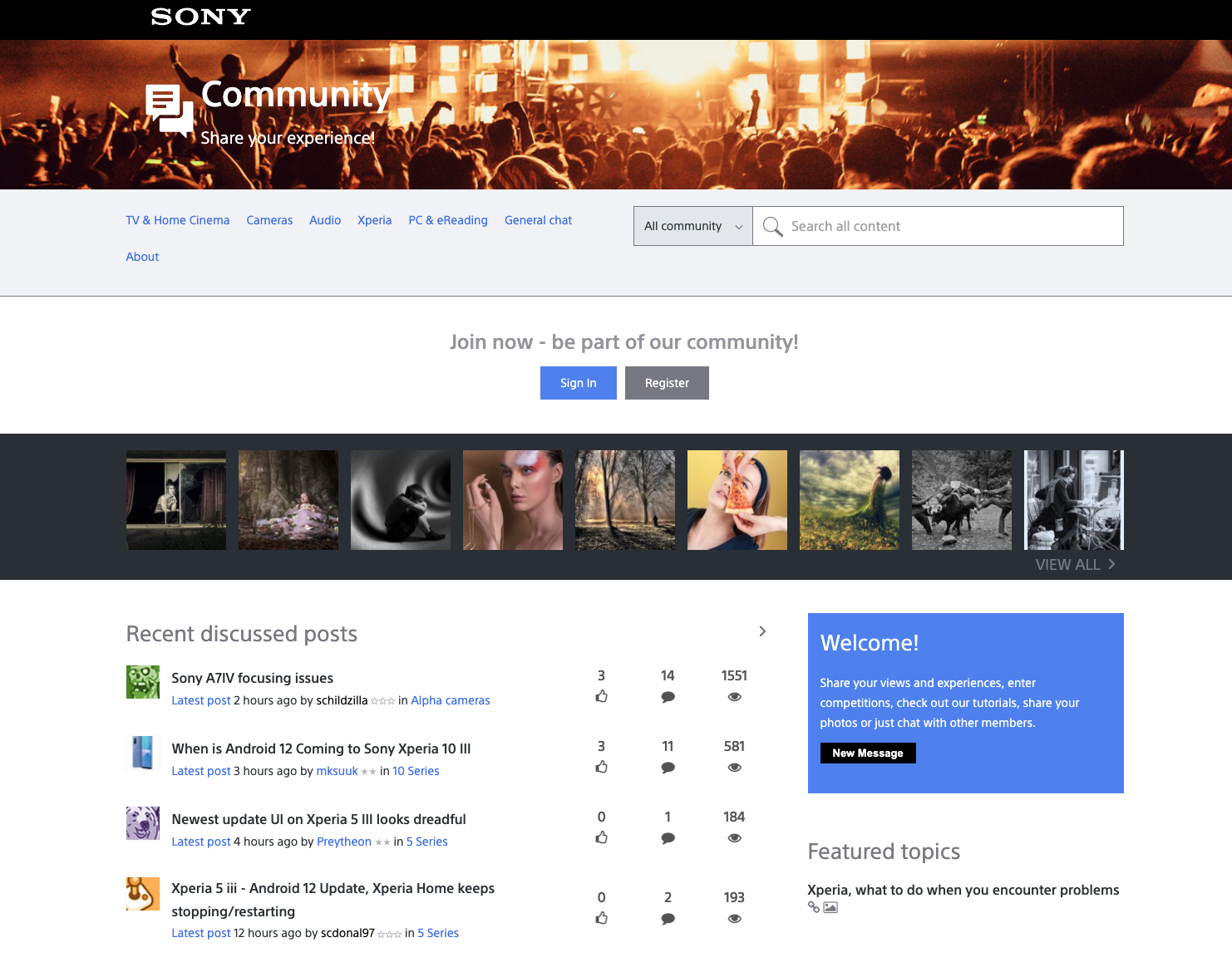
Let’s take the Sony Community homepage, shown below, as an example of what not to do.
This is a useful example of a community with a sidebar.
 (click here for full image)
 (click here for full image)
To put it bluntly, this homepage is a complete mess. Let’s tackle three specific things here.
1) The messaging.
If you browse the discussions, it’s patently obvious the majority of visitors want answers to their problems. Yet the messaging seems to cover every possible need except this.
“Share your experience!”
“Be part of our community!”
“Share your views, experience, enter competitions, check our tutorials, share your photos, or just chat with other members”
The messaging is promoting the things members least want to do when trying to solve their problems.
2) The photos.
There is no reason why photos should appear on this homepage at all. It’s clear they get almost no engagement. Members neither want to share them nor view them. Many of the photos haven’t been updated for the better part of a decade.
It might make the homepage appear more dynamic, but it is clearly unnecessary clutter.
3) The navigation.
The navigation of the site is pretty much a disaster. The navigation bar is hard to spot immediately. It’s light blue text on a light gray background. Worse yet, the ‘about’ tab creates an entire new row of every space which pushes everything else down the page.
You need a proper navigation bar for community menus where members expect to find it with the most popular areas clearly signposted. Both Atlassian and Fitbit do this much better.
So what if we redesign this community with a focus on all the principles here.
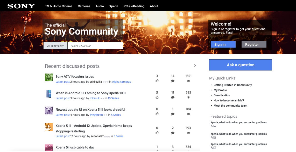
(click here for full image)
Do you notice the difference?
You can see a breakdown of all the changes below:
(click here for full image)
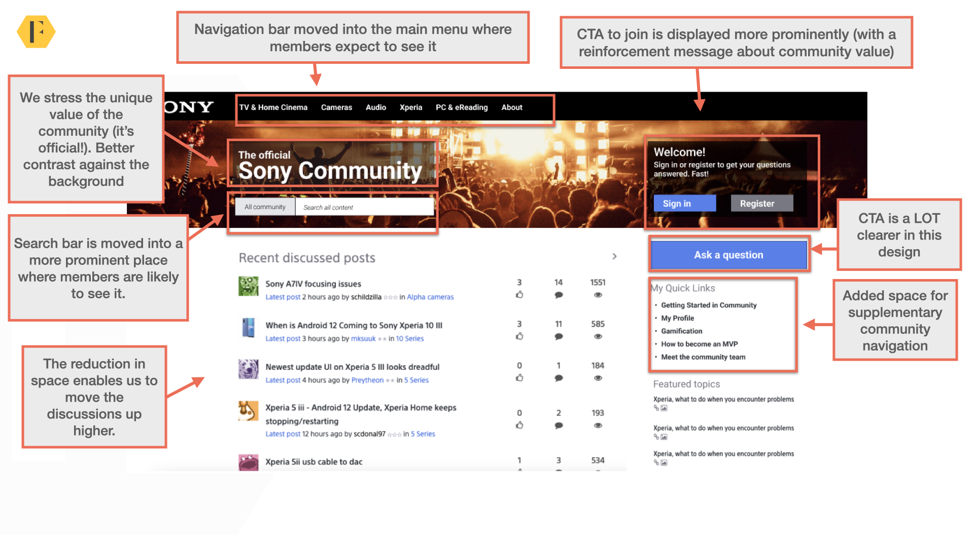 (click here for full image)
There are a few things going on here, but let’s highlight some of the most important from the perspective of the three audiences.
1) Better navigation bar. The navigation bar is where members expect it and out of the way of other areas of the site.
2) Clearer registration/login CTA. This isn’t taking up the entire row, it’s placed where members are likely to look for it alongside the other critical CTA.
3) Clearer messaging. The messaging here is a lot clearer. This is a community to get fast answers to your questions in an official Sony environment.
4) Search box is clearer. We moved this to where it belongs so disappointed seekers are more likely to find it.
5) Add community navigation sidebar. This is for the return visitors to quickly find the parts of the community they need.
6) Moved discussions/features topics up. This provides a better experience for disappointed seekers and regular visitors. It enables the community team to feature discussions where members are more likely to see it.
It’s worth noting, this is just a design I created in 30 minutes to showcase the key principles here. Overall, it’s a FAR better community experience catering to each of the three audiences we’ve featured above.
Get The Basic Design Principles Right
It’s painful when an otherwise good community design is let down by ignoring basic principles of design. Here are a few to be mindful of.
1) Watch out for distracting background images. Both Mural and Qlik have otherwise fabulous communities. But we can probably agree the background images in the navigation bars below are extremely distracting for both:
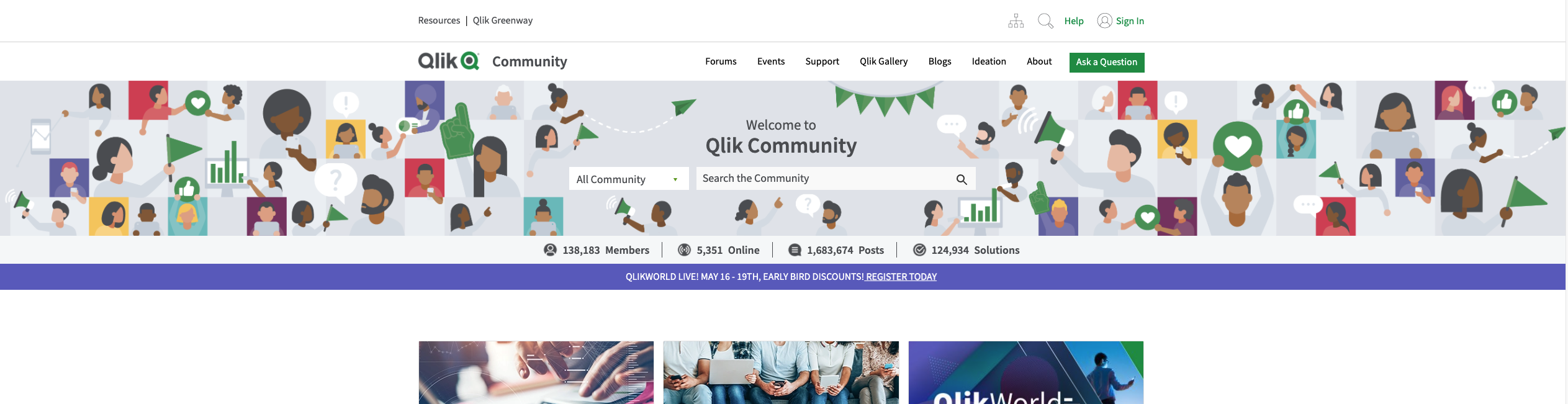
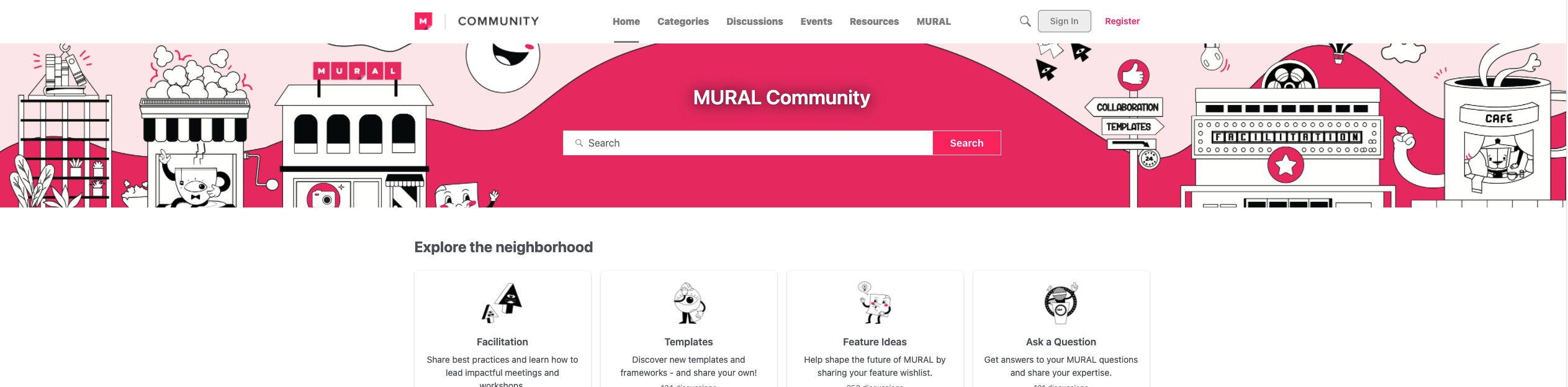
Both of these images add far too much noise without offering any value. It makes it impossible to find what you want. White space is your friend here.
2) Align the elements. The Sony example above is a typical example of what happens when elements are randomly placed on the page with a mixture of right and center alignment (and some options randomly dropped into their own rows). Nothing should be randomly placed on the page. Everything should be aligned to specific columns.
3) Contrast. Make sure the text contrasts well with the background image. It should never be difficult to read the text. The more important the text, the more it should contrast with the background.
4) Avoid the massive banner. Remember members don’t want to spend forever scrolling to find the content they want. Avoid having a massive banner. It’s never, ever, necessary. A simple example here is the Dropbox Community below.
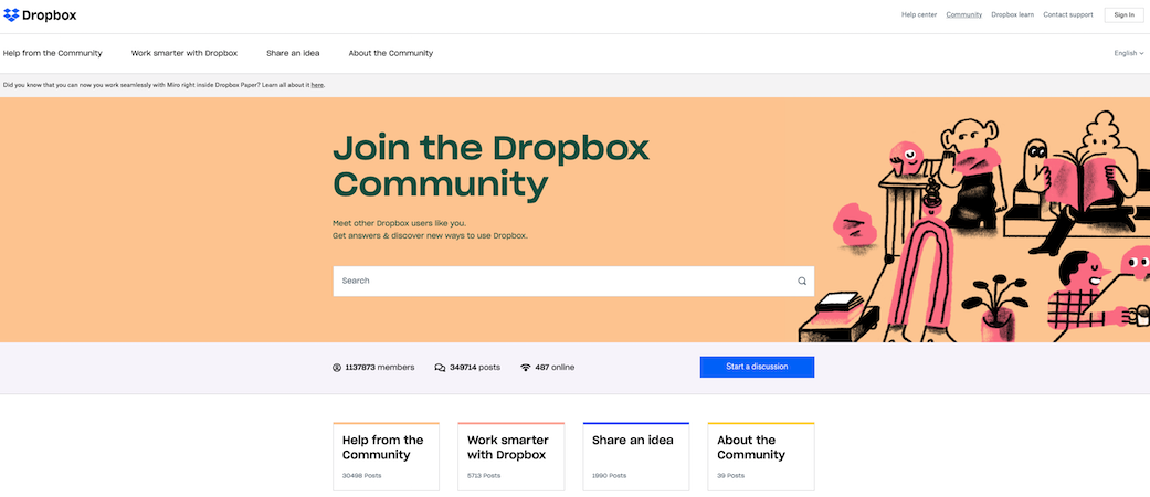
The banner consumes around 80% of the space on the homepage forcing members to expend a lot more effort to find what they want.
5) Position the calls to action clearly. A while back we revamped the banner for an Eventbrite community and increased conversion by 400%. The simple trick was to put the call to action in the most visible places.
By making it crystal clear about what we wanted members to do, more people took action.
For Mega-Communities, Use A LaunchPad
People interested in getting answers to their Microsoft Windows problems aren’t the same people who are going to be interested in getting help with their Xbox game. The audiences are so different it would be silly to try and set up a single homepage for them.
It would be a waste of everyone’s time here to try and create a universal brand homepage. Instead, create a launchpad and multiple sub-communities.
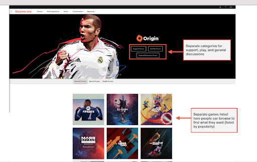
The EA Games Forum, shown below, is a good enough example.
There is a relatively simple rule of thumb here:
If regular visitors are unlikely to be able to answer questions outside of a unique category, you need unique communities.
If the audience is relatively the same, then you can design a homepage. If you’re engaging completely different audiences with few overlapping interests, create a launchpad.
How To Evaluate Your Homepage Today (a simple checklist)
Here’s a simple checklist to think about when evaluating your homepage.
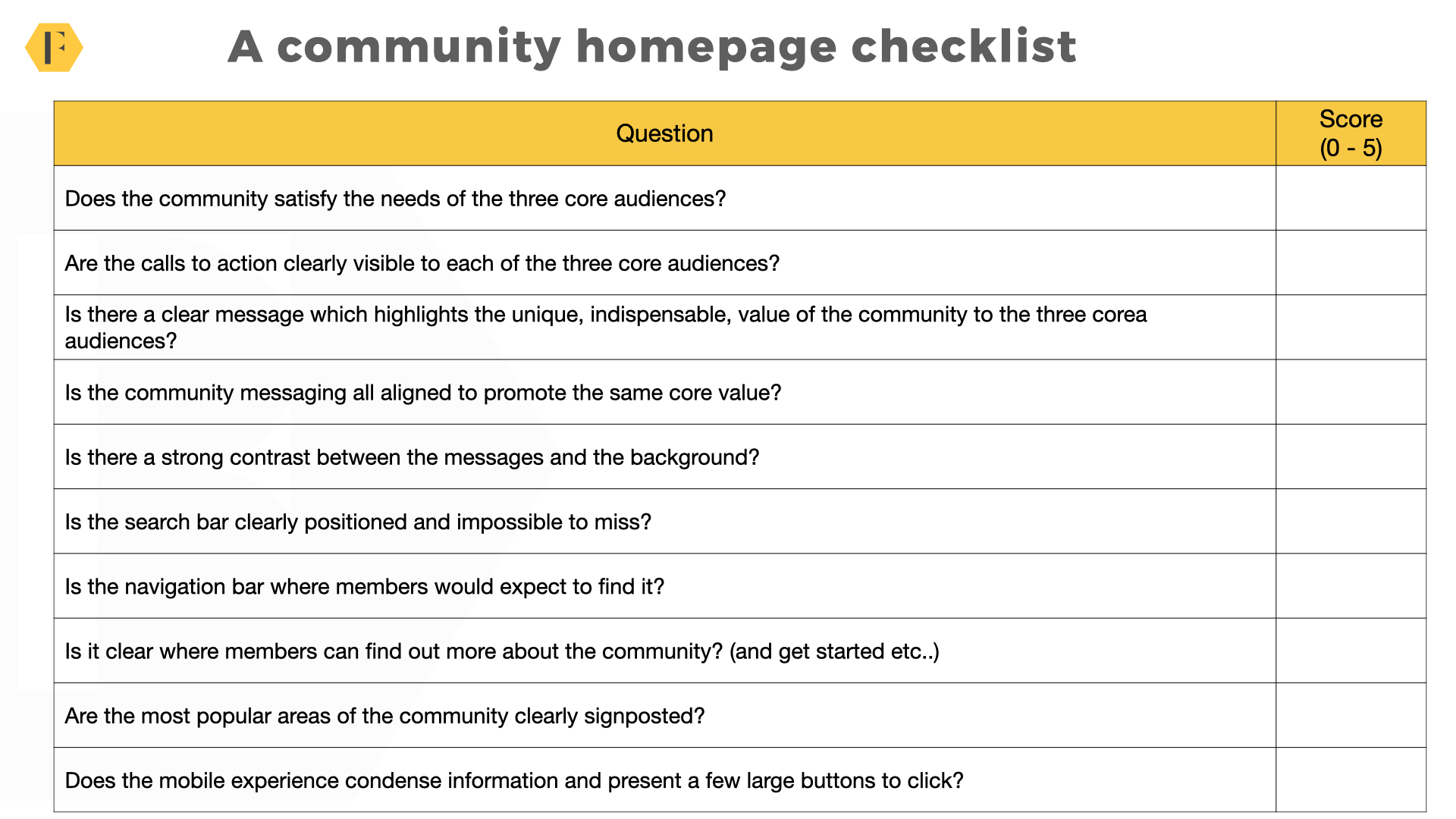
1) Does the community homepage satisfy the needs of the three core audiences?
2) Are the calls to action clearly visible to each of the three core audiences?
3) Is there a clear call to action which highlights the unique, indispensable, value of the community to these audiences?
4) Is the community messaging all aligned to promote the same core value?
5) Is there a strong contrast between the messages and the background?
6) Is the search bar clearly positioned and impossible to miss?
7) Is the navigation bar positioned in the place members are expecting to see it?
8) Is it clear where people can go to find out more about the community (and/or getting started with products etc..)
9) Are the most popular areas/topics of the community features in places where members are likely to see them?
10) Does the mobile experience condense information and present a few, simple, large buttons to click?
This isn’t a comprehensive list, but if we follow just these principles most homepages would deliver a far better experience.
Some Resources To Build Better Homepages
- FeverBee consultancy (even the biggest brands need experience on their designs).
- Steve Krug – Don’t Make Me Think (The classic book on user experience).
- Robin Williams – The Non-Designers Design Book (you don’t need to be a design expert, but learn the basic principles).
- Figma (probably the best tool for prototyping pages today).
- Omnigraffle (build your taxonomies in this).
- Designing Community Experiences (our in-depth masterclass on building world-class community experiences).
- Community Taxonomies (understanding the different types of taxonomies and which you should use).