


FeverBee has been working with Sephora for 6+ months now.
A (small) part of that work was helping update the homepage design to make it cleaner and easier to navigate.
This is what the homepage looked in the old design:
It’s not terrible, but the key calls to action are buried, the background draws attention away from the key elements and it’s really difficult to find the most popular areas of the community (groups and galleries etc..)
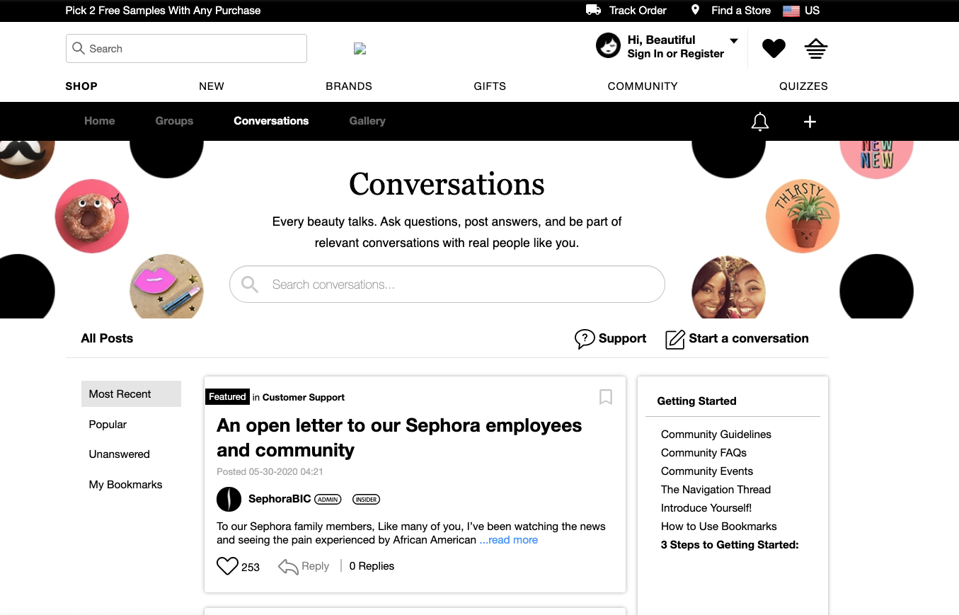
This is the updated version:

This design makes it dead simple to navigate around the community.
If you’re new, there’s a clear place to get started, there is a simple (separate) area for customer support, and the most popular groups and photos are listed right there.
You can also see the vital statistics. The community feels a lot more alive now. Most importantly, everything is aligned to the primary reasons which draw people to the community in the first place.
Navigation
It’s also important to keep the navigation levels clear. Community has moved to the very top bar in the top right (next to sign in).
The top navigation bar enables members to still browse around the entire Sephora.com site and make purchases.
The secondary navigation level provides another place for members to quickly navigate through the community.
The homepage experience is one of the major areas where you can exert influence on what members do. Too many homepages are simply far below best practices today. Spend some time on Sephora’s community, get help if you need it, but, most of all, make the tough decisions about what to prioritize and why.