


As we’ve covered in our ‘Designing World-Class Online Community Experiences’ session, the purpose of the homepage is to let regular visitors quickly scan for new content they can either reply to or learn from.
Too many homepages make this surprisingly difficult to do.
There are three common problems.
1) Pushing latest activity ‘below the fold’.
The Apple Community is an example of this. It looks great but pushes activity way too far down the page.

(If you can’t see the image, click here)
Don’t have large graphics or banners which push activity below the fold. Ensure members can hide the banner and remove anything which doesn’t let members immediately see what’s new in the community.
Remember that this is equally true in mobile too. Well-intentioned ideas to make the community look good typically force members to endlessly scroll through static images to find what they want.
Compare the SAP community mobile experience with the Unbounce community below.
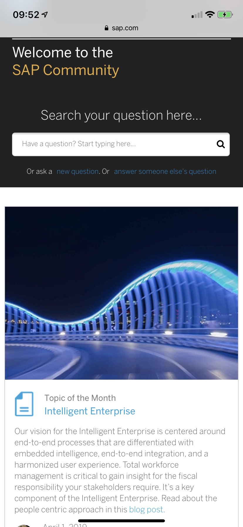
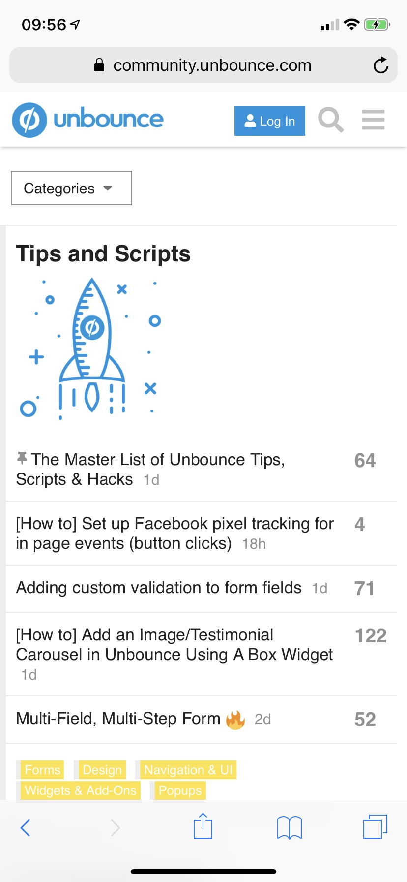
(If you can’t see the images, click here and here)
Big images look good, but completely limit the amount of content members can see. Even Unbounce can remove the large icon and make it easier for members to scan the community.
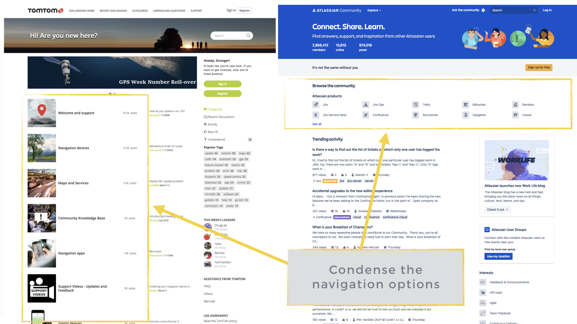
2) Showing navigation options instead of activity.
Another common problem is showing navigation options instead of activity.
Navigation options should be clear but condensed. Compare the acres of space the TomTom community uses to display categories. Atlassian displays more categories in about 1/8th of the same space:
(If you can’t see the image, click here)
If you need to add navigation within the homepage as well as the navigation bar (which is often smart), make sure it’s minimal so members can still see the latest fresh activity in the community.
3) Showing static content instead of new activity
Don’t show static content to members who have seen it hundreds of times before.
Too many communities violate this rule. 70%+ of the content on your homepage should show fresh activity members can easily scan through.
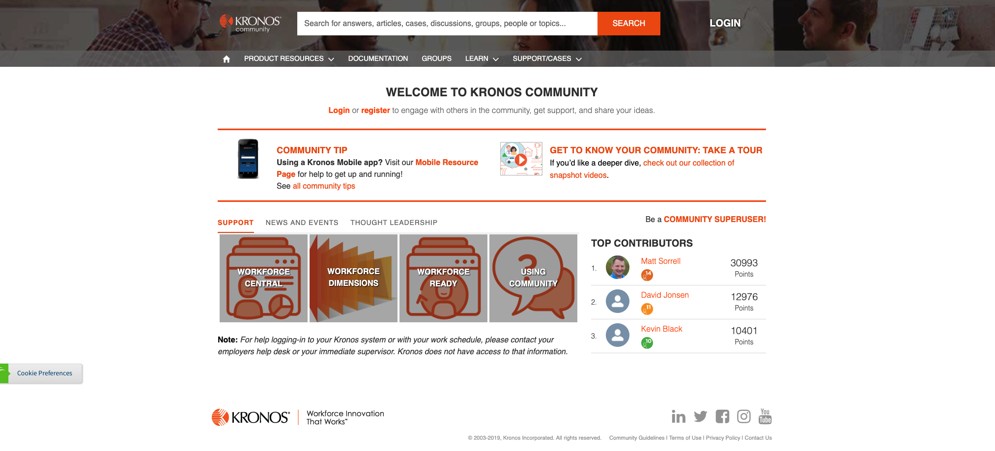
For example, the Kronos community homepage features almost 100% static content.
(If you can’t see the image, click here)
Returning members see the same material every single day and have to click through to find anything interesting. Not many are going to bother to do that.
The Alteryx community is similar, most of the ‘above the fold’ content is static.
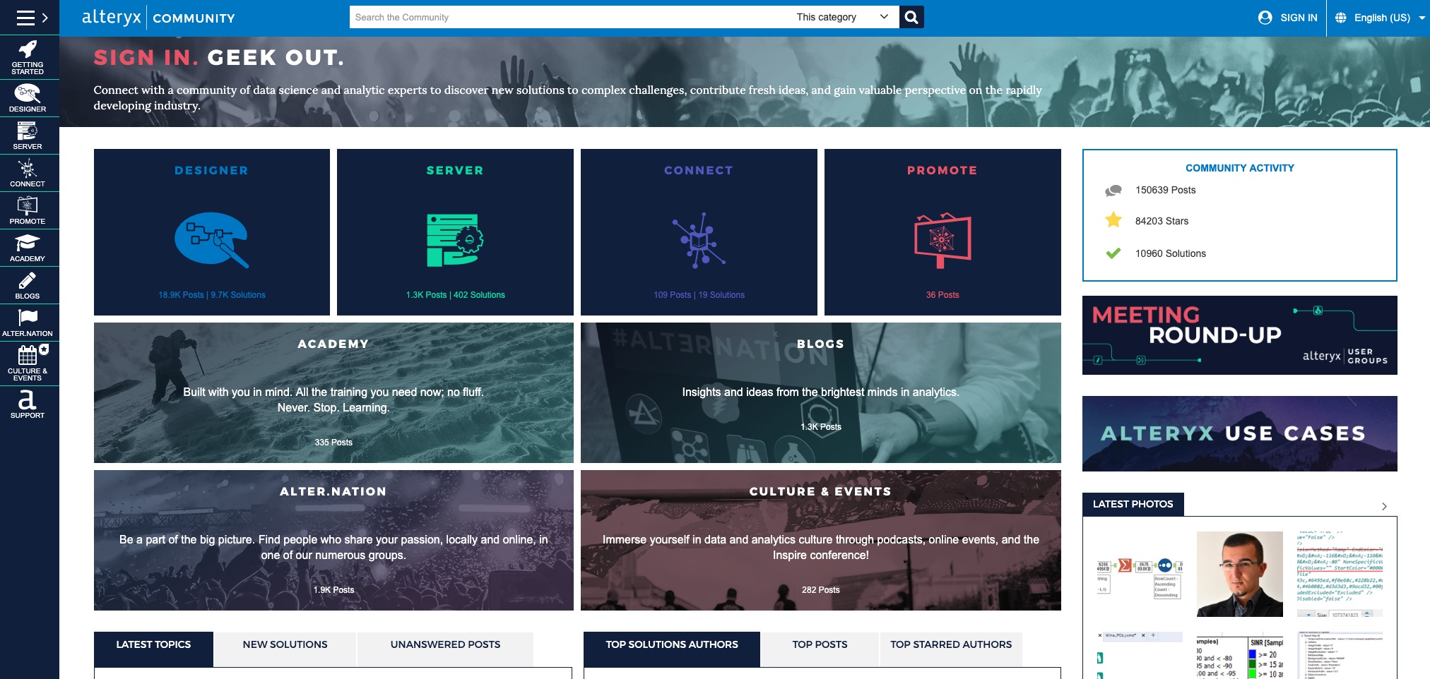
(If you can’t see the image, click here)
Make sure that the majority of the space on your community is filled with dynamic content/new activity which is regularly updated.
Redesign Your Community Homepage
Improving the community homepage is the beginning of a positive community cycle. The easier it is to scan, the more people will view and participate.
The more participation, the more people want to contribute good content to get noticed.
…and the cycle goes on.
This is just a few of the best practices in developing a community homepage. We’ve consistently increased participation in client’s communities by 25-50% by redesigning their homepage.
You can get a lot more from your homepage if you know how (or let us do it for you).