


In most surveys, we ask a question about the relevance or satisfaction of the community.
This is usually a Likert scale question such as:
On a scale of 0 to 10, with 10 being the highest, how relevant or irrelevant do you find the information shared in the community?
On a scale of 0 to 10, with 10 being the highest, how satisfied or dissatisfied are you with your community experience?
On a scale of 0 to 10, with 10 being the highest, how helpful or unhelpful do you find the community in achieving your goals?
Some organisations simply use a poll and calculate the results from that.
The problem is that these results are widely misinterpreted, leading to strategic blunders.
Why The Average Score Is Dangerously Misleading
Sadly, people love simple scores which are easy to interpret.
For example, let’s imagine you run a survey and get an average member satisfaction, NPS, or relevancy score of 4.1 out of 5.
A year later you run the survey again and the average is 3.8 out of 5.
This looks like a bad result (and it could be). But it’s equally as likely to be a change in who is responding to the question.
For example, imagine in year one, your survey collects data from 70 newcomers, 20 intermediate members, and 10 top members. The following year, it collects data from 50 newcomers, 20 intermediate members, and 30 top members.
Your overall average will probably be worse. This isn’t because you’re offering a worse community experience. It’s because the percentage of responses from different groups in the sample has changed.
This is why tracking members by segment is key. You will get not only an overall average but you can see how each segment feels about the community. You can then adjust for sampling bias to get an overall score and track that over time.
Response Bias Favourably Distorts Survey Results
It’s genuinely hard to get people to complete a survey if they had a bad experience. Why would they bother? You could try offering money – but then you would have to know their answers to the survey in advance to know to who to offer money. It’s a catch-22.
We see this in the data all the time. Pretty much all segments in all communities score the community at least 3 out of 5 or above. This often leads clients to think that an average score of 3.6 out of 5 is good (when it isn’t).
It simply reflects that most people who are really unhappy don’t tend to complete surveys.
This is also why you should be careful when member satisfaction scores are compared against other channels (i.e. customer support). This is never an apples-to-apples comparison. The methodology changes everything. How, where, and when people are surveyed in their journey will have a big impact on the outcome
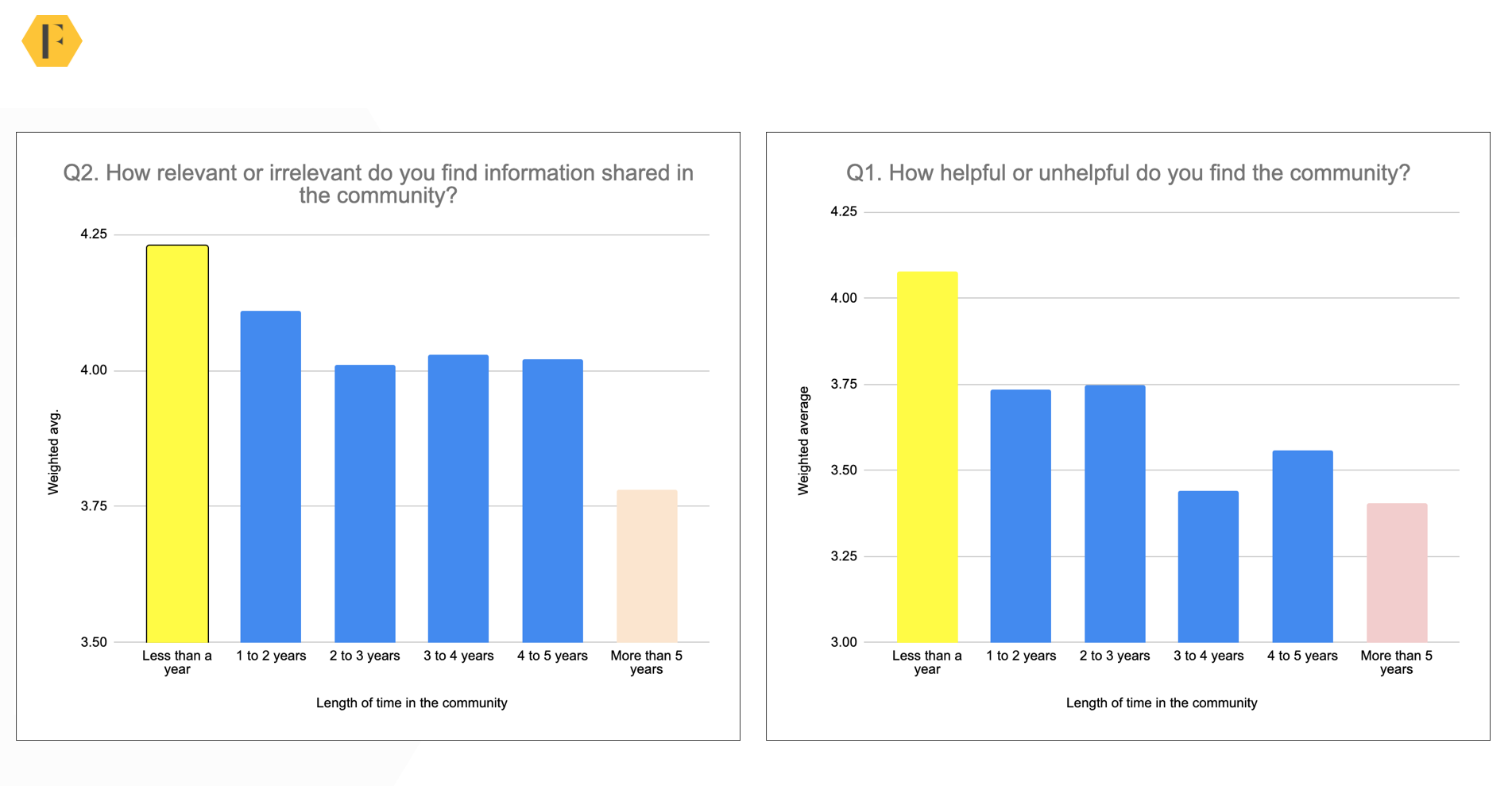
Why Top Members Are Usually The Least Satisfied
The other challenge is the results vary tremendously by whichever segment the member is in.
Before we began doing satisfaction surveys, we expected the best results would come from the top members (or longest-serving members) and the worst results would come from newcomers (or least active members).
In reality, we often find the opposite is true.
As you can see below, the veterans/top members are typically the least satisfied while the newcomers (especially those who have just joined) are the most satisfied.

Why would the most active and longest-serving members also be the least satisfied?
Wouldn’t unhappy members simply vanish from the community altogether?
One reason is pretty obvious. Being the least satisfied or least happy isn’t the same as being unsatisfied or unhappy. Members who are truly unsatisfied or unhappy with the community don’t bother to complete a survey at all.
The more we’ve explored we’ve dug deeper into the survey data and combined it with qualitative responses from different groups, the more we’ve been able to build up a clearer understanding of how and why members engage the way they do.
Top members are usually the least satisfied for three reasons.
- They compare the community to its past state. Many top members compare a community to an idealised former state. This is usually when they were on a platform they liked more, or where they know the community team better. The more mature the community is (and the more changes you’ve been through), the bigger the problem this becomes. They’re not evaluating the community by the daily experience they have, but against a nostalgic sense of the past (not too dissimilar from how many people have nostalgic views about the 70s, 80s, or 90s).
- The top members notice the small problems. Top members spend the most time in a community. This means they’re more likely to notice minor other members don’t. It’s best to imagine this as visiting a friend’s well-decorated home with beautiful views. The house is likely to seem better to you than to them. They’ve experienced all the small issues you haven’t.
- Top members are evaluating their relationship with the brand. Top members often evaluate the community experience by how they feel the community team treats them. If they harbour a sense of past injustice or don’t feel they are getting the respect or recognition they deserve, they evaluate the community poorly. They’re not evaluating the experience as much as they are the relationship.
Ultimately this means top members are using a different rubric to evaluate the community and they’re evaluating the community against far higher standards.
Why Newcomers Are The Most Satisfied
Newcomers tend to be more satisfied for three reasons:
- They’re evaluating a small slice of the community. Newcomers only evaluate the parts of the community they’ve experienced. Often this is simply them asking a question, getting the answer they wanted, and departing. If that small slice of the community was good (and it usually is), they are satisfied.
- They’re still excited by the community’s potential. If someone asked you how satisfied you are with college after your first day, you would probably say highly satisfied. You’re still in the excited phase. After a year, your review would be different (probably lower). It’s easy to forget how exciting joining a community filled with great expertise could be. There are so many things to learn and people to engage with. The excitement about the community’s potential skews the results.
- They’re comparing the community to search. Related to the above, newcomers often compare the community to search engines or tediously browse the documentation. They’re not objectively evaluating the community, but they’re comparing it to other places where they could get information.
Newcomers are evaluating a small slice of the community using different comparisons and are buoyed by the excitement of its potential.
How To Use Community Survey Data
It’s really easy (and tragically common) to compare the groups against one another and misinterpret what the data is telling you.
This could lead you to invest more time in top members and less time in newcomers.
But this isn’t what the survey is telling you to do!
The survey is a snapshot of information collected during a given period. It’s a reflection of the natural mindset, impulses, and attributes of each unique segment of the audience.
They’re not more or less satisfied because of what you’re doing, they’re more or less satisfied due to being a part of the segment.
So what’s the point of undertaking this survey if it’s not showing you what you think?
There are three reasons
- Create a benchmark for future comparison. This data lets you create a baseline (both overall and for each group) that you can use over time. This becomes your benchmark. You can (and should!) run the survey once a year and track progress. This will reveal whether the satisfaction is increasing or decreasing each year – and why specific groups are driving the outcome.
- Compare against industry standards. We’ve been running these surveys for so long now that we know when a result is an outlier and worth exploring. When we compare the results of one client’s survey against the industry baseline, we can see if the client should be doing better or worse. This is great data to check if your performance is within the expected range – if not you can discover who to learn from.
- Identify unique issues. The very next question when members give a rating should be to provide a reason for their rating. Are there any specific things they especially do or don’t like? This creates opportunities to learn about specific issues you can prioritise.
Summary
It’s great to have some method of measuring member satisfaction (a poll or survey question). However, you need to have some expertise in your community and how the data was collected to turn the data into useful insights.
Don’t use the average score without also considering the composition of respondents. Be mindful that the score will be distorted by a response bias. And anticipate that top members will seem the least satisfied – and that’s ok.
Track the data over time and then use the data to decide which groups need more or less support.