Get a comprehensive community strategy
Select, migrate, and design your community platform
Measure and prove your value
Develop a world-class community team
Get regular insights by email
Browse our latest insights
Access free lessons
Get inspiration from top communities
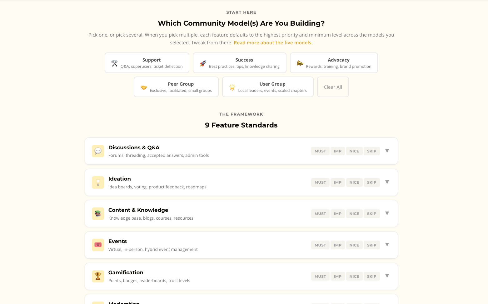
Score the major platforms against the community model you are building
Published by us and recommendations
Learn how to create a successful community strategy from scratch
Discover how to prove ROI
Nurture top members
Get quickly up to speed on the basics.
Learn how to approach your community strategically.
Subscribe for regular insights
Explore by Category:
Resources: