(reminder prices for our Strategic Community Management course rise tonight).
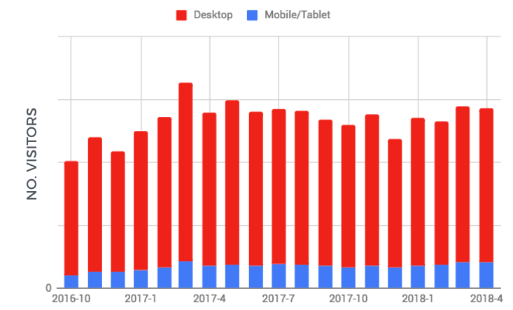
It’s a mistake to believe that you win the argument if you have the right data. During this week’s webinar, I presented this slide and asked attendees whether the level of traffic was going up, down, or staying the same.
The audience was split between the three.
We’re all looking at exactly the same graph and coming to completely different interpretations.
That’s pretty incredible don’t you think?
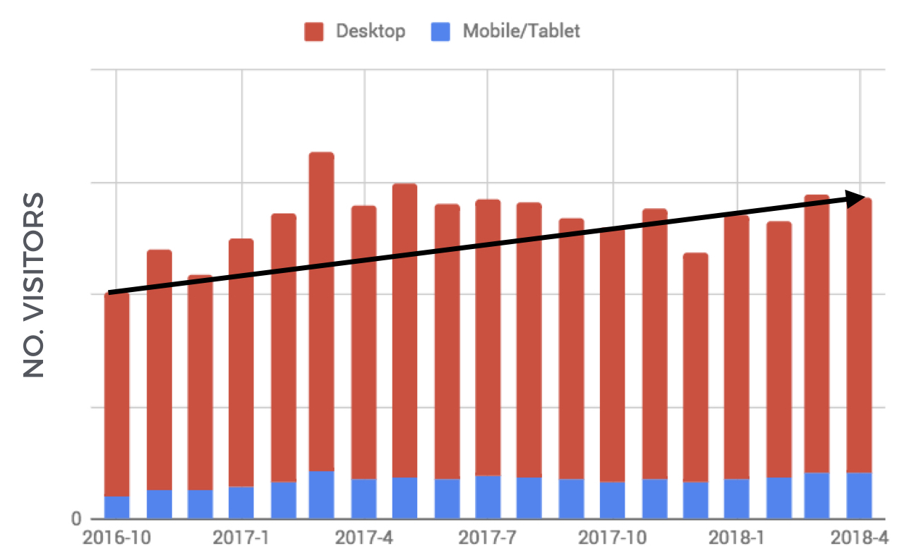
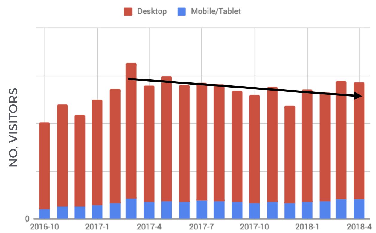
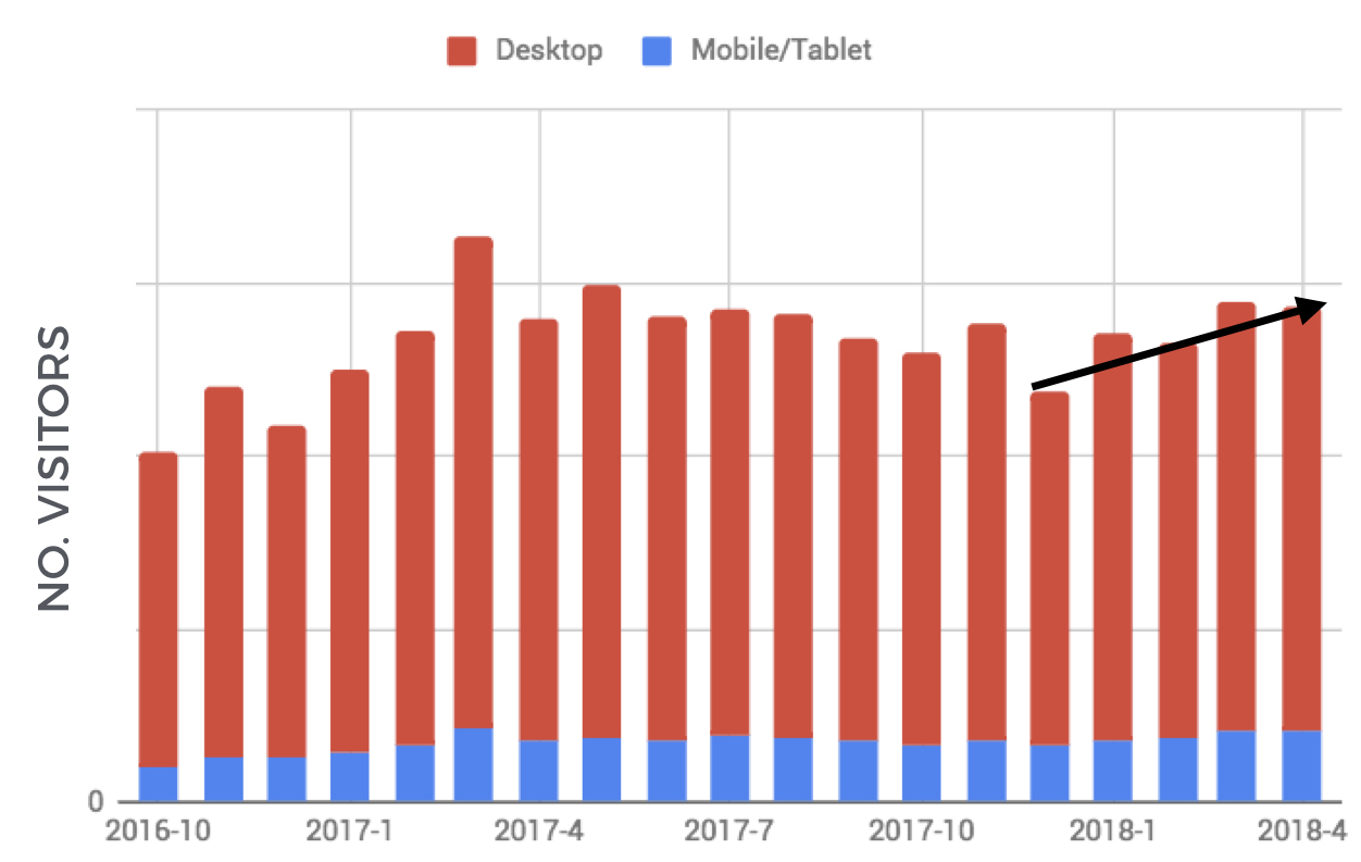
But this is true of most data. Do you look for the line of best fit, the trend in the past few months/years, or some sort of average over them?
You can see this in the images here:
This happens with almost every possible metric. Everyone brings their own biases into their interpretation of data. If they don’t know you, don’t believe in you, or don’t understand the community then the same metrics you’re delighted to present can be perceived negatively.
You might be delighted to show the community solved 20% more customer questions than last year while the head of customer support might note it’s still only 5% of the total questions the support team receives. Why bother?
Data is one of many signals that helps people understand how the community is doing/what it’s worth. It isn’t the strongest or weakest. Others include the relationships you’ve developed with senior people, whether you’re delivering impact for them, what the narrative of the community is, who else supports the community, whether they’re engaged in the process of community etc. etc…
It’s better to have great data than not, but don’t imagine it will be a silver bullet solution to get the support you want.
