


In 2016, Microsoft replaced its Yammer Office community with TechCommunity on the Lithium platform. This cannot have been easy. There are plenty of other platforms for different purposes. If Microsoft made a mistake, they will have thousands, perhaps millions, of angry members.
This week, we’re going to do a breakdown of the Microsoft Tech Community and dive slightly into Microsoft’s broader community structure.
This is our 6th community breakdown, you can find the others below:
Note: If you’re reading this by email either click here to see the full post, get the slides here or simply enable images in your browser.
What You Will Learn
- Overview and Structure
- Community Structure
- Community Design
- Search
- Onboarding
- The Engagement Experience
- Gamification
- The Microsoft MVP Program
Overview and Structure
As we can see below, Microsoft has multiple communities across multiple platforms for multiple audiences and purposes.
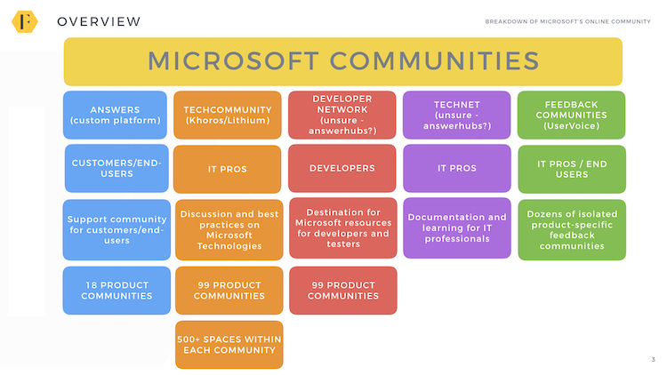
(If image doesn’t display, click here)
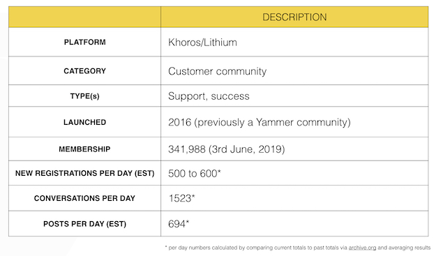
Making this even more complicated is the incredible speed of growth in the community. Since launching in 2016, the community has grown at a staggering pace with 500+ new members every day, 600 new posts, and over a thousand new conversations.
(If image doesn’t display, click here)
One potential problem here is the number of conversations per day far exceeds the number of posts. This means either a huge number of conversations are being started which do not receive a response or there is a flaw in the data.
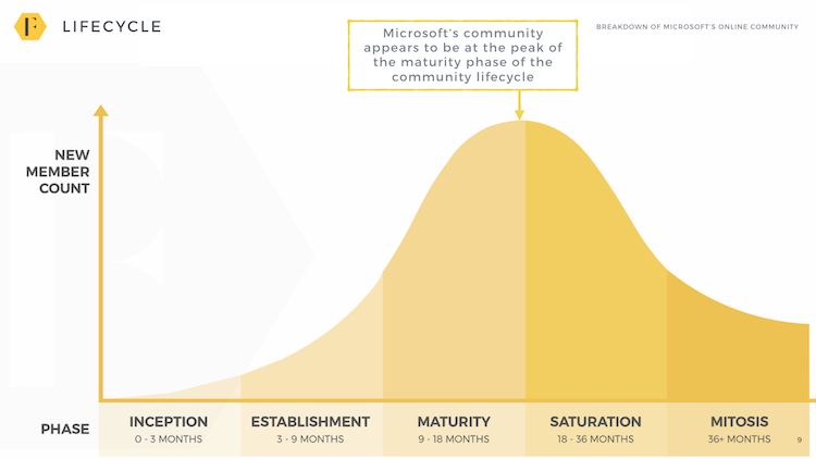
Based upon the community lifecycle, we would consider this community at the very peak of its speed of growth. However, given the overwhelming size of Microsoft, we would note the community in many aspects has already jumped ahead to the mitosis phase.
* Note: per day numbers are collected by comparing figures listed on the website today vs. several months ago (via Archive.org) and averaging the results. This will not account for any posts which have been removed.
(If image doesn’t display, click here)
Community Structure
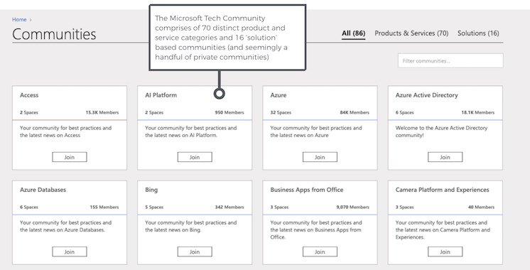
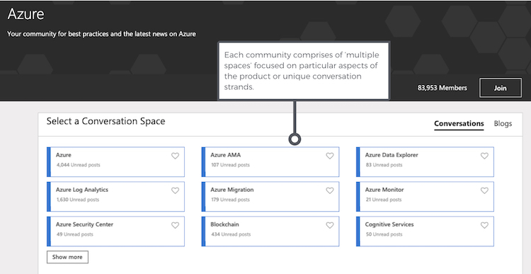
The Microsoft Tech Community comprises of 99 distinct communities (70 distinct product and service categories, 16 ‘solution’ based communities and several hidden communities).
(If image doesn’t display, click here)
Each community has one or more ‘spaces’ where members engage with one another.
(If image doesn’t display, click here)
It’s important to distinguish between the TechCommunity – for IT professionals and the answers community for end-users here. The community is designed to help IT professionals get the most from Microsoft products.
However, despite the complexity of the community, the community uses a relatively basic set of features from Lithium (Khoros).

(If image doesn’t display, click here)
The lack of groups and knowledge base is interesting. This could be because either group is a relatively new feature from Lithium or because it’s outside of the community strategy.
Community Design
(If image doesn’t display, click here)
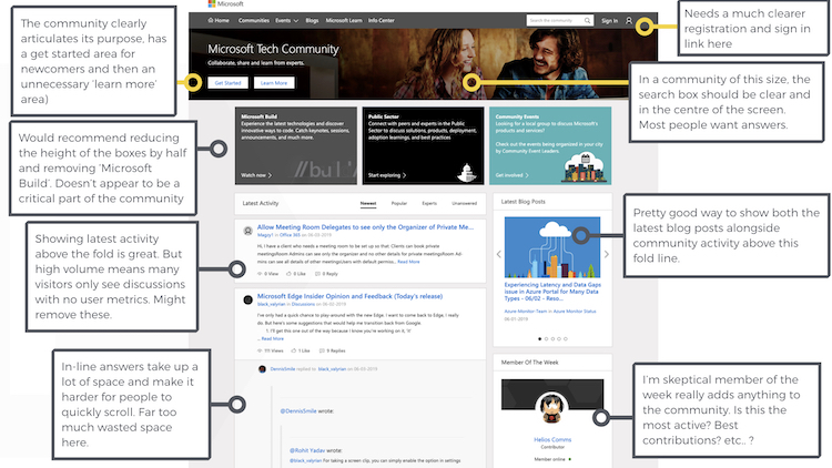
The community essentially uses a small number of templates with minor variations for both the homepage and each sub-community/space/other areas. This ensures a consistent (if somewhat unexciting) experience. It also makes it a lot easier to review the community.
The community does well to clearly articulate its purpose, provide a place for newcomers, and show some of the latest activity above the fold. It could be improved by reducing the static boxes to half the height, adding in trending topics, and possibly removing the in-line answers which take up a lot of space, but make it harder for members to scroll through the page.
We would also like to see clearer calls to action in both the search and a registration box. Both are relatively well hidden but are pretty important.
The display of blog posts alongside the content is handy and something other communities could embrace.
Mobile
(If image doesn’t display, click here)
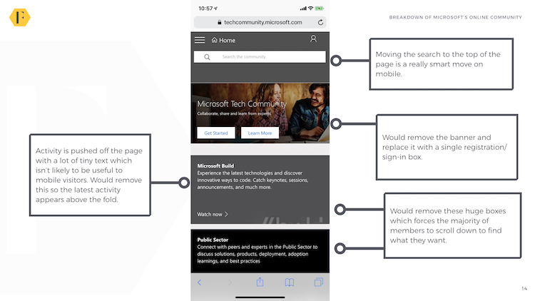
The mobile experience is good but could also be significantly improved. Moving the search to the top of the page (and keeping it there when members scroll) is a really smart move on mobile. It would also be good to bring the rest of the activity up by removing the static banners and other content.

(If image doesn’t display, click here)
The image on the left would be an ideal mobile experience. It also makes sense to show the expanded content here. The community also has a great display of blog posts. It would even better if members could quickly swipe to the next blog post for simplicity.
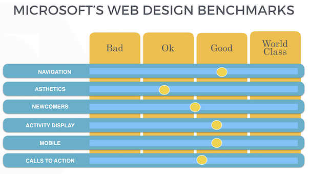
Final Design Rating: B-
Using our benchmarks, the community design hovers somewhere around a B-. It has simple enough navigation, somewhat guides newcomers, and displays most activity fairly well. Its mobile site is ok, but calls to action could be a little improved. It’s not going to win any awards for being aesthetically pleasing but neither is Microsoft.
(If image doesn’t display, click here)
Search
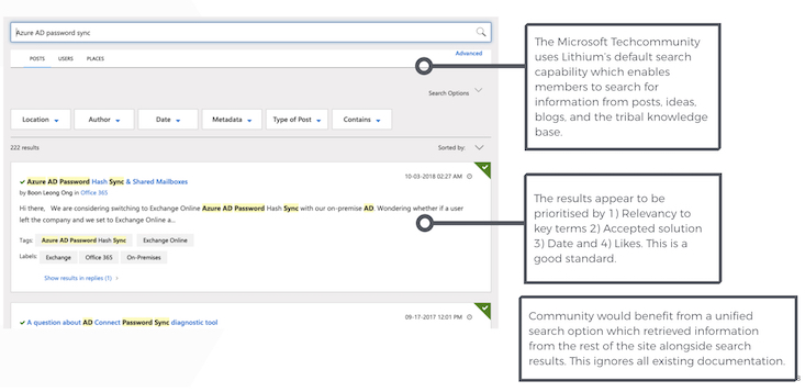
(If image doesn’t display, click here)
The community uses Lithium’s native search function which performs ok. This enables members to search for information from posts, ideas, blogs, and the tribal knowledge base (which is only used for older Yammer articles). The results appear to be prioritised by 1) Relevancy to key terms 2) Accepted solution 3) Date and 4) Likes. This is a good standard.
Like many communities, this could benefit from a unified search option which retrieved information from the rest of the site alongside search results. This ignores all existing documentation.
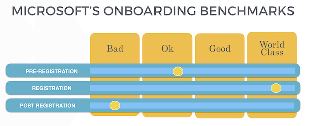
Onboarding
We can break onboarding down into three areas; pre-registration, registration, and post-registration.
Pre-Registration
At the time of writing, Microsoft is the most valuable company in the world with a huge array of products, services, and information to communicate to different target audiences. We’re less than surprised the community does not appear prominently on the company homepage. Most links to the Tech Community are buried down the pages for each product.
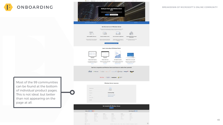
(If image doesn’t display, click here)
While this likely attracts a lot of traffic, it also means most traffic is going to come via search.

(If image doesn’t display, click here)
Like many brands which require extensive product documentation, the community must compete with documentation to appear higher in search results. There is likely scope to improve and prioritise how discussions appear in search results to attract more traffic and differentiate from product information. We suspect the community attracts the long-tail of search results which documentation can’t easily cover.
When members do visit, it’s difficult to see where to register. Members have to click on the ‘login’ section instead of a registration link. It might be better to show a registration call to action for visitors who haven’t logged in.
Registration
The Microsoft community uses SSO (single sign-on) but without Facebook/Twitter support. To join the Microsoft community you need to have a Microsoft (or Skype) account. To join you need to give the community access to your Microsoft account. This is a little clumsy, but probably understandable.
Like most, SSO-based communities, this is a little clunky. But it seems to work easily enough.
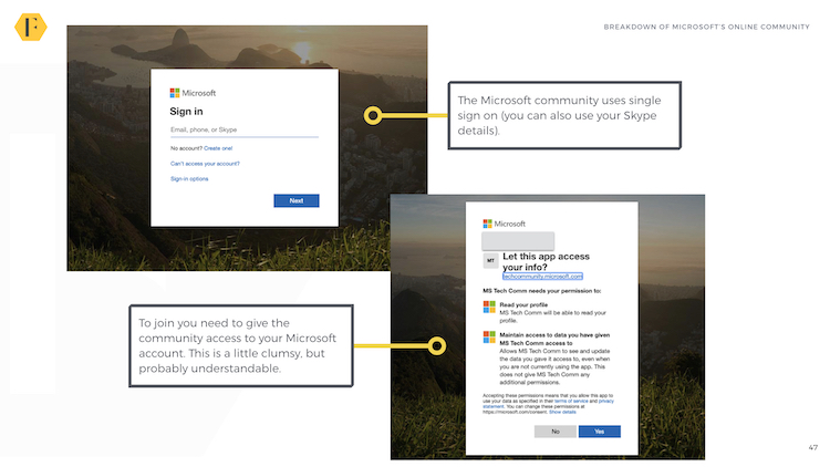
(If image doesn’t display, click here)
The process is simple and only takes a minute or two (even without an existing Microsoft account).
Post-Registration
Once a member has registered, they’re immediately asked to highlight the areas which most interest them. This ensures members aren’t overwhelmed with irrelevant information.
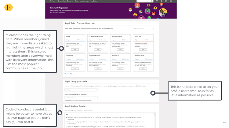
(If image doesn’t display, click here)
Below this, members are asked for some very basic profile information. This is a great example of understanding what members want and asking for as little information as possible. It might also be useful here to have a separate Code of Conduct tab.
Once complete, the homepage shows an activity feed filled with content members chose to follow. This is ideal for communities where members are likely to use multiple products.
However, there are no further onboarding or automation rules here to better engage newcomers within the community. An email campaign or a clear next step would be useful.
Final Rating: C+
A very mixed onboarding experience. We would probably give the community a C+ (ok) grade here. The pre-registration is ok, the registration is great, and the post-registration is somewhat non-existent.
(If image doesn’t display, click here)
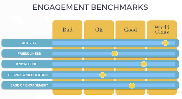
The Engagement Experience
The Microsoft engagement experience is spread across multiple areas. The core of the community is the Q&A discussions which take place within each space of each community. However, this is slightly augmented by a community section, an ideas area, blogs, and events.
Communities
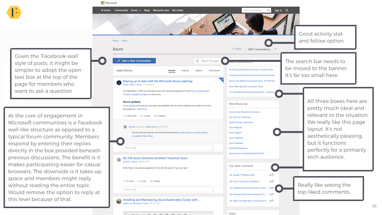
(If image doesn’t display, click here)
There is a lot to like here and a little to dislike. At the core of engagement in Microsoft communities is a Facebook wall-like structure as opposed to a typical forum community. Members respond by entering their replies directly in the box provided beneath previous discussions. The benefit is it makes participating easier for casual browsers.
The downside is it takes up space and members might reply without reading the entire topic. It might also be simpler to adopt the open text box at the top of the page for members who want to ask a question.
The search bar clearly needs to be moved to the banner. It’s far too small here for the thousands of people who need to search for answers to their questions. All three boxes on the right, however, are pretty much ideal and relevant to the situation. We really like this page layout. It’s not aesthetically pleasing, but it functions perfectly for a primarily tech audience.
Spaces
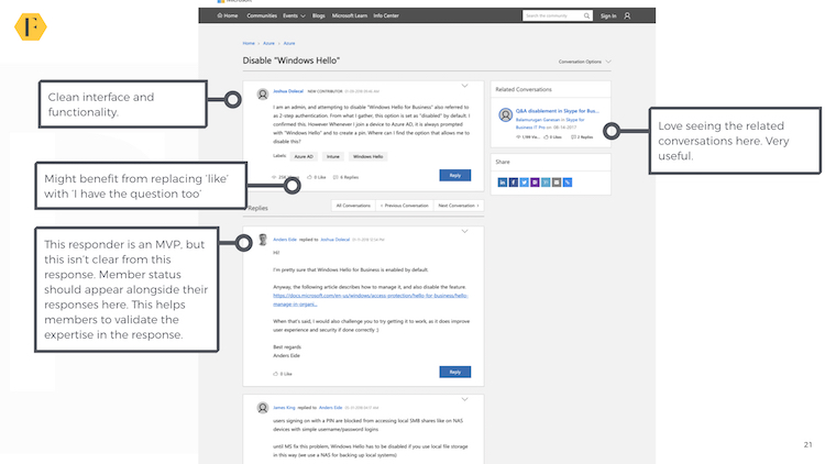
(If image doesn’t display, click here)
The interface for Spaces is clear and focused on function over form. This too would benefit from a clearer search box. We would also recommend replacing ‘like’ with ‘I have this question too’ which reveals more information about the visitor’s needs. Related conversations on the right is also a good touch.
Ideas
Ideas and feedback is where the structure of the community becomes strange and murky. At one level, there is a fairly good ideation page for community feedback hosted on the community below:
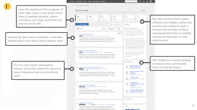
(If image doesn’t display, click here)
There is room for improvement, but generally, it’s a good way to see the latest ideas and the status of these ideas. However, this ideas section isn’t used for any of the product categories. These are still hosted on the external UserVoice site.
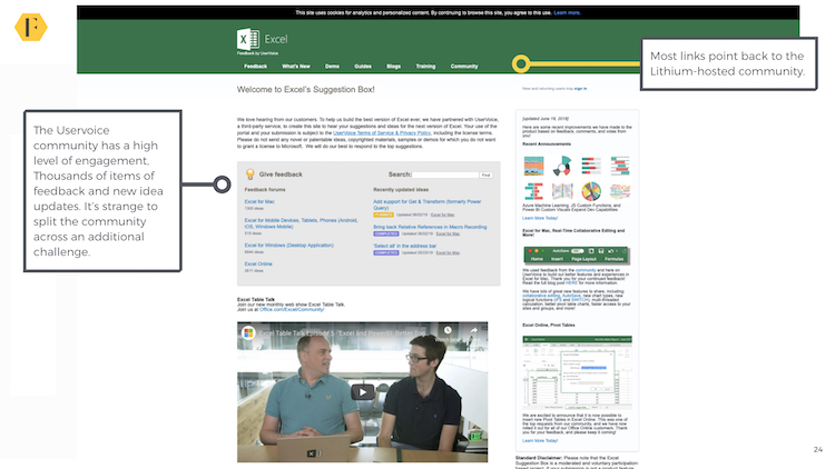
(If image doesn’t display, click here)
It’s odd to pay for ideation from Lithium and barely use it. The Uservoice community has a high level of engagement with thousands of items of feedback and new idea updates. While most links direct you back to the relevant community, it’s strange to have two places for the same function.
Blogs
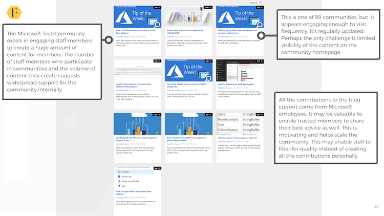
The community generally does a great job of displaying blogs. Staff are highly engaged in creating a lot of topical content within their area of expertise. This suggests widespread support for the community across the business.
(If image doesn’t display, click here)
All the contributions to the blog currently come from Microsoft employees. It may be valuable to enable trusted members to share their best advice as well. This is motivating and helps scale the community. This may enable staff to filter for quality instead of creating all the contributions personally.
Events
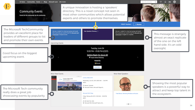
The Microsoft Tech Community has an interesting approach to events. Any related social group can seemingly add an event to the calendar with their own page which takes members to a separate registration link on Meetup/Eventbrite or possibly other communities.
(If image doesn’t display, click here)
Events are shown by their respective popularity with the biggest even given the dominant position.
(If image doesn’t display, click here)
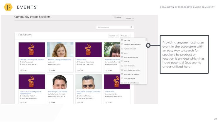
Another interesting innovation is to create a list of the top speakers searchable by category and field of expertise. This enables anyone hosting an event to find people to speak to and may attract top people to visit and maintain their profiles.
Final Rating: B
Microsoft delivers a fairly good engagement experience with high levels of activity across almost all areas of the community, unique innovations, and a friendly, if not overwhelming friendly, response to many questions. However, the response rate is a concern and may be the result of competing with similar Microsoft-owned properties for the same audience and attention.
(If image doesn’t display, click here)
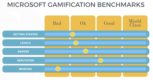
Gamification
(If image doesn’t display, click here)
The Microsoft community uses standard Lithium gamification with multiple levels based upon a combination of actions members have performed and badges reflecting individual achievements. There doesn’t appear to be any integrations with other areas of Microsoft (which is a huge missed opportunity) or any interesting innovations.
Levels
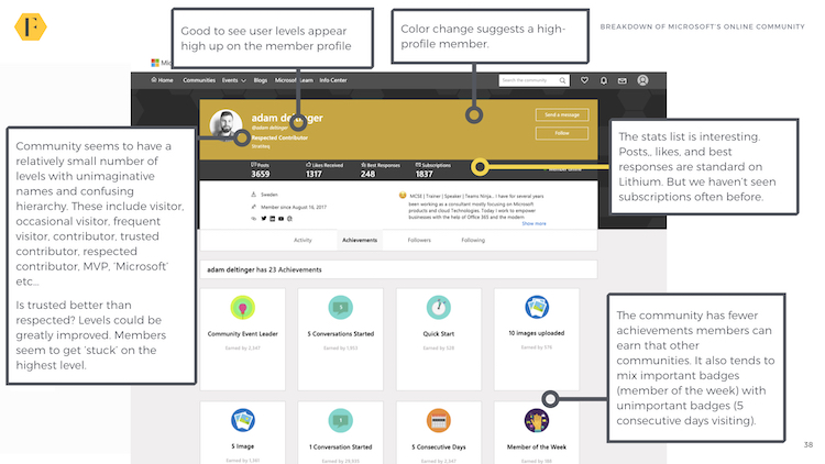
Community seems to have a relatively small number of levels with unimaginative names and confusing hierarchy. These include visitor, occasional visitor, frequent visitor, contributor, trusted contributor, respected contributor, MVP, ‘Microsoft’ etc…
But is trusted better than respected? Levels could be greatly improved (perhaps with numbers instead of names). Clearly, some members have become stuck on the top level and the community is less than 3 years old.
However, it’s good to see user levels appear high up on the member profile and reflected in a colour change on that member’s profile.
(If image doesn’t display, click here)
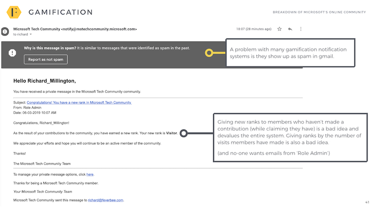
One major annoyance is the community sends notifications to members who haven’t made a contribution telling them they have increased a level as a result of their contribution. This devalues the effort required to reach new levels for everyone.
Another problem is these notifications almost always winding up in the spam folder through poor design.
Badges/Achievements
The community has fewer achievements members can earn than other communities. It also tends to mix important badges (member of the week) with unimportant badges (5 consecutive days visiting).

(If image doesn’t display, click here)
Microsoft isn’t alone in doing this. It seems to be a default Lithium option.
Leaderboards
Each of the 99 communities has a leaderboard of top contributors. However, these are buried too far below the fold on the homepage of each community to be meaningful to (or seen by) most members. It would be nice to bring them closer to the top and increase their visibility within the community.
Final Rating: C+
Microsoft doesn’t appear to have put much thought into its gamification system and instead used the defaults provided by Lithium which are less than ideal.
(If image doesn’t display, click here)
The Microsoft MVP Program
It’s almost impossible to evaluate an MVP program on the scale of Microsoft’s within a few relatively short paragraphs. In a sentence, it is the program other companies should aspire towards.
(If image doesn’t display, click here)
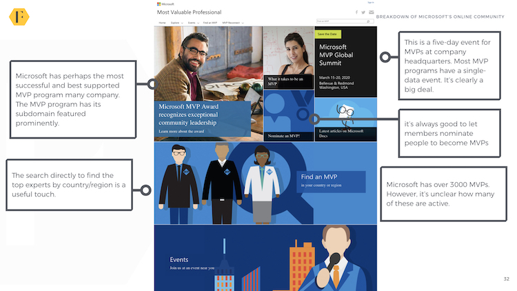
Microsoft has perhaps the most successful and best-supported MVP program of any company. Microsoft has over 3000 MVPs (although it’s unclear how many of these are active). The MVP program has its subdomain featured prominently on the Microsoft website.
Members can be nominated or apply to join the MVP program. There doesn’t appear to be a rigid standard, but more of a fluid criteria which evaluates the contributions of an applicant across multiple projects, communities, blogs, user groups, and more.
Perhaps the most remarkable aspect of the entire program is there is no outlined reward scheme. As shown in the copy, it’s simply a way of ‘showing thanks’ to members. This demonstrates that MVPs don’t need rewards, they need to feel they have an impact, have some asset of exclusive information, and a sprinkle of status.
Members do gain access to a five-day event for MVPs at company headquarters. Most MVP programs have a single-data event. It’s clearly a big deal.
(If image doesn’t display, click here)
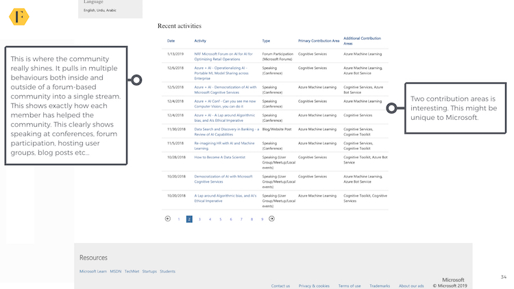
Each MVP has a distinct bio. The bios are clear and simple enough which clearly list a member’s expertise. They are also searchable by their region and level of expertise. One area where the bios really shine is listing members contributions to the entire Microsoft ecosystem into a single stream. This shows exactly how each member has helped the community. This clearly shows speaking at conferences, forum participation, hosting user groups, blog posts etc…
Final Rating: A
Perhaps the best MVP program in the world right now.
(If image doesn’t display, click here)
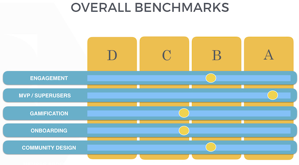
OVERALL RATING: B
The Microsoft community is one of the most complex and challenging communities to evaluate (let alone manage). It exists in a challenging environment, with veteran users, and long-established habits. This creates challenges which Microsoft has largely done well to overcome:
(If image doesn’t display, click here)
The community has a consistently high level of engagement, benefits from a terrific MVP program, and has a design that enables a community of this size and complexity to work. However, it also suffers from poor gamification and onboarding experiences – both of which should be improved.
In addition, the community is still competing against its own, more popular, legacy communities. This is less than ideal and needs to be resolved. Our recommendations would be:
1) Develop a communications plan to ensure all IT pros and developers are focused on a single platform beginning with TechNet and then the Microsoft Developer network. This will cause annoyance but yields benefits in the long-term.
2) Use the ideation functionality provided by Lithium to replace that used by Uservoice. Sending members away from the community to post feedback and ideas doesn’t make sense.
3) Improve the post-registration experience of community members to have a longer automation journey highlighting how they can become top community members.
4) Remove the worthless gamification badges and focus them on big achievements. Revamp levels to ensure there are more of them and they have a clear hierarchy of value to everyone. Make sure leaderboards are more prominently displayed.
5) Develop a system to flag unanswered conversations and ensure a large group of members in each community are dedicated and rewarded for tackling these.