


This week I put together a detailed breakdown of Apple’s online community.
Here you can learn how Apple develops and manages its online community.
This includes how Apple:
- Designs its community platforms.
- Forces people to ask good questions.
- Gets people to register and onboards them.
- Encourages users to submit tips.
- Uses gamification to attract newcomers to join and participate.
- Responds to questions about the community.
You can view the slideshare below (and download the PDF)
Or you can read the detailed breakdown below:
BACKGROUND
Apple has had an online community ecosystem since the earliest days of the internet.
The current incarnation of the official community was launched in 2006, revamped in 2011, and has been gradually tweaked and upgraded since then to the site we see today (hosted on Jive).
The community is designed as a customer support channel. The primary goal is most likely to deflect customer support tickets (and calls) and provide a superior level of customer service customers can get through other channels.
The community also provides a less noticeable area for user tips. Members above a certain level can share their best advice to use products more effectively. This can have an impact upon customer satisfaction and retention.
COMMUNITY HOMEPAGE
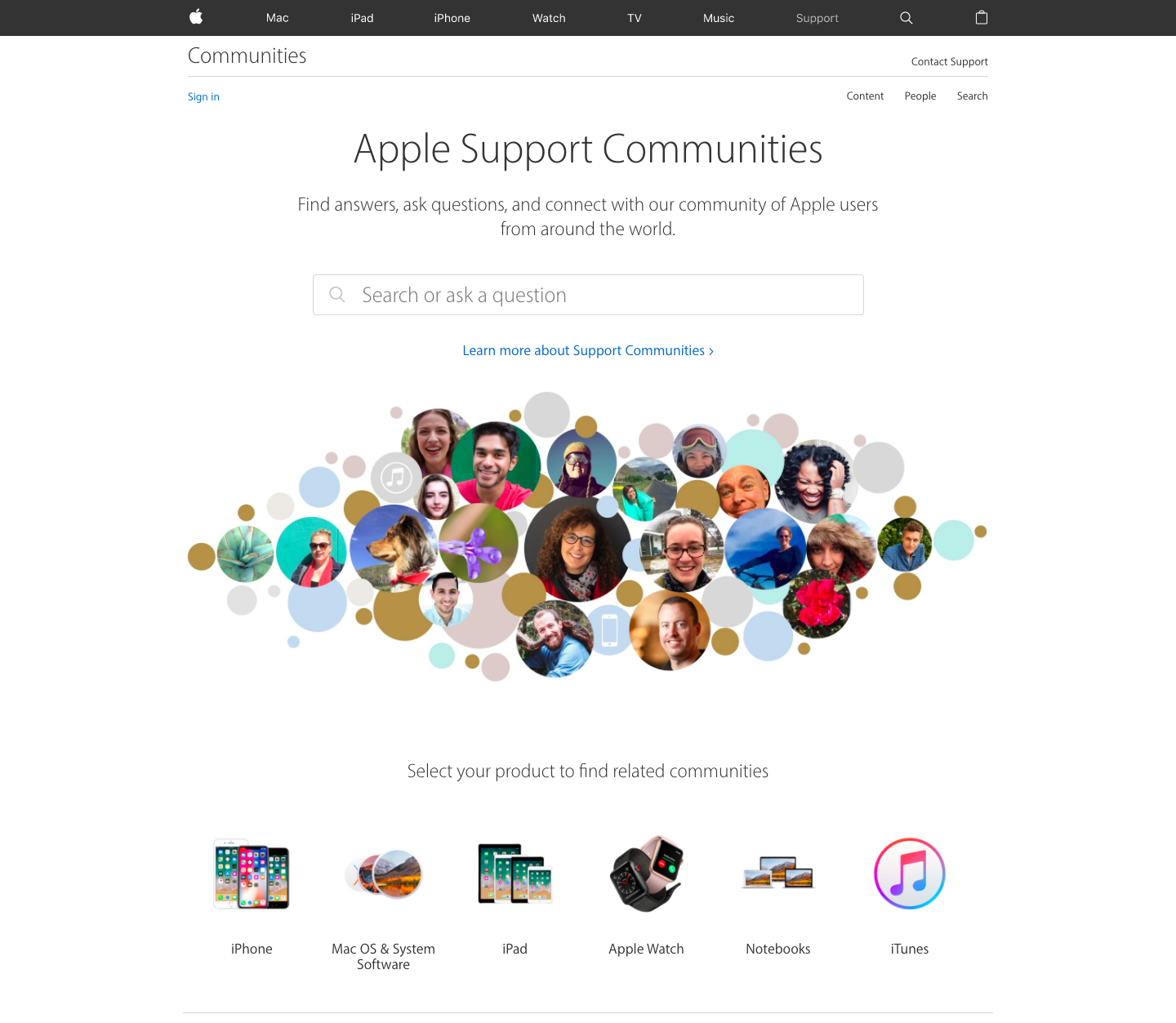
- The ‘sign in’ option is hidden and it’s not clear this is the option to register. This could be pushed below the search box next to ‘learn more about’.
- The search bar is a very clear call to action (find answers) with the search box prominently displayed. This is common in most enterprise platforms today. This is a best practice worth following.
- The central image takes up a lot of space and doesn’t add anything to the page. It would be better to pull up the categories beneath to help people find what they need. Or, at least, feature the top community experts in this area.
- The featured categories are optimised by popularity with further categories hidden (but available) in a useful drop-down. This is great for navigation.
- It’s not clear what ‘featured’ means; Are they trending? Most popular? Most useful? Could replace with ‘trending issues’ or ‘most popular issues’ or ‘top tips’.
- There is a lot of empty space. Apple could reduce this space and have some tips appear side by side. It’s also good to personalize these tips to each member based upon their previous contributions or self-tagged interests.
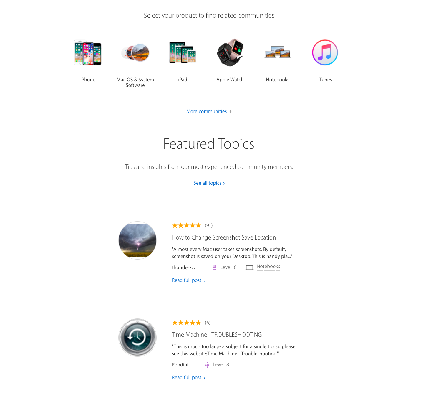
- Still a LOT of empty space here that could be used to reduce the size of the site and need to scroll down.
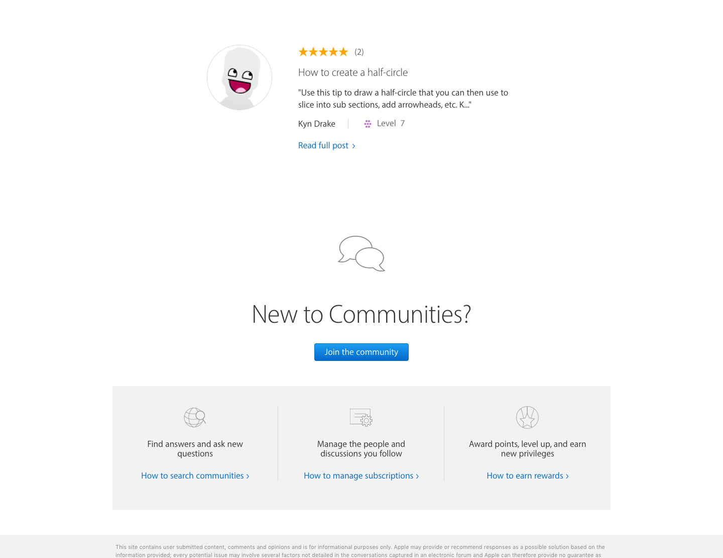
- The ‘new to communities’ area is a redundant feature. There was already a ‘learn about support communities’ just below the search box. Could easily remove this and bring the bar below higher up.
- These three benefits are really interesting but relatively downplayed. Might be worth seeing if they can be moved up or have different versions of the site for return visitors/regulars.
PRODUCT-SPECIFIC PAGES
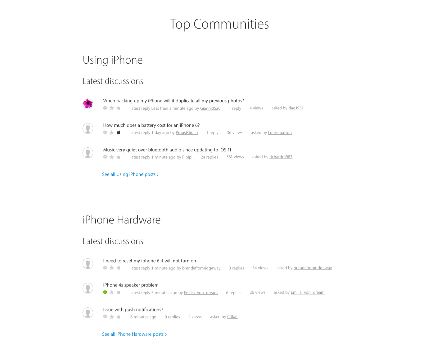
Each product has it’s own support community with navigation, top communities, and latest posts. These are generally well-designed.
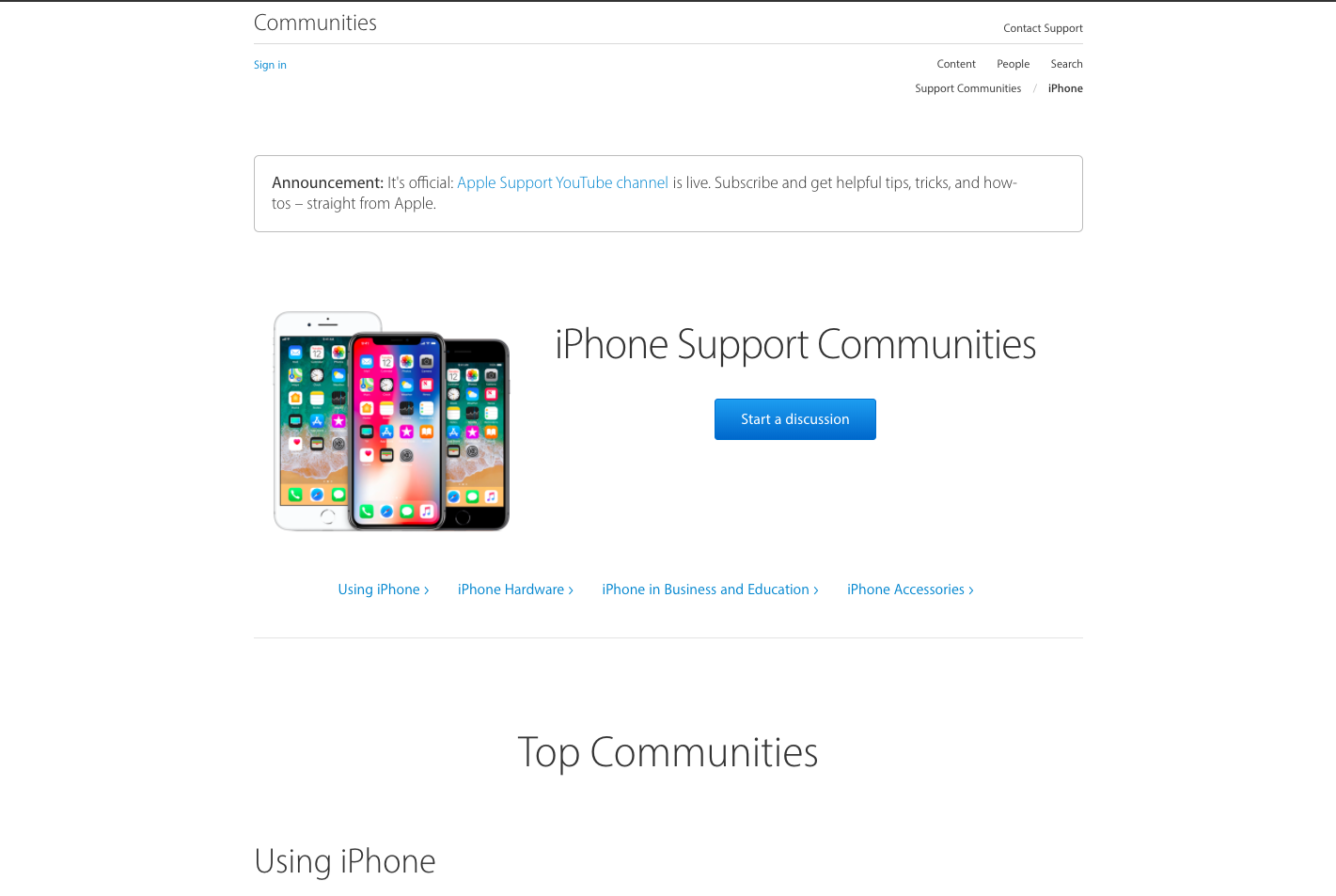
- Using the top banner for major announcements is a good idea.
- ‘Ask question’ is probably better than ‘start a discussion’ given the nature of the support community.
- Apple has 60+ communities across several major product lines. The navigation of these is pretty good, clean, and simple. You can get to any community in three clicks using the sub-menu. They are also well prioritised.
- Using the top banner for major announcements is a good idea.
- I suspect very few people want to ‘follow’ the discussions of an entire community (top right). Might be better to include an easier to find search bar here.
- The structure of these sub-communities feels a little odd. It’s unlikely the last 3 questions will answer the visitor’s question, so display these by most popular at the time rather than latest. This stops you showing a lot of unanswered questions to members.
MOBILIZE OPTIMIZATION AND RESPONSIVENESS
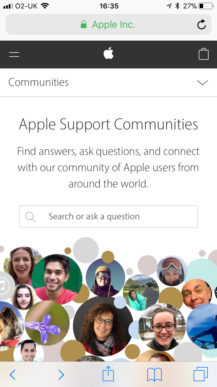
- The homepage feels designed for mobile, which works extremely well. Product tips vanish from the mobile version of the site.
- The site is also responsive with product tips disappearing at about 1/3rd of the screen.
PARTICIPATION EXPERIENCE
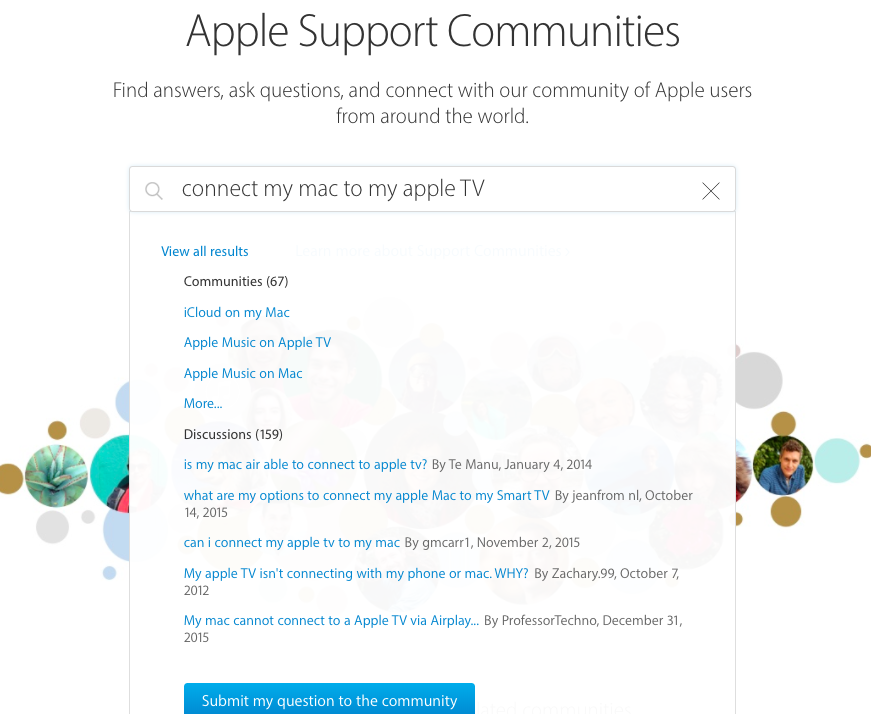
- Autocomplete Search. Jive’s autocomplete search is a little slow but works well to find relevant communities and discussions. This is definitely a best practice today and forces members to check if a similar question exists before asking a repetitive question. However, it’s unclear if these discussions have been resolved or not. Many of the questions may also seem old and out of date.
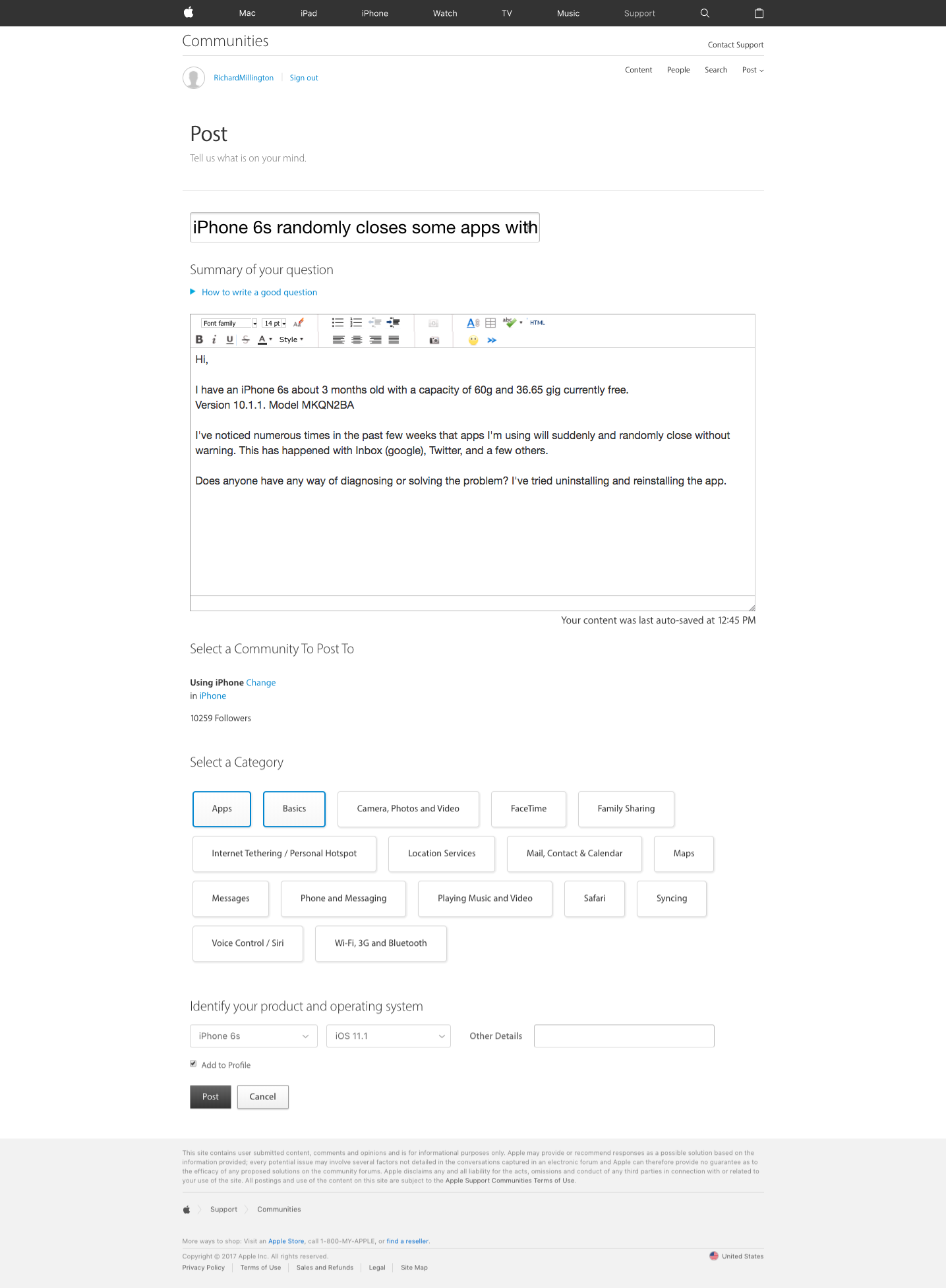
- ‘Tell us what is on your mind’ works better on Facebook than someone who wants to get their problem solved right now. This isn’t a place people will casually chat about Apple.
- How to write a good question is minimised here, but should be expanded by default – especially for first-time posters. Anyone that forgets the basic principles won’t get the answer they need.
- Relatively simple, clean, interface. Allows HTML and other styling.
- It’s always REALLY hard to get people to post in the right areas. Apple makes it easier by autofilling from relevant keywords to help you select what community to post to. Very clever.
- Turning categories (used here more as tags) into buttons that people can easily select is really clever too.
- Asking people to select their product and operating system really helps people answer the question. The ‘add to Profile’ is also smart. Apple nails this section.
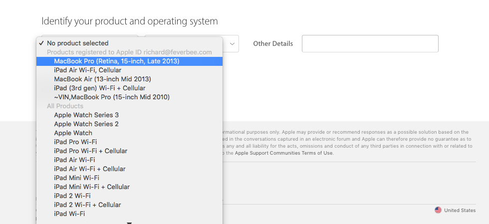
- This is a really awesome profile information integration here. It highlights what products you already own and helps you answer questions.
- Not immediately clear to the visitor if the question has a solution or not. This appears below the question, which it could be positioned here.
- Need to add prompts when people are writing the question, that any question < 200 characters should include the exact product, describe the exact problem or include a screenshot so people can answer it.
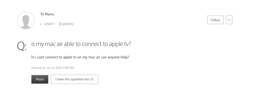
- “I have this question too” is an extremely useful feature (better than like) as it highlights what questions Apple should focus on resolving.
RESPONSES AND EMPATHY
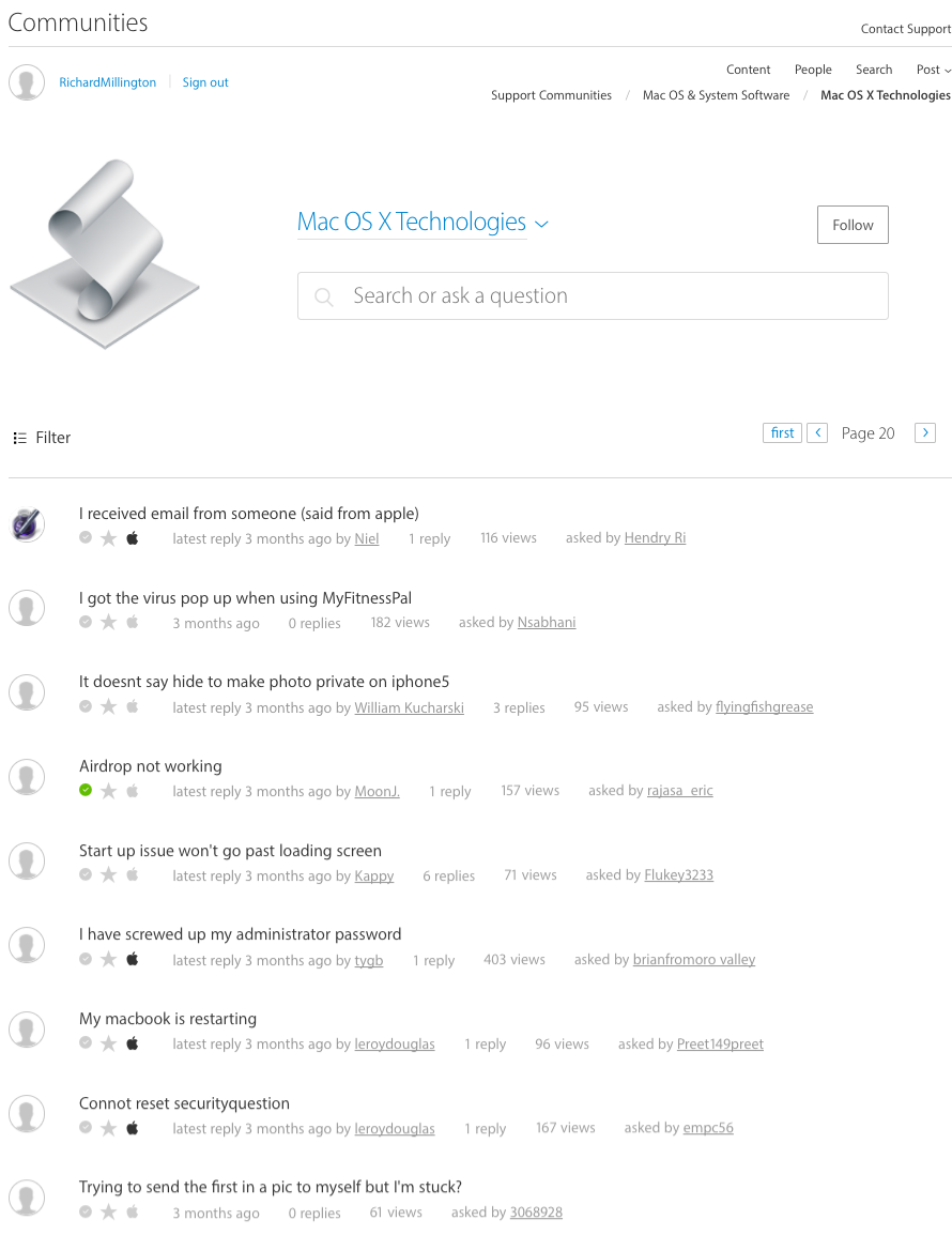
- Apple suffers greatly from not being able to get an accepted answer to most of the questions which appear in the community. This is the single biggest flaw the community faces today. Most of the online communities we looked at, the number of solved questions was extremely low. These were questions asked days, if not weeks ago. This discourages future people from responding. Questions with solutions should be featured near the top along with any trending or ever-present questions.
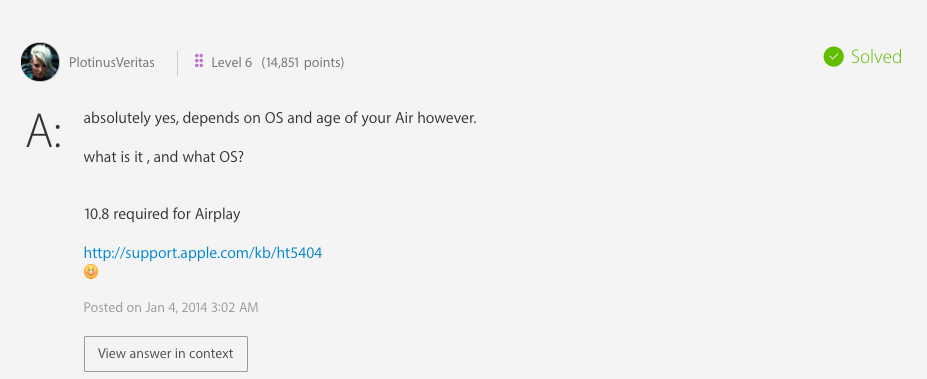
- Who is this person? Do they work for Apple? Are they an expert supporter? Showing the level is good but would be ideal to make clear distinctions.
- The ‘solved’ green icon is a little too hidden away.
- The content of the response could use a little work, but we’ll go into that later.
- View answer in context is good when there are a lot of responses and the answer builds upon previous answers. Likely to be irrelevant for most answers.
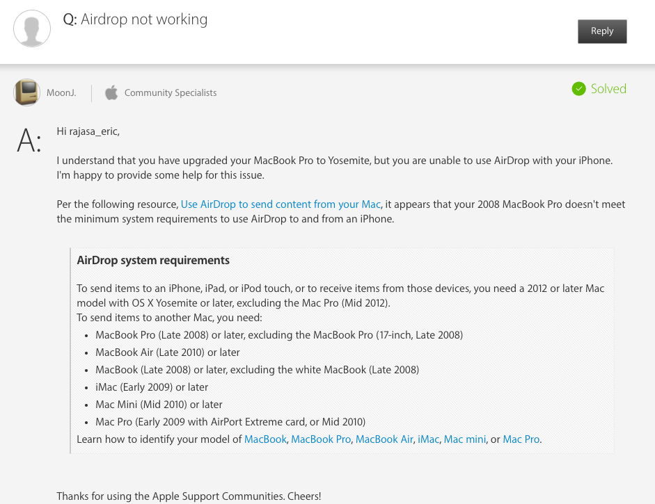
- It’s a clever static bar at the top. This keeps the question present as you scroll down.
- What is a community specialist? Why does this person not have a real name or photo? Is this someone that can access my customer record and have real power or not? Is it an employee or a helper? Is it an external contractor (probably).
- Repeating the question back for clarity is good. Taking the information out of the resource and dropping it into the question is also smart. Don’t make people make that extra click if you don’t have to.
- Bullet points are ALWAYS a good idea in longer answers. Remember your responses have to be scannable.
- The ‘sign off’ feels a bit insincere. Let’s have a real person’s name sign this.
- Generally the responses are personalised and contain good knowledge, but they score badly on friendliness, checking for resolution, and giving the member a sense of influence over the outcome. Could use this as an opportunity to be more friendly, show more personality. Suspect this work is outsourced to a western contractor with a quota of questions to get through. For a contractor, it’s generally ok.
REGISTRATION AND ONBOARDING
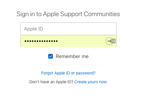
- Apple unsurprisingly requires you to log in with your Apple ID or create one to be able to participate in the community. The single sign on and security is one of Jive’s strengths and works well here.
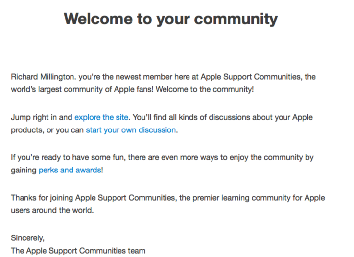
- This email is repetitive and badly written. Would be better to send after someone has participated. Most people who register will have one single-goal in mind; getting an answer to a frustrating question. The welcome email should acknowledge this and guide them to where they can get their answer as quickly as possible. This is the only thing that matters at this time. Would also sign it from a named community manager.

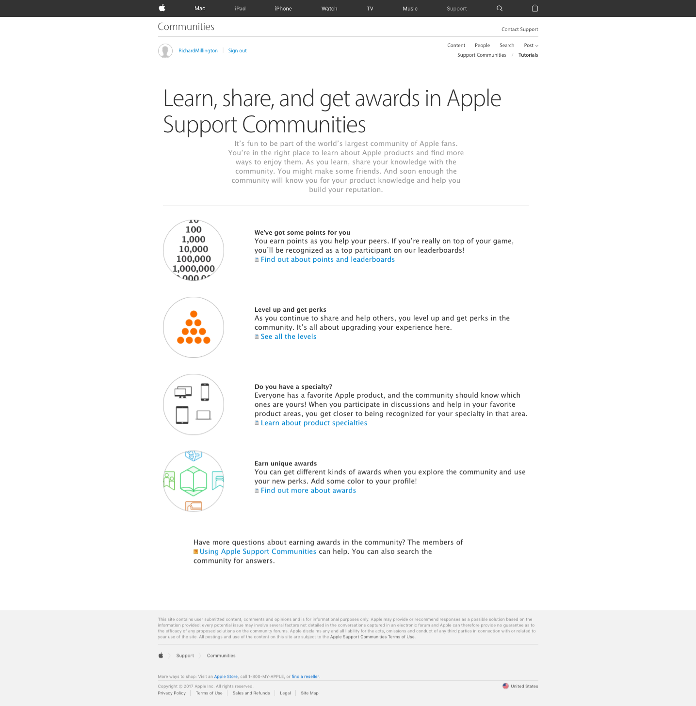
- This tutorials page is a REALLY good idea and works well here. Easy to navigate and learn more about the community.
Post-registration
- After registration there is no further on-boarding program via email or series of notifications from Apple to help anyone get more engaged in the community or identify people who could become top participants from those who just want a response to the question. If you want to turn a one-time visitor into a regular, look at the on boarding of newcomers and your autoresponder series. There is usually a great opportunity here to establish a perception of the community and the idea someone can become seen as a top member.
GAMIFICATION
- As a mature community with hundreds of thousands of members, Apple deploys a seemingly complex reward system which covers points/leaderboards, levels and perks, specialities, and ‘unique awards’. In reality, it’s actually two-related systems. A points-based system and a specialist-based system. Can easily remove ‘unique awards’ from this area.
- Points and leaderboards target each person’s competitive nature and create a habit.
- The perks target people’s need to feel a collective sense of identity with Apple. This works by giving members access to exclusive stuff.
- Specialities are rarely used, but really smart to have. They let each member ‘own’ their own small part of the community and feel an incredible sense of competence.
- The bottom ‘unique awards’ area feels a bit redundant. Could easily skip these. Also ‘adding colour to a profile’ is the least enticing perk imaginable, what’s the best perk to feature here?
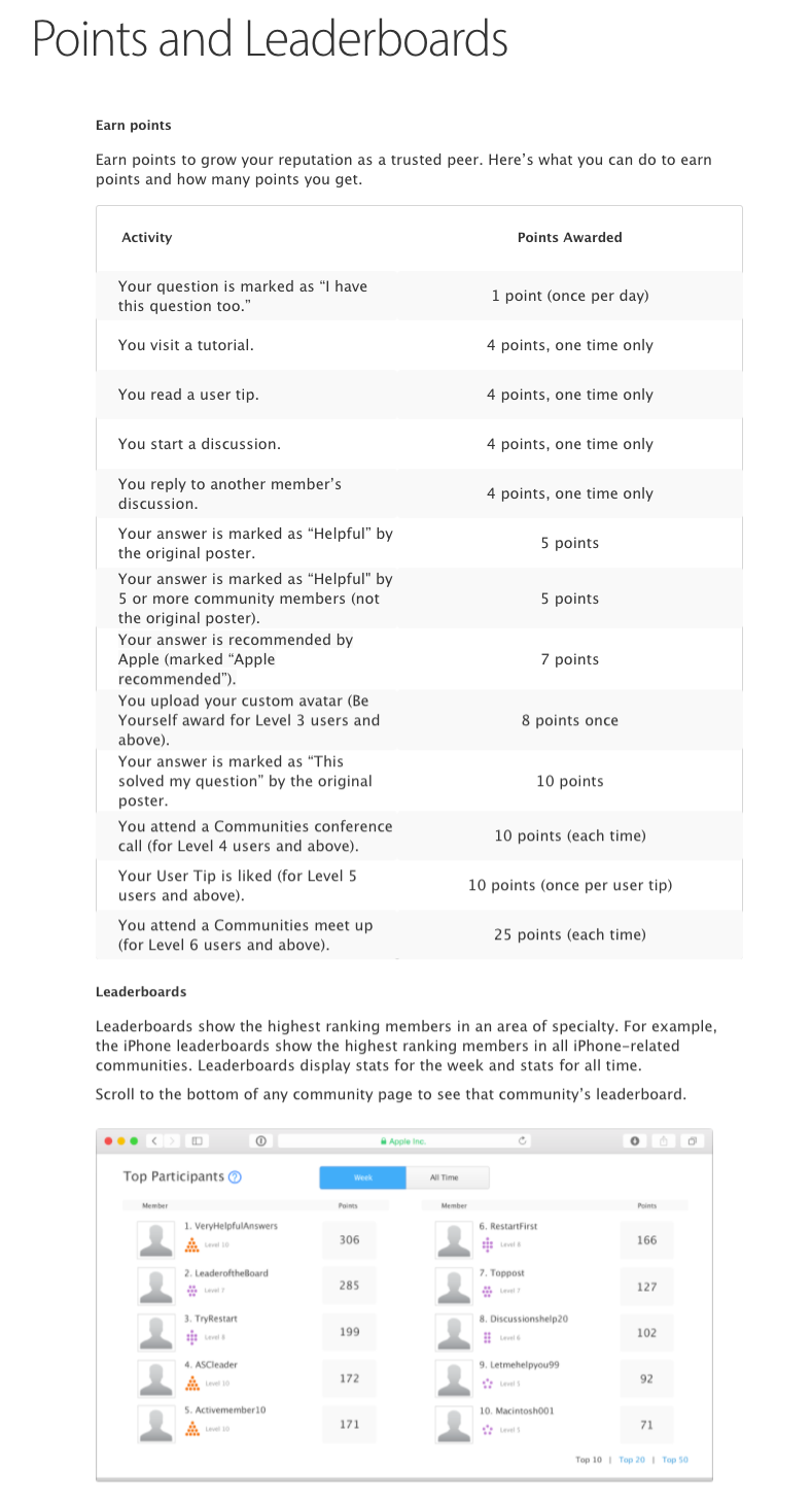
- The points system is designed to convert newcomers into addicted participants by getting a quick ‘hit’ to their first question and then rapidly raising their score with the next few actions which gets them to socialise with other members or learn more about the community.
- After the first hit, the focus shifts to asking ‘good’ questions and eventually attending community conference calls or sharing community tips. It’s generally a logical and smart progression.
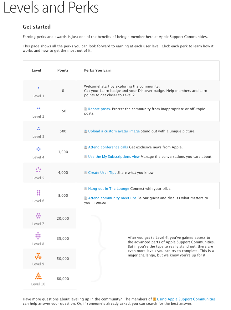
- Now we can see how the points translate to unique perks across 10 levels. The structure of these seems odd, reporting posts could easily be something to gain points.
- These levels are incredibly spaced apart and make it difficult to imagine progression from getting 4 to 10 points to a level where we’re on 1000+ points. The perks seem relatively minor too. Though note this is the first appearance of conference calls and user tips. Would be easier to show the perks for the higher levels here too. No reason to hide this.
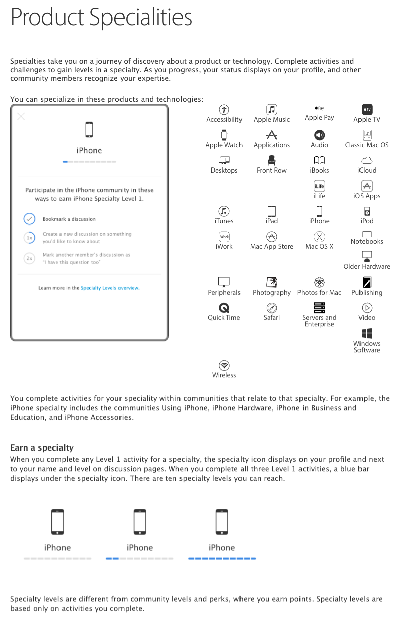
- This is an incredibly clear and specific table about moving up the specialist levels. The levels get exceedingly more difficult at the higher end. Would be interesting to know of any special perks at these levels. What is the benefit of being a specialist compared with a generalist?
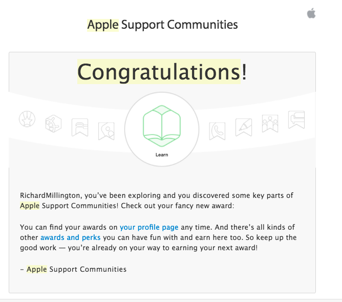
- It’s relatively easy to get a few badges. I’m not sure the value of these early badges for simply browsing the community are useful. Could raise the barrier to getting the first badge to at least some kind of active contribution, even clicking ‘me too’ on a single question.
USER TIPS
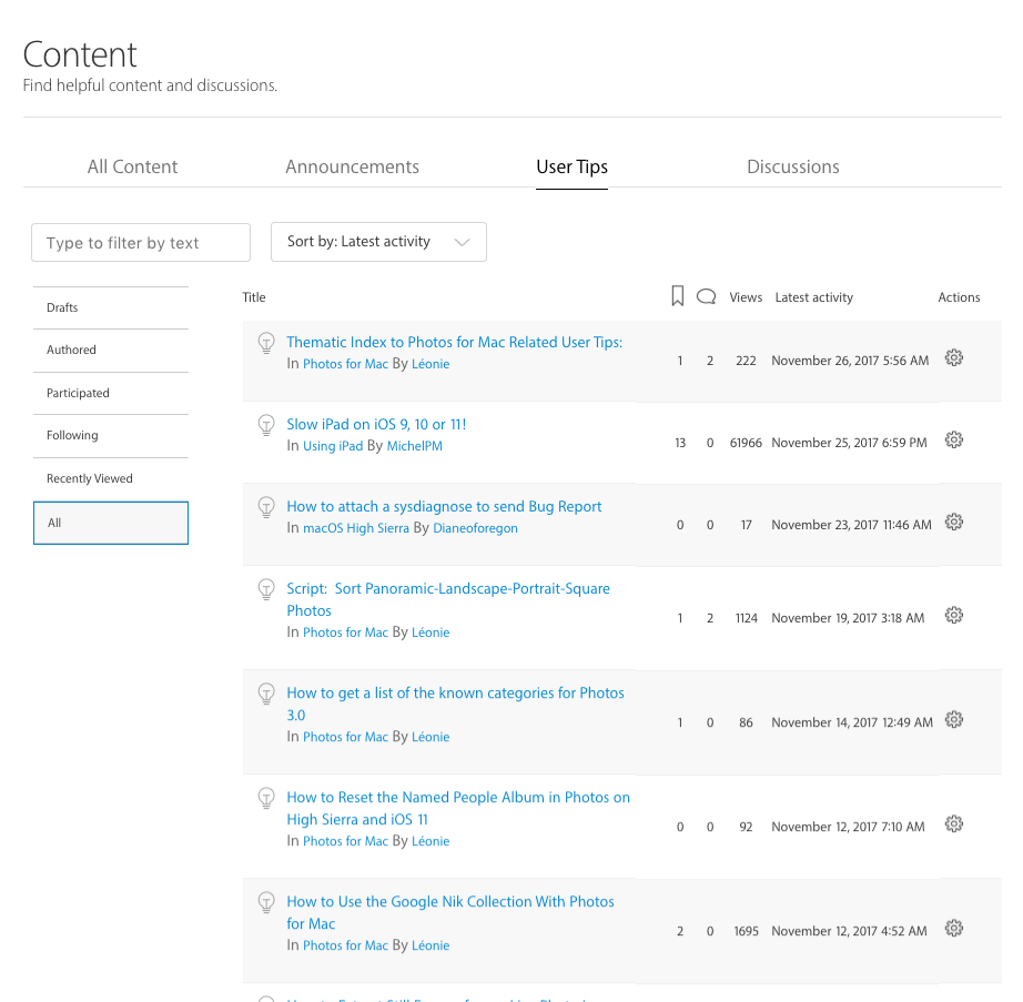
- Behind the home page the content section becomes a more typical ‘no thrills’ Jive experience.
- User tips are presented without much fanfare. This does a huge disservice to many of the excellent tips shared which should be featured at different levels.
- Apple would benefit from designing a proper tips section or only including tips on each product page (where some tips are already featured). Far too many tips are not getting the audience they should in this format.
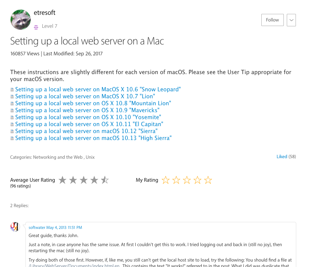
- This is simple and clean. Not sure whether this person is a specialist from the profile page but the layout is clean.
- Does this need both the user rating and the ‘like’ button? Does the ‘like’ button add anything the user rating doesn’t have? Could merge at least the like button and the follow button similar to Facebook
- Would be better to show the reputation at the beginning of the question. Move the average rating to the top. It’s one of the first things people need to see.
SNAPSHOT SUMMARY OF THE APPLE COMMUNITY
- Apple’s online community is strong on everything to do with technology. It’s level of integration with existing systems is terrific, navigation is extremely good, posting is simple enough and tackles the common challenges of repeat posts. The community makes the best use of Jive’s functionality.
- Use of the gamification modules are also among the more complex we’ve seen. Generally it is logical and is well designed to hook members who would most likely become regular, active, members.
- Apple is a little less strong on the social side. The answers are ok, but far too many discussions aren’t getting a response. This is a huge problem that can’t be tackled solely by technology.
Visit for yourself: https://discussions.apple.com/
Let me know if you found this audit useful, richard@feverbee.com