


Many of us haven’t really scratched the surface of what’s possible with our data.
If you want to see what’s possible, I recommend you watch this talk if you haven’t already.
You can do far more with your data than you probably realise.
Note: You should also sign up for our workshop on building community data systems on Nov 2.
Yet just knowing what’s possible doesn’t help us achieve our goals. We also need the knowledge to jump from where are today to get to where we need to go. And that destination is a place where we finally have the data (in the manner we need it) to make the right decisions for our community.
Benchmark Your Current Data System
If you’re trying to jump from a novice to an expert overnight, you’re setting yourself up for disappointment.It’s far better to figure out where you are today and track your progress over time.
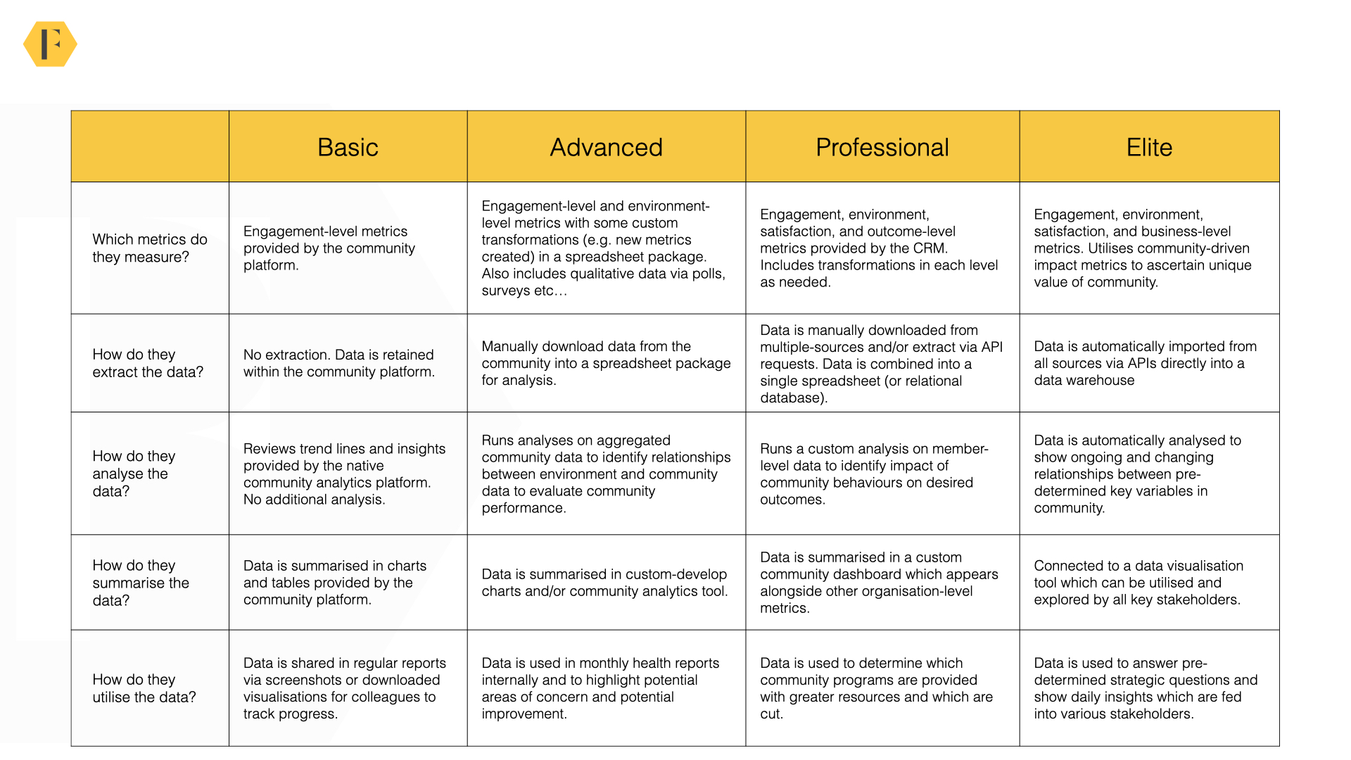
As you can see above, we benchmark community data skills along the four levels.
To summarise briefly:
- Basic. Tracking changes in community engagement.
- Advanced. Tracking what happened and why it happened by using external data.
- Professional. Evaluating community impact and making data-driven improvements.
- Elite. Automating the entire process.
- Metrics. Which metrics do you measure grow and expand over time?
- Extraction. How do you gather the data from different sources?
- Analysis. Which analyses do you undertake in your community?
- Summary. How do you summarise and visualise the data?
- Utility. How do you utilise the data in your strategy?
If you’re like most people, you’re at the beginner or advanced level. This is good – it means you can make a lot of improvement in a relatively short amount of time!
Resource: Community Data Benchmarks
The Basic Level
If you’re relying upon the insights that come up with your community platform, you’re at the basic level.
Almost all of us begin by using our community platforms to track engagement. Yet even within this level, there is a huge variation in the data you have.
The quantity and quality of insights provided by inexpensive tools like Facebook, Circle, and Tribe are very different from those provided by premium enterprise platforms.
Generally speaking, the more you spend the better insights you should have.
At the basic level, you can usually answer the following questions:
- Is engagement heading in the right direction?
- Who are the most active members of the community?
- What are the popular discussions in the community?
However, there are critical insights you won’t have. For example:
- What’s causing the changes in engagement (and what to optimise for)?
- Are changing because of your actions or things happening outside of the community?
- Where are people dropping out of the community journey and why?
- Is the community having an impact on key business metrics?
Sooner or later, you need to move on to a more advanced level of insights.
The Advanced Level
The advanced level is when you begin to get serious about community data.
At this level, you’re not just concerned about what happened, you’re concerned about why it happened. The why is what lets you improve your community efforts. This is the foundation stone upon which you build a data-driven community strategy.
e.g. If you know [x] is causing a positive outcome, you probably want to do more of [x].
The key difference at this level is you need to combine multiple datasets. You’re still working with aggregated data (i.e. behavior is combined into a metric rather than separated by members), but you need to wrangle a few other sources of data together.
Step One: Gather Environment-Level Data
At this stage, gather data on what’s happening outside of the community to see how it impacts things within the community. We could easily write a series of articles about the precise metrics to measure, for now, I’ll recommend our ROI guide and this guide.I would recommend getting monthly time-series data to reveal:
- No. visitors to the company website. (Google Analytics, Adobe Analytics, Amplitude Analytics etc..).
- No. unique, new, visitors to the company website (Google Analytics, Adobe Analytics, Amplitude Analytics etc..)
- No. search visitors to the company website (Unique visitors – source: Search).
- No. customers/users (sales data/usage data – usually upon request)
- No. new customers/product activations (sales data).
- No. support tickets/customer calls per month (help desk software/customer support software – usually upon request).
- Any proxy metrics for no. developers, admins, users etc…
You can usually download these metrics individually from each source. However, it might take a little effort to clean the data so you can create a single spreadsheet. The spreadsheet should have each attribute above as a column and each month should be a row.
Note: It’s difficult to download monthly time-series data from some platforms (e.g. Adobe Analytics). You might need to download data from each month at a time. This is also true of some community platforms. This is painful and takes a little time – but you only need to do it once (thereafter you’re updating the data each month).
Step Two: Setup and/or Collect Qualitative Performance Data
Quantitative data can reveal plenty of useful insights, but it doesn’t show whether members are becoming more or less satisfied with the community. This is why it’s also good to have a measure of member satisfaction you can track over time.This can be done in three ways.
- An annual survey. You can set up an annual survey of up to 10 questions to get an ongoing measure of how members feel about the community. This will go out to all members (ideally using the same questions each year).
- A quarterly survey. You can set up a survey which goes out to a rotating sample of members at random. This makes it easier to track data over time but is prone to strong fluctuations if you don’t get 300 responses.
- A poll. A poll is an ideal solution to track member satisfaction. This appears to members as a pop-up in the community and asks members to rate their satisfaction, whether they got the answer or the overall impact of the community. These results can be aggregated into a summary score over time. I’d strongly recommend setting up the community-driven impact score system at this level.
Ideally, you should combine this data with your community data on a monthly time-series basis.
If you can’t get data monthly (it’s hard to do this for surveys unless you sample a rotating group of members), simply share the annual data each month for now.
Step Three: Analysing Community Performance
Once you’ve got your dataset, you should be able to analyse community performance.You can see the kinds of questions you can answer below (but, be mindful, this isn’t a definitive list).
| Question: What are the trends we need to adapt to? | Data |
|---|---|
| What content / categories / tags are rising or falling in popularity (use % from normalised baseline). | Aggregate group activity by category. |
| What areas, features, sections of community are rising or falling in popularity? | Aggregated visitor data from different sections of the community. |
| Is there any major shift in locations people are coming from? | Google analytics – top 10 locations – 100% bar chart with trendines. |
| Are the type of users changing (more devs, admins etc..). | Member profile data (or synched customer data). |
| Any specific changes between types of visitors? | Google Analytics data on devices, regions, languages etc? |
To perform this analysis, you might also use your current variables to create new metrics.
For example, you might create metrics like posts per active member, visitor conversion rate etc…You can find an example of what we often look at in this sheet.
You can now create graphs to help you answer questions like:
- Is the community doing well in attracting attention and acquiring newcomers? (i.e. attracting the expected number of visitors, newcomers, and questions)
- Does the community have the right number of superusers / is the quality of superusers good enough? (i.e. are the majority of questions being resolved/answered as the community grows?)
- Are customers more or less likely to turn to the community for support? (i.e. what is the relationship between support tickets vs. community questions?)
Note: Be mindful that this is always correlational data. This doesn’t make the data bogus, but it should be treated as a relationship which could be explored further.
Step Four: Using the data
If you have the expertise, you can run a regression analysis to show the strength of the relationship numerically. But this isn’t always easy to interpret.Often simply looking at the data on a chart will help you explain what’s happening.
It’s good to highlight any significant changes within the organisation which might’ve taken place during this time frame to see how they impacted the community (e.g. new product launches, website redesign, Black Friday etc…).
You can overlay these with the data itself to see if there was any major impact.
You should be able to tell a compelling story here which explains:
- What’s happened so far?
- Why did those things happen?
- What’s likely to happen in the future (the forecast function is worth learning)?
- What should you do more of, less of, and change to improve results?
The Professional Level
At the professional level, two things change.- You look at member data. Instead of only tracking outcomes by month, you track outcomes by member. For example, you might see if members who have been invited into a newcomer group had a higher product trial completion rate than those who didn’t.
- You integrate databases. Instead of getting a single metric from each source per month (i.e. 16,434 customer calls), you get the list of who made the calls and when. You need to combine data from several databases to show the impact of community.
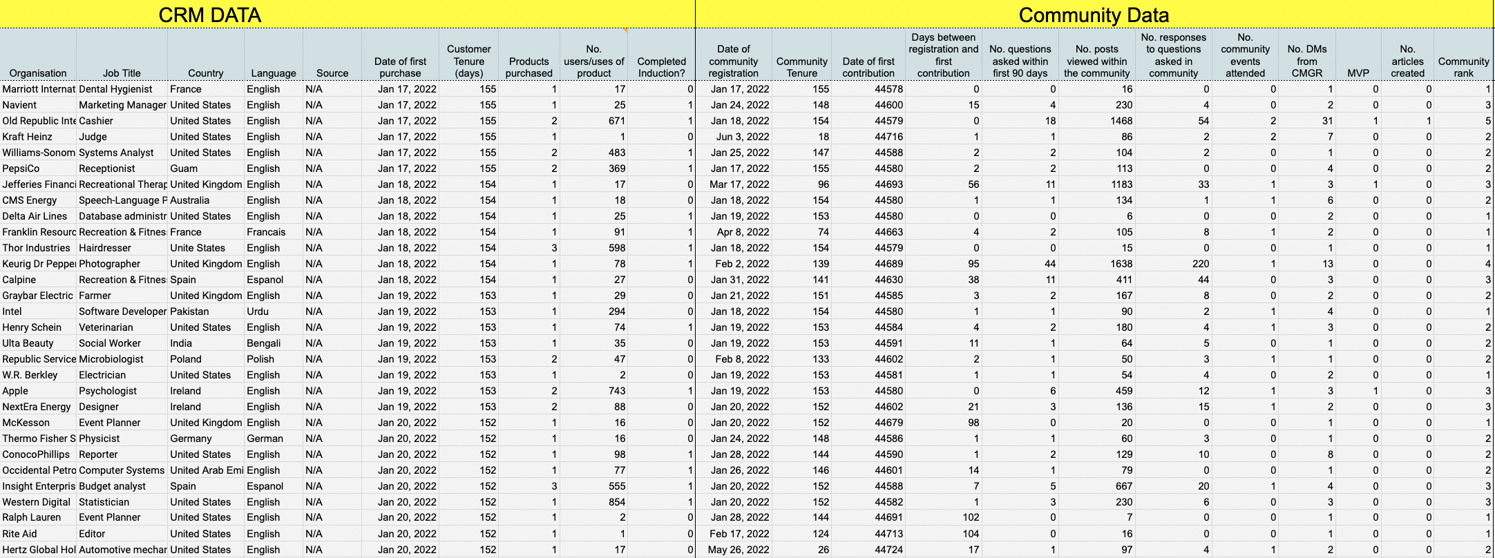
As this example dataset shows, once you have data at the member level the quality of analyses you can undertake improves considerably.
Step 1: Identifying sources of member data.
Member-level analysis requires you to build a database of individuals where each row (observation) is a member rather than a month. This database needs to combine records from several sources.These sources might include:
- The community platform.
- The customer relationship management system (CRM).
- The mailing list provider (see who did and didn’t open emails).
- The learning management system (LMS) (see who completed training courses).
- The call or help-desk system (see how filed tickets).
- Social media platforms (community intelligence tools).
- The event /usergroup hosting software (see who attended events).
- Etc…
It’s also common at this stage to use community intelligence tools like CommonRoom and Orbit to create a more detailed picture of member behaviours from a variety of different channels (i.e. you can learn about member engagements on Reddit, Discord, Slack, and other social media channels).
Step 2: Extract and combine the data
Sometimes you get lucky and the platforms you’re using have a connector which lets you easily combine data (and keep it updated). It’s far more common, however, that you will need to pull together the different datasets yourself.This might be by extracting the data from the available APIs, or it might mean manually downloading and combining the data from each source individually. The challenge is often matching up records of different individuals across platforms. If members don’t use a consistent email address, this becomes tricky (but not impossible) to do.
Even if you get the data, the quality of it might vary considerably. API data can be in the form of raw server logs which you then need to process to be useful.
Another challenge is it’s very likely you will be working with datasets which are too large to process on your personal laptop – so you might need to consider virtual solutions for collecting, processing, and securely storing the data (data security is going to be a critical consideration).
As a general principle, cleaning and transforming the data usually takes 80% of the entire scope of the project.
Step 3: Analysing the data
Once you have data on individuals, you can still do some really exciting things.This includes
- A sequential analysis to determine the order of member behaviors and community participation (i.e. see what came first).
- Survival analysis to see how retention rate varies by month and member segment.
- Analyse superuser performance by accepted solution rate.
- Segment the community by category and see which areas need more attention.
- See how product usage varies by community participation and types of participation.
- Identify attributes which cause members to stay for longer.
- Identify unique clusters of members by community behaviours and build distinct mailing lists of them.
- Develop detailed journeys of each member.
However, this requires expertise in statistics. If you don’t have expertise in this, we can set up this system for you.
Note: you have to be really, really, precise about the definition of any metric you use here. For example, if you want to know the impact of the community on customer retention. You have to define what metrics best represent each of those terms. Two different people can define the terms in two very different ways and come to different conclusions.
Step 4: Summarise data in a custom dashboard
Once you have a clean dataset, you can develop a custom dashboard in Tableau, PowerBI, or any tool you’re familiar with. Again, this requires some technical knowledge. But here we would recommend having colour-coded dashboards which help you make the critical decisions you need to make about your community.Common metrics here would include:
- Activity-level metrics (no. posts, active members, newcomer retention, and no. active MVPs).
- Program-level metrics (% questions with a response, average time to first response, accepted solution rate).
- Satisfaction-level metrics (from polls/surveys).
- Impact-level metrics (impact upon customer retention, utilisation, or community-driven impact score etc..)
This dashboard should have pre-determined success/failure metrics which identify whether unique community programs succeeded or not. Those programs which succeeded should be provided with additional resources and those which didn’t succeed should be altered or have fewer resources in the future.
From this, everyone can determine both how the community is doing today and what to focus on next.
Resource: Setting Targets and Building A Community Dashboard
Resource: The Dream Community Dataset
The Elite Level
The big difference between professional and elite is the automated data pipeline.A simple overview of a data pipeline is shown via Newsela below:
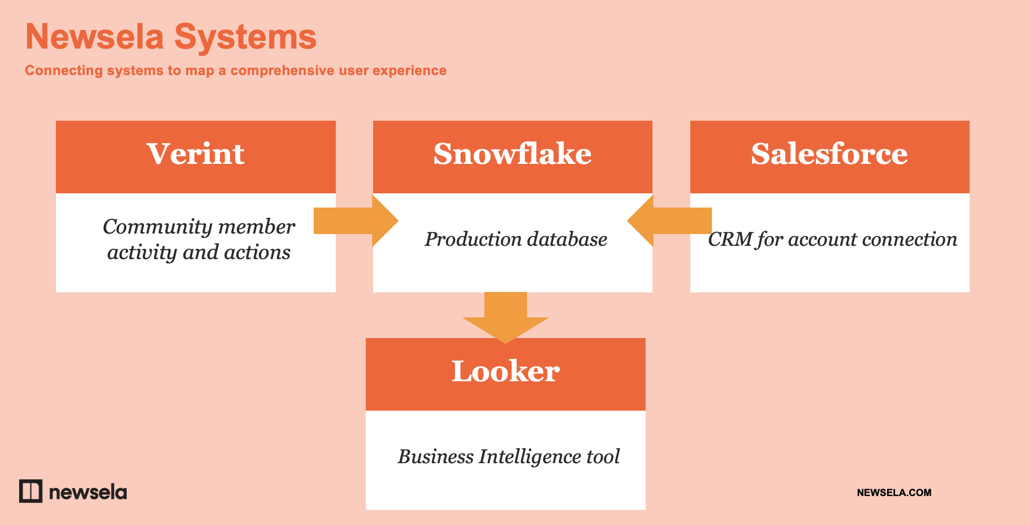
(p.s. you should watch the full presentation hosted on the Verint/Telligent Community)
At the elite level, you’re not manually pulling and analysing data. It’s not a monthly task you have to (painfully) endure. Instead, it’s a fully automated pipeline of fresh insights.
Typically, data is extracted via APIs (and direct connectors), cleaned, transformed, and stored within a data warehouse. From there a business intelligence or data visualisation tool is used to explore the data. You can provide different colleagues with different levels of access to the data depending on their needs.
This is infinitely more scalable and it gives you regularly updated data (to the day if needed) which others can explore. For larger communities, it’s beneficial to get real-time insights rather than wait until the end of the month to see what’s happening.
The downside is this is a project which requires significant investment. It requires significant resources, expertise, and time. You also need to account for maintenance costs (data pipelines frequently break when platforms are updated or tweaked ).
Before beginning this journey, you need to carefully consider issues such as data quality, integrity, governance, privacy, and security.
The steps you take might vary, but this is what we would usually recommend:
Step 1: Create a steering group to define the outcome
Every process is different, but it’s useful to begin by bringing the right people together to start. I’ve lost track of how many data projects stumble because of issues which weren’t foreseen at the time.The steering group varies but often includes a combination of:
- Community team
- Community vendor
- Company software engineers
- Customer loyalty/success
- Marketing
- Sales
- Legal
- IT (esp. Data security-minded folks).
- Data-specific people
Always begin this process by bringing the right stakeholders together to gather requirements, identify issues and challenges, and understand their needs from the data. It’s likely others want to ensure key outcomes are considered too.
Step 2: Decide who will be doing the implementation
The next step is to define the right architecture for your data system.If you don’t have a data engineering background, please don’t try to do this yourself. Selecting the right architecture and technology requires considerable knowledge of the competing options and a deep understanding of your organization’s own needs and requirements.
In the past, we’ve seen a community data pipeline shut down after two months because the organisation’s data technology stack was moving to a different set of tools.
The earliest decision you need to make is whether you have the resources to do this internally or not. This is whether consultancies can help. You need someone to work with your team to define the requirements in architecture and help select the right technology stack.
Step 3: Implement the solution
This is a bigger topic than we will cover here. Perhaps the most important difference in this process is you will first import data from a variety of sources into a data warehouse (Snowflake, BigQuery, Redshift, etc…).In some cases, this might involve writing a custom webhook to import the data and using separate data orchestration tools. You will also need a data analytics tool which integrates with your data warehouse.
We’re not going to cover the process of building the full data pipeline here. There are far better resources than us to learn about data pipelines.
Be mindful that this is an intensive process – one that often involves considerable trial and error. This will usually take several months to complete.
Step 4: Training stakeholders to use the data
The final step in the journey is to develop a process for persuading and training stakeholders to use the data to support their work. This applies to both your immediate team and to a broader set of community stakeholders.This involves both a combination of emotive-driven storytelling and training workshops where you can guide stakeholders through the process of extracting the data they need.
I’d recommend having three things in place.
- A simple roadshow deck explaining the remarkable value of using the tool. This should cover the basics of community, the type of insights people can get, and how to explore the data.
- A regular workshop (hosted every 3 to 6 months) for stakeholders can attend where you will help them access and explore the community data. This lets them run analyses themselves, address questions and, most importantly, get time on people’s calendars for the community.
- A short guide to support colleagues getting set up on the data visualisation platform – included with some basic do’s and don’t’s. At a minimum, stakeholders should know how to run basic queries and explore the data to find useful insights.
Resource: Fundamentals of Data Engineering
Resource: What Is A Data Pipeline?
Next Steps
If you’ve found this guide useful and want to explore it further, I’d strongly recommend attending our community data workshop on November 2nd.Ultimately, if you want your community taken seriously you have to take your community data seriously.
Community platforms can show you if engagement is heading in the right direction and who the most active members are, but they’re never going to be able to do much more than that. They can’t answer the critical questions you and your colleagues have. They can’t show a meaningful impact caused by the community.
Many of us need to tread beyond our comfort zone to get the data we need. You don’t need to be a technical person, but you do need to know the process and how to advance to each level. You’re also likely to need outside help.
Begin with the questions you want to answer. You can get a good list of these from speaking with your stakeholders. Refine these questions into specific metrics and start identifying the source of each of these metrics. Be as specific as possible.
Get the environmental data you need and start combining it with community data. Once you can do that, get the member-level data from different databases into a single destination. Now you can consider building an automated system for the whole process.
Resources
- Richard Millington – How To Prove (And Improve) Your Community Value (CMX Talk)
- Building Successful Community Data Systems – Nov 2, Workshop
- Community Data Benchmarks
- How To Calculate The ROI Of Online Communities
- Community-Driven Impact Score
- Setting Targets and Building A Community Dashboard
- The Dream Community Dataset Template
- Fundamentals of Data Engineering
- What Is A Data Pipeline?