


In surveys in around a third of our projects, members cite navigation problems as one of their biggest challenges.
This creates a battle where we try to make it dead-simple for members to get to every important area of the community within a single click (while still leaving space for banners, announcements, search, and the latest community activity).
Our work with Sephora is a good example of this process in action.
This is why communities like UIPath work so well.
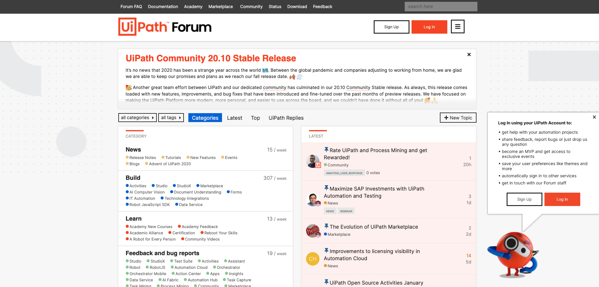
You might not think it’s the most attractive site, but I love it.
Every visitor can easily see and reach every part of the community. The latest discussions, categories, and links are all in one easy place – with a banner for new information.
In 90% of cases, ease of navigation massively trumps aesthetics.


