


The more research we do, the more I’m convinced most community professionals completely misunderstand how members use their sites and what they feel about them.
I say this having sat through hundreds of sessions where members show us how they use the community.
This misunderstanding leads to huge amounts of time being invested in improving aspects of the community experience that members really don’t care much about. Too much time, money, and resources are wasted which could be better invested in higher impact areas.
 I want to share our approach to this problem and what we’ve learned from it.
Why The Current Approach To User Experience Is Inadequate
The current approach to developing a better community experience is woefully inadequate because of poor research.Typically, a community person will speak to a few members, ask them what they like and don’t like, and then try to make improvements based on that. Often this leads to really random suggestions floating to the top of the priorities list.
I’ve seen more than a few organisations spending months revamping gamification programs, member profiles, and adding more groups because it came up in member interviews. Later they will wonder why this had no impact.
The problem is members are bad at describing what they want and need.
There is a much, much, better way to improve your community. But it also begins with having the right data to begin with.
Watch What Members Do, Not What They Say
Members are terrible at recalling a community experience and how they felt in the moment. Yet this is exactly the kind of information you need.The secret then is to be there with them in the moment!
The way FeverBee approaches audience research these days is to sit with members and watch how they progress through a community.
I mean this in almost the most literal sense possible. You have to have members sharing their screens as they progress through the community – and ask them questions as they do.
There are several steps to this process.
- Step 1) Build a list of members to speak to
- Step 2) Send out the invites and schedule calls.
- Step 3) Give them tasks to do and see how they do it.
- Step 4) Identify and prioritise the issues.
Resource: Rocket Surgery Made Easy (read this – it outlines the process in detail!)
Step One – Building A List Of Members To Speak To
The common mistake is to interview the people you know best. These people are usually the most highly engaged members of the community.The problem is they experience the community in a completely different way from your regular members.
You don’t want to just talk to your superusers, you want to talk to the people who aren’t superusers (yet). You want to build a list of members you can speak to which includes lurkers, newcomers, irregulars, and veterans.
If your community caters to multiple groups, you want that reflected in your research too. This is especially important if you’re dealing with developers, users, administrators etc…or those from diverse geographic locations.
A big word of warning here, don’t recruit people from places like userinterview.com.
While having a group of random people review a site can give you some interesting insights, they won’t behave the way your members do. They won’t begin with the goals and understanding of the topic.
Resource: Build your list of inteviewees
Step Two – The Outreach Email (a simple script)
A clumsy outreach email can undermine a good process.The best outreach messages run along the lines of
“Hi [name],
I’m reaching out because we’re looking to improve our community efforts in the coming year and I’m hoping you might be willing to help.
We’re looking to get your experience on what is and isn’t working for you – and see how you experience the site.
Would you be willing to spend 30 minutes speaking with [person]?
No worries if can’t, but it would really help us if you can”
The goal is to keep it personal and low-pressure. We also try not to over-automate the process. We could easily add a calendly link in the first email, but then it would seem less like instruction and not seeking consent.
If we receive a positive response, we can then follow up with….
“That’s great, thank you so much!
During the call, we would love to sit and follow how you explore the community in real-time and get your thoughts as you go. You don’t need to prep anything.
Let me know if you have any questions.”
This lets people select a time slot that works for them. Make sure this is connected to a Zoom link too so people can easily participate.
This process has to be friendly, personalised, and solicit their consent before making requests of members to do something.
If you don’t get a response to initial messages, you can add a $20 gift voucher and see if that works. But we’ve usually found we don’t need to do that. Most people are interested in sharing their thoughts and feeling appreciated.
Step Three – Tasks For Members To Participate In
The next critical set is to give the right instructions for members. These calls are typically 30 minutes long (any longer and we find the acceptance rate drops sharply!).During this process, it’s important to give members specific tasks to do which reflect what you know most members come to the community to do.
Sure, having members casually browse the site and highlight what they like or don’t like is interesting. You might pick up a few pointers. But this isn’t how most people behave. Most people visit the site to do something specific. There’s a certain mindset which is associated with that.
Here are some of the best examples:
- “You’re looking to solve [common problem], how would you go about doing it? Why did you go there? Why not the community?
- “You want advice on the best equipment to use to [achieve goal], how would you do it?”
- “You landed on a discussion page and didn’t find the answer, where would you go next?”
- “You want to ask a question, how would you do it?”
- “You want to find information about [common issue], where would you go?”
- “You’ve noticed an issue you want us to fix, how would you let us know about it?”
- “There’s something you want changed about our products, how would you tell us about it”
You will quickly get a sense of the issues and how people go about their choices.
| Task | How frequent is this need? | What did they do? | Why did they do it? | Any issues / notes? |
| Solve a product problem | Monthly | I search on Google | It’s easiest place to get the best information | Perceived community as too much effort to find the answer. |
| Find peers in my position | Weekly | It’s easier to search by job title. | Haven’t seen this as an option | |
| Find latest expertise | Monthly | Went to the company page and then latest product. | Didn’t see any obvious place to get the information in the community. | Release notes is hidden and the language is unclear. |
Resource: Interview Script
Don’t Reveal The Answer In The Question
Notice in the tasks above, we don’t use the common terminology of a community site. We don’t tell people to join groups, connect with others, ask questions, make feature suggestions etc.If you do this, members simply scan the text and select the words you just gave them. This isn’t how people use the site. The goal isn’t to find out if members can find the community features you’ve named. The goal is to see if members can intuitively achieve their goals using the features the community presents to them.
You want to know if the terminology is right and if the features are positioned where members can see them, and which features members choose to use for which goals.
This is why we don’t tell people to log in to ask a question, we want to see if they figure it out.
This is also why we don’t use ‘feature suggestion’ and instead use “tell us about it”. They have to figure out which sections of the community best guide us to the answer.
Don’t Give People ‘Community-Focused’ Tasks
With some exceptions, most people don’t come to the community to do tasks like updating their profile, viewing the gamification score, or joining newcomer groups.Asking people to do these tasks gives you pretty useless data. The tasks you give people to do should reflect what members want to do before they arrive at the community.
People often want answers to questions, to find people who can help them, and to find the information they need. You want to keep this relatively broad and see how people solve the issue.
Prompt People To Share Their Thinking
As you go through the process, you want to prompt members to share what they’re thinking at any given time.You don’t need to do this every five seconds, but as you watch people try to solve a task they’re given, it’s a good time just to ask them to share what they’re thinking as they do it.
You might get answers like:
“Well I think I need to register, but I can only see a login button and not a register button.”
This kind of information was useful because the company assumed everyone would realise that to register you simply click the login button. A simple change of text resolved this.
“I can’t be bothered to browse through so many navigation options, so I’m just going to search and see what comes up”
This suggests that the site is overwhelming and people will increasingly rely upon search to resolve their issues.
Another answer might be:
“This is the 4th page of the registration process, it’s really starting to get annoying. I just want to get going”
This was interesting for a client where the registration process was long and they were trying to overly prepare the member for the experience instead of just letting a member dive in and do what they wanted to do.
You don’t need to overdo this. I.e. asking people to do this every 10 seconds just gets annoying (and starts to seem a little insecure). But it’s a good idea to do this when you notice a pause or a moment of uncertainty.
It’s a good idea to use Otter AI or another transcription tool to automatically convert the discussions to text so you can others can analyse it with the recording later.
Resource: Otter AI
Step Four – Identify and Prioritise The Issues
As you begin seeing how members really use your site to solve issues, you start to notice the issues.For example, you might notice no one is reading your onboarding messages and some areas of the community receive almost no clicks.
You might notice people struggle with the search function and often don’t find the answer they want.
In one client, we noticed that rather than browse the community, they would return to Google and search again for a related term with the community brand name and see the results.
You don’t need to do this alone. If you’ve recorded the sessions as you should be able to watch this with colleagues and get a real feel for how people use and experience your community.
List all of these by how critical the issue is.
Here’s a simple scale you can use.
- 5 – Showstopper – immediately stops the user from progressing any further.
- 4 – Critical – has a major negative impact on the member experience.
- 3 – Annoyance – causes a strong negative reaction.
- 2 – Frustration – causes mild frustration.
- 1 – Drag – slows the user from achieving their goals.
| Issue | Cause | Severity |
| The forgot password feature isn’t working. | Uncertain why these emails aren’t going through | 5 |
| Community is overwhelming – people don’t know where to ask their questions. | Too much information on the homepage. Unclear where members should go next. | 4 |
| Doesn’t realise the login option is also the registration option. | The term ‘register’ isn’t used anywhere | 4 |
| Members can’t find the latest information about products. | ‘Release notes’ isn’t a term members are familiar with. | 3 |
| Registration process takes too much time to progress through. | Too many pages have slowed this process down. | 3 |
| Members can’t find the posts they’ve recently made. | There’s no natural path outside of member profiles to find posts a member has made. | 2 |
| Members are unable to connect with people like themselves. | There’s no easy way for members to search a member directory by attributes | 1 |
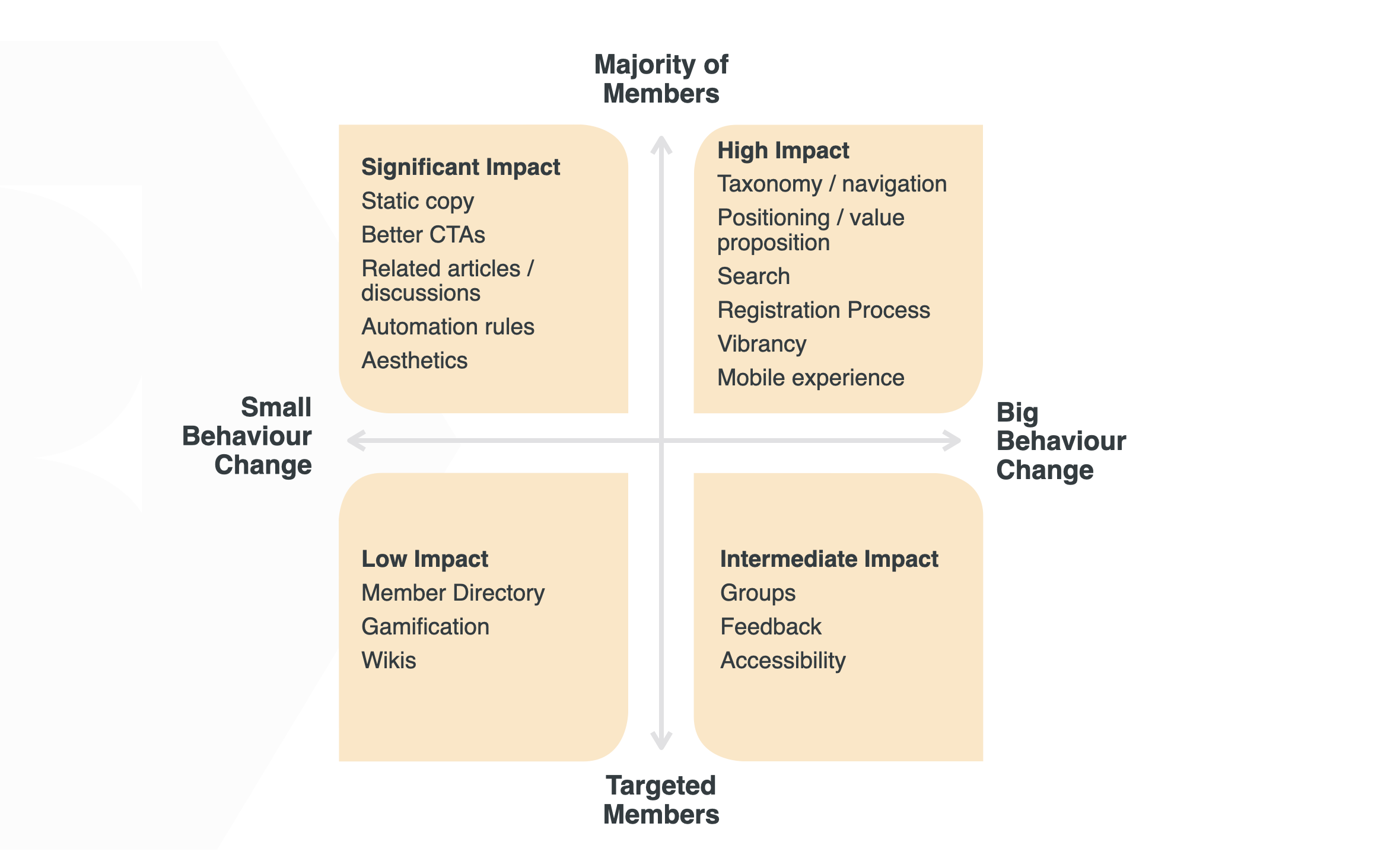
Step Five – Prioritise By Effort and Impact
Now we have a prioritised list of issues, we can start thinking about the solutions to each of these issues.At this stage, you may need to ask around, spend time talking to developers or your platform vendor, and see how other communities have addressed the issue (or get consultancy support).
For each of the issues you identify, you want to know the solution and how much effort the solution will require. You can develop any scale you like, but we prefer a scale such as:
| Time | Money | Misc | |
| 1 – Maximum effort | 6+ months | $50k+ | Procurement required or info sec review needed. |
| 2 – High Effort | 3 to 6 months | $10k to $50k | Vendor support required. |
| 3 – Significant Effort | 1 to 3 months | $1k to $10k | Developer needed. |
| 4 – Low Effort | 1 to 30 days | $100 to $1k | Admin support needed |
| 5 – Minimal Effort | Less than a day | $0 | Can personally implement |
Now we can put the solutions and prioritised list together.
| Issue | Solution | Severity | Effort | Priority score |
| Doesn’t realise the login option is also the registration option. | Easy tweak to login/register. | 4 | 5 | 9 |
| The forgot password feature isn’t working. | Needs a developer to review the process and resolve it. | 5 | 3 | 8 |
| Community is overwhelming – people don’t know where to ask their questions. | Need a revamp of the community homepage with separate instances for members depending upon profile data. | 4 | 2 | 6 |
| Members can’t find the posts they’ve recently made. | Need to show members the recent posts they’ve made on the homepage when they visit and in the member profile. | 2 | 4 | 6 |
| Members can’t find the latest information about products. | Need a separate signposted area on the homepage and on discussion pages. | 3 | 3 | 6 |
| The registration process takes too much time to progress through. | Need to reduce redundant pages and reduce the information we ask from members. | 3 | 2 | 5 |
| Members are unable to connect with people like themselves. | Need to create a member directory and solicit metadata from members. | 1 | 2 | 3 |
You can add and change this over time, but it’s always a good idea to do it.
Counter-Intuitive Discoveries You Should Know
In the time we’ve been doing this for clients, we’ve made some discoveries which seem to apply to most communities. So here’s a cheat sheet of things you might want to think about when developing your own community experiences.- The majority of visitors read almost nothing. The overwhelming majority of visitors won’t read more than 2 to 3 words on your homepage. They scan to find the ‘thing’ of interest and then jump to that. You should reduce static homepage text to a minimum.
- Members really struggle to follow conversations. Members really want to find the discussions they’ve participated in previously (to check for updates), but they often struggle to do so. They forget what category they posted in and can’t find it from the homepage. This is a huge frustration. It needs to be dead simple for members to find a list of discussions they’ve participated in.
- Members switch to a different site quickly. Rather than spending just 5 to 10 seconds trying to get your SSO or two-factor authentication to work, they’re more likely to switch to a different site to find what they need. It’s just too much effort. Sites which have a tendency to log people out often for security reasons cough Salesforce cough struggle with this most.
- Most people make a couple of searches for the answer. Asking a question is usually a last resort. Most people with a question will make a few searches and then publish a question.
- Members post questions in multiple places. People care more about getting an answer than where they get an answer. Around 50% of people seem to post questions in the community and support at the same time.
- Average visitors browse the homepage for 5 to 10 seconds. The average person wants to feel a sense of progress. They browse a homepage for 5 to 10 seconds and then click on something (anything), to feel a sense of momentum. People hate feeling stuck.
- Only a tiny percentage of regulars scan the latest discussions. This really surprised us. Despite the common practice of putting the latest questions at the top of the homepage, very few people scan them. Most consider them irrelevant to their problems right now.
- Members browse top-level navigation before searching. Most members view what’s in the top-level navigation and click the word that most closely resembles what they’re looking for. What appears in the navigation and how the navigation is structured is critical. Members must be easily able to browse for what they need.
- Almost nobody seems to look at the leaderboards. Even the people on the leaderboards don’t seem to look at them often. This is especially the case for static leaderboards based upon cumulative activity since launch as opposed to monthly leaderboards or the past 30 days.
- No one reads the welcome message. It really doesn’t matter what appears in the welcome message unless people are confused about the nature of the site. If they don’t understand the community itself, they might glance at the welcome message to comprehend what it’s about. But these are very rare situations.
- No one reads the code of conduct. Theoretically, you could put terms and conditions you like in there and people would still agree to it. Although, interestingly, they will read articles titled “The Five Rules Of [community]”. So, maybe give it more of a Fight Club vibe?
- Popular discussions. Members generally like seeing the list of popular discussions in a community. This list works best on individual discussion pages as much as on the homepage. However, once a member has seen the list once, they dislike seeing the same discussions again.
- Related discussions matter a lot – but only in high-volume communities. At low volume, the related discussions usually aren’t relatable enough. They simply appear because something has to appear.
- Recent activity really, really, matters. If the community seems dead, few people ask questions. Recent activity labels are far more important than any static copy/text on the page. No one can recall the liveliness statistics, but they might build up into a more subconscious understanding of how busy the community is.
The more research you do (with an open mind) the more interesting discoveries you will make.
As long as you’re willing to sacrifice some sacred cows, you can rapidly improve your community experience by following the member journey.
Get FeverBee To Undertake Your UX Research
If you don’t have the time or experience doing UX research, we can certainly help. It’s a service we’ve done for many clients and we’ve been able to show rapid improvements.In this capacity, we can do deep benchmarking of your community experience, undertake interviews with a range of members, and build a detailed list of improvements.
If you like, we can also take this a step further and undertake the design and development work ourselves to bring the community up to the highest possible standard.
If you want help, you can click here to contact us.