


Begin with the number of new visitors to your community.
This metric shows you how many people you’re attracting to visit your community for the first time. This is simple to discover in Google Analytics.
1) Select new visitors
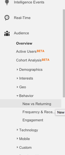
2) Click on new visitors.

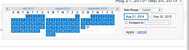
3) In the top right select back the previous year.
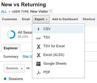
4) Export the data as a .csv file.
Key metric: Is the number of new visitors increasing or decreasing?
If the trend is going up over the previous year, this is usually a sign of healthy community growth. You have an increasing number of newcomers to convert into active members.
If the trend is going down, this is usually a bad sign. You have less people visiting the community. That’s less fresh blood to replace your natural churn rate. Once your churn rate exceeds your growth rate, you enter a death spiral.
Understanding why growth may rise or fall
There might be three causes of rising or declining growth.
1) The sector is growing/shrinking.
Every community lives within a sector. If the sector is growing, more new people should be visiting the community too. If it’s shrinking, you usually find less new people are visiting.
There are several ways to assess this. Using free tools to track mentions of relevant keywords. These tend to appear and disappear frequently. You can use Google Trends for relevant search terms in the space. LinkedIn is also useful if you target professionals. You can get a free LinkedIn Premium account for 30 days. Track how many people add/remove relevant terms to their profile each month.
Finally, you can see what other organizations in this sector are doing. Are the circulations of relevant magazines/blogs increasing or decreasing? Alexa will give you some insight into this. There are other paid tools such as Compete, Quantcast, and others that can also help.
2) Referrals have dropped.
Referrals means any time someone has mentioned the community outside of the community. If less people talk about it, less people join. You can track this using mention on social media from existing members (you will need the twitter accounts of your members to do this) or simply by having an option on the registration page asking people how they heard about the community.
Keep it to three options; from a friend, social media, search, other (say which). You can turn the most common other responses into a standard response. Include both a friend and social media as a referral.
3) SEO / promotional efforts have declined.
Changes in SEO have a big impact in the number of new visitors to your community. An increase or decrease can significantly increase or reduce traffic to your community. This can refer to one of two things. First, either the number of people searching for a term has declined or your search ranking has declined. You can track relevant search rankings each month using an incognito window (cmd + shift + n).
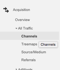
You can measure your search traffic easily enough in Google Analytics. Just select channels under audience acquisition.
Decision Tree
[tweet_dis]The biggest mistake we make in measurement isn’t the measurement, it’s the decision we make afterwards.[/tweet_dis] If growth is rising or falling, how does that change what we do?
Three simple rules here:
1) If growth is falling because the sector is shrinking, reposition your community to be in a related, rising, sector. We stop being interested in a topic because something else has replaced it. We need to focus our attention on that topic. Follow your audience, unless your audience is literally aging out.
2) If growth is falling because referrals are dropping, you need to focus on high-engagement activities. This will usually mean content, activities, or other efforts that is both more engaging and exciting for members to participate in. These are harder to predict. So look to see what works for other communities and adapt their best ideas for your own. AMAs are a useful example of a universally adaptable idea.
3) If growth is falling because SEO traffic is declining, either invest time to learn how to increase your SEO ranking, use paid search tools, or hire an SEO expert to help you increase your ranking.
Part Two: The Registration Page
Now we want to know how many of your visitors make it to your registration page. This typically ranges from 1 – 10%. To find this information, you first need to logout. Then visit your community. Now click on your registration page and copy the URL (usually /register or /signup).
Now in Google Analytics go to Behavior > Site content > all pages.

In the search box (on the right) search for the relevant registration page.
Now track this for the last year and export the data as a .csv file again. Copy and paste this line of data into the previous .csv then divide the registration page hits by the new visitors and turn this column into a %.
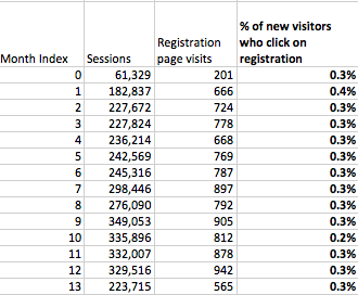
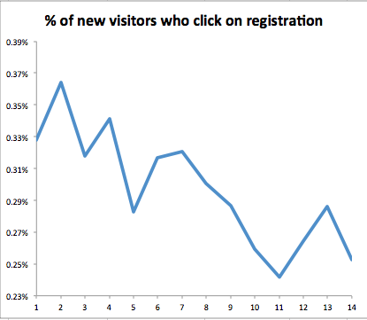
Here we can see that the number of new visitors who register seems remarkably consistent over the previous 12 months, until you put this in a chart format. Very often you will see large swings that reflect an increase in poorer quality traffic or changes in web design.
Key metric: Is the % of people who visit the registration page increasing or decreasing?
Decision Tree:
This creates a range of options you can test.
1) Change the placement or positioning of the registration option.
The easiest approach is to increase the size, the colour/design contrast, or the placement of the registration option. All three can work well, but the balance is key. You need to emphasize the registration as much as possible without overwhelming the existing activity in the community or irritating regular visitors/members.
2) Require registration after people read/visit {x} articles.
We implemented this on FeverBee recently. After you visit 3 articles, we ask you to register. The upside is more registrations. The downside is the quality of these registrations might be weaker.
The greater the number of articles you allow people to visit without registering, the greater the quality of registrations – but you will get fewer of them. Our bet is once people are members, they will see the benefits and become more active.
3) Increase the status of being a member.
A simple option is to increase the status of being a member of a community. If you turn membership into an exclusive, high-status, role more people will be keen to register for it.
4) Feature member contributions.
This is a really simple trick. The more you feature contributions from members, the more people are primed to join. You’re more than welcome to test this for yourself. However, this idea has a restricted efficacy. There are only so many member contributions which can be meaningfully featured until the impact is weakened through over-use.
Part Three: Registration data
Now we want to see how many people actually registered given that time frame. Most platforms should let you list members by the date joined and export that data. Thus you can manually count how many people joined each month and add it to the metrics below.
Another option is to use the post-registration page. i.e. the “register/confirmed” page. This isn’t exact, but it is a good substitute if you can’t get the exact data you need. This shows you how many people that begin the registration process get through it.
If there are multiple pages, you need to combine them using the same process as before. If you’re not sure what the URL is, go through the registration process yourself and find out what is the post-registration page URL. You can then search for this as per the process above.
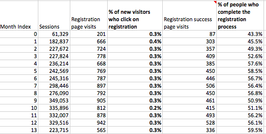
Export the data again and divide the registrations by the number of hits to the registration page to get a %. For example:
Combined with the previous metric, this gives you two huge areas for improvement.
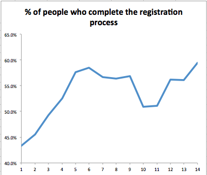
Here we can see that just over half the people that begin the registration process will complete it. This would be very low for a low-traffic community (ours has around 70% – 90% completion rate) but about average for a large community that encompasses a broad array of traffic.
In chart format it shows a steady improvement.
Decision Tree:
Again what do we do with that data?
Remember here there is no clear ‘right’ or ‘wrong’ metric, just a ‘where are we now’ and ‘are we getting better or worse’ at this metric.
1) If the ratio is increasing, focus your time on the next stage. Don’t interfere in something that is improving. Run a cohort analysis to see how engaged these members are and where they tend to drop out.
2) If the ratio is consistent, identify if this is the biggest place for improvement. If it is, consider reducing the copy required, adding affirmations – unbounce for example includes testimonials/quotes on the registration page to guide people through it. Ensure the confirmation e-mail goes out for a unique individual and people can easily respond.
You have limited scope for registration page improvements. The conversion rate is largely decided by the quality and motivations of people going through the process. If they have been forced to go to the page, less people will progress through it. If you’ve been promoting the community widely, less people will progress through it.
Improving the ratio often requires improving the traffic and how you get people to the page initially.
3) If the ratio is decreasing, either you have changed something or the quality of traffic has declined. Often the more prominent you make the registration feature, the fewer % of people will progress through registration. This isn’t a problem if overall a greater number of people get through it overall. You can use the same steps as above to tinker with the page. You can also track the confirmation e-mails, spam filters etc…
From Data to Decisions
The entire purpose of measurement is to make decisions that lead to actions.
The measurement side is relatively easy. You want to know who is coming in and what they’re doing when they arrive. Is growth increasing/decreasing (and why). The decision side is slightly more difficult. Growth is rising/falling, what will you do differently. If the answer is nothing, then it’s pointless to measure anything.
The action side is hard. [tweet_dis]Too often we take the time to measure what’s happening without ever finding the time to change what we’re doing today.[/tweet_dis]
If we’re going to increase the growth rate of communities, we need to increase the number of people who visit, click on the registration page, and complete the process.
p.s. We’re now just 50 days away from our FeverBee SPRINT event. If you want to learn a lot of advanced community skills from 14 world-class experts and ourselves, I hope you will join us at: http://sprint.feverbee.com.