


Community redesigns are always easier from afar.
A couple of years ago, Alteryx had one of the better homepage designs. At a click everyone could get to everywhere they wanted.
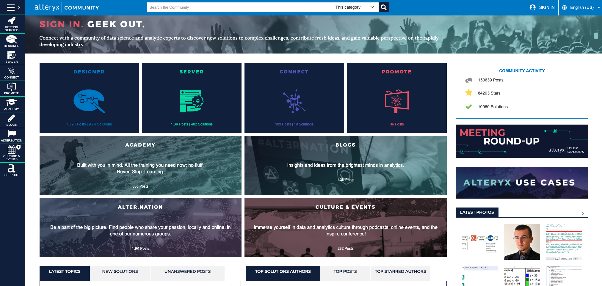
The homepage catered to different audiences, different needs, and guided every visitor to anyone they needed to go. The only downside was it buried the latest activity and thus had too many static areas of the community.
A year or two ago, this design was replaced with a new homepage design.
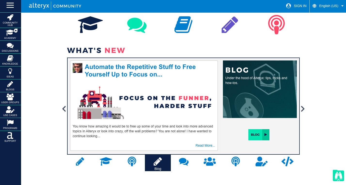
This was much more difficult to navigate and felt amateurish compared with what came before.
Content seemed to float randomly, there was no obvious prioritisation given to different areas, and icons were repeated several times on the same page.
Recently Alteryx have updated this community to a new homepage design.
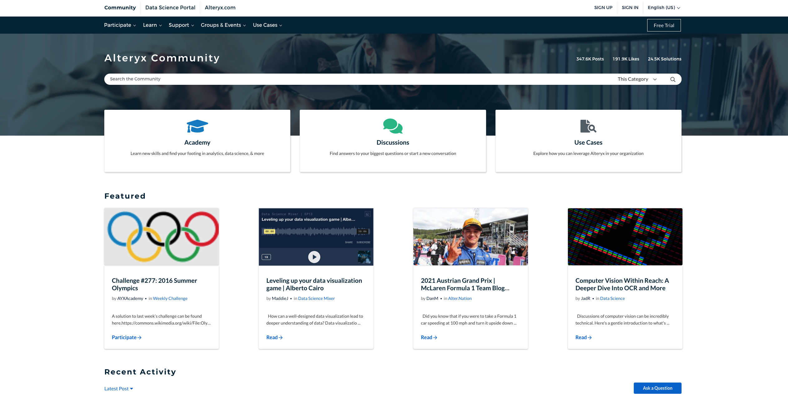
We can probably all agree it’s a heck of a lot better. It still buries fresh discussions a little too far down for my liking (and it’s mobile version seems a bit suspect), but it does the core things well.
1) It prioritises the key actions. You can tell visitors are first expected to search for information and then either visit the academy, participate in discussions, or browse use cases.
2) It reduces overwhelm by featuring things members should see. The featured content drives members to the key activities taking place in the community at any given moment.
3) Intent-based navigation. The community lets members navigate by use-case based around participate, learn, support, groups & events, and use cases. I’m not always a huge fan of intent-based navigation (compared with navigation by products), but it works well here. The taxonomy is clean and simple.
4) Much easier on the eye. It’s much more aesthetically pleasing than either of the other two homepages. The use of white space works and it feels cleaner.
The homepage redesigns works because it’s seemingly prioritised the needs of members, made crucial trade-offs and (likely) brought in much better designers.
p.s. In my book, Build Your Community, I guide readers through the process of developing an effective community homepage.
p.p.s. You can also get some design support on the book’s resources site.