


What do you notice about the following four communities?
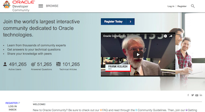 | 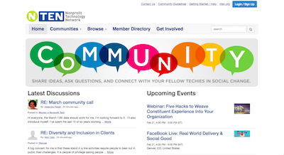 |
Oracle Community | NTEN Community |
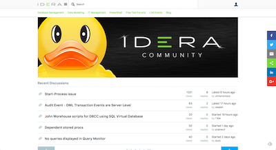 | 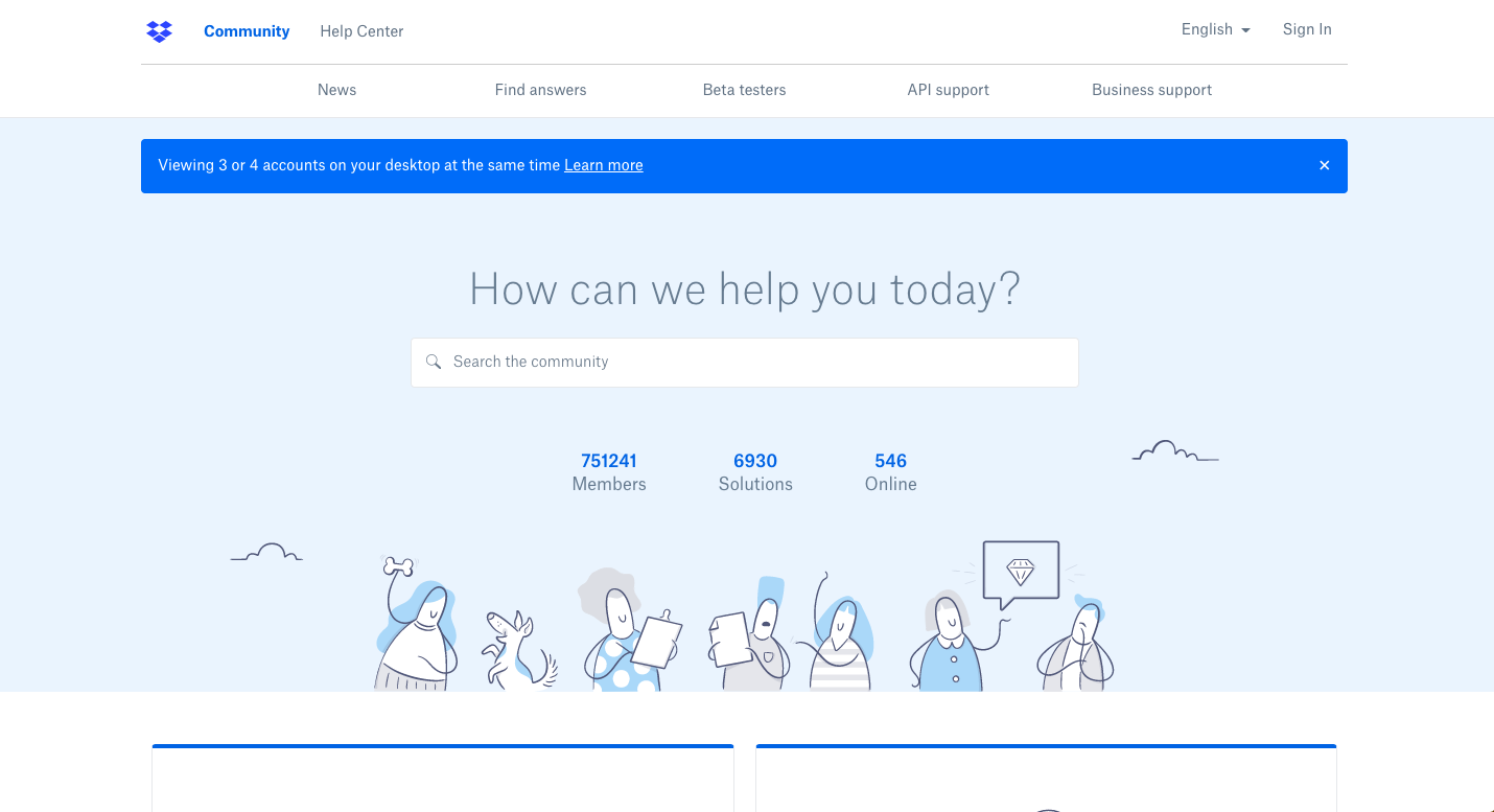 |
IDERA Community | Dropbox Community |
….they all have terrible banners.
Most community banners today are doing more harm than good. They’re static monstrosities filling far too much real-estate with bland messaging trying to appeal to every member segment.
A banner is not a game-changer for any community, but it is a useful tool to drive the kind of behavior you need, help with the signal to noise problem, and set the tone for a community.
But banners come at a big cost, they push activity off the page. They make it harder for members to see who or what is new in the community. The bigger the banner, the greater the cost. Your banner comes at the direct expense of activity.
The Big Problems With Most Banners
The problem with banners comes in 5 areas. These are:
1) The design. Many community banners have curiously bad design. This often includes an ugly palette of colors, text that doesn’t contrast well with the background, or bland photoshopped images.
2) The size. Most are far too big and take up far too much space. You generally don’t want to push activity below the fold.
3) The contents. No-one really cares much about being ‘welcomed’ to the community. Online communities have been around a while, most people know they can ‘connect’, ‘share’, and ‘learn’ from each other in one. What makes your community unique/different/surprising?
4) Static. The same message is often shown in the community regardless of whether members have already read it 10,000 times. It’s rarely updated with new information and members can’t get rid of it even if they wanted to.
5) Same banners appear to everybody. Far too often, the same banner is shown to every visitor regardless if they’re arriving for the very first time or visiting for the 10,000th time.
There are some exceptions to these challenges. A customer support community, for example, should have a question box right at the top for all visitors to easily ask questions. However, even this should be regularly adjusted and augmented.
The Design
Most organizations easily have the budget to do a better job with the design of their community banners and avoid most of the common mistakes. These tend to fall within 3 categories.
1) Not using brand colours. Sometimes you want the community to have a unique brand, but generally you want to keep the colors relatively on brand. Try to avoid using a full palette of primary colors here.
2) Stock images of people. Stock images of people don’t tend to work well in brand banners. Use either a generic image (like Fico) or avoid using images entirely. You don’t need an image for a banner to work well.
3) Contrast. Make sure the text contrasts well with the background. If it doesn’t, either change the color of the text/background or add a layer behind with a degree of opacity behind it. You can use any text if you had a layer behind it. We do this on FeverBee experts too.
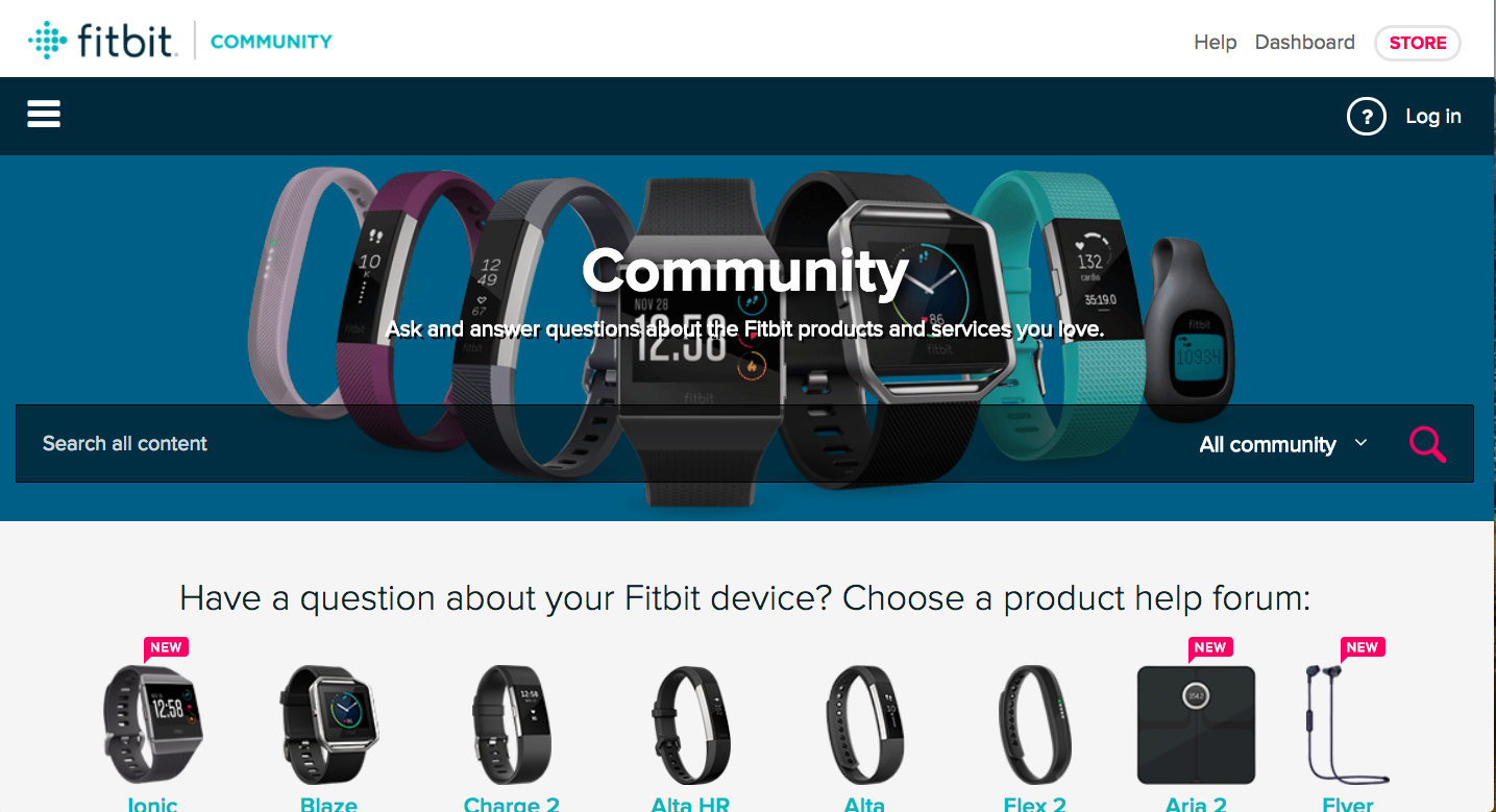 | 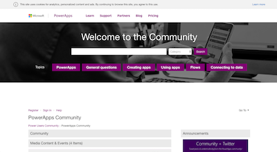 |
FitBit CommunityNotice how difficult it is to read the text above because of the weak contrast between the text and its background. | Microsoft CommunityNot a work of art, but the text contrasts well against the background, it avoids using stock images of people, and the calls to action are clear. |
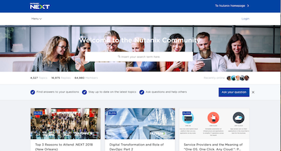 | 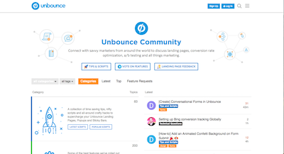 |
Nutanix CommunityTry to avoid using stock photos of people. They appear on almost every community. Also avoid text that blends against the background. | Unbounce CommunityOn brand, easy to read, with key actions at the top. |
Getting The Size Right
This should be easy. A banner should be as short as possible. It should take up 30% of the page at best, 50% at the very worst.
Any more than that, and you might want to consider removing copy. As we can see in the examples below, you can often move a few features around to reduce the size of the copy.
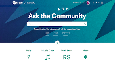 | 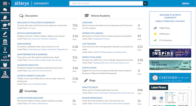 |
The Spotify CommunityThe banner takes up a huge amount of space which could be easily tweaked for a better experience. | Alteryx Community(notice how by pushing the metrics to a side box they have freed up a lot of space for the activity) |
You might need more height than Alteryx, but you should be able to reduce the copy or contents of a banner until it fits to less than 50% of the page.
The Message And The Call To Action
This is by far the critical part of it. It’s inseparable from the message itself. What you don’t want is a bland “welcome to the community” banner which offers nothing.
The right messaging and call to action may include:
- Headline personifying what makes the community special (this is usually critical)
- Clear next steps to take.
- A search box (vital for customer support communities).
- Trending topics
- Most popular topics/questions
- Registration/login information.
- Videos/multimedia messaging.
- Community Statistics (although these can usually be avoided)
The messaging and calls to action you use should depend largely upon who the audience is trying to reach and what you want them to do.
This will depend upon the type of community you’re trying to build as well. Trending topics works well for fields where there are new, major, issues. Registration/login works well for visitors. Videos/multimedia messaging works well when there are major announcements that you can frequently update. Search boxes work well for customer support communities etc…
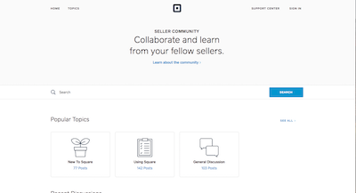 | 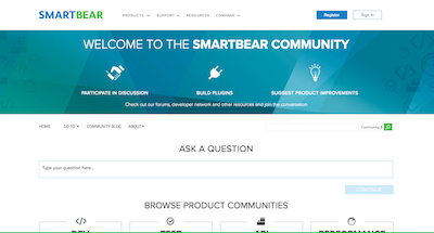 |
Square SellerThe Square Seller community provides a pretty clear and handy headline. | SmartbearThe Smartbear community can remove the welcome message, but at least it gets the CTA messages directly at the top. |
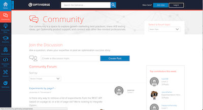 | 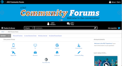 |
OptimizelyThe messaging in the optimizely community is actually quite clear and specific, but the weak contrasts hurts the design. | AT&TThis is the opposite of what you want to do in the community messaging. A generic banner that adds nothing to the community |
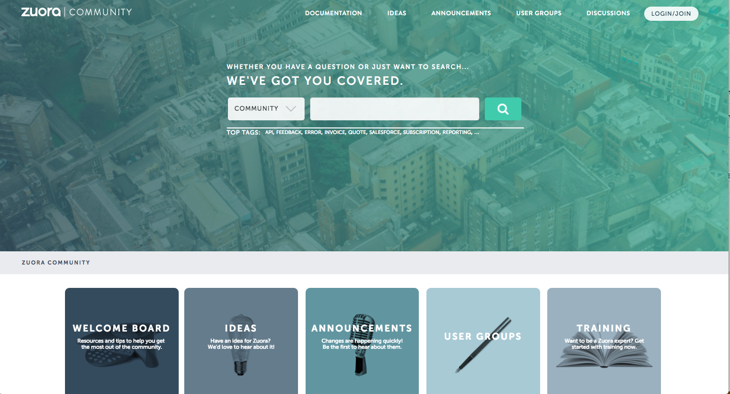 | 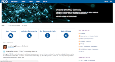 |
Zuora (90% of screen)The Zuora messaging is weak, but the trending topics beneath the banner is really good. | FicoThe Fico community banner is clean, if not very inspiring. |
Static/Never Changing Banners
With few exceptions, a banner which is static and rarely changes is never a good sign. There are two good solutions to this.
1) Regularly update the banner with new, useful, information. This means with new content/activity that members need to see. This works well when you make frequent new announcements and there are new things to see.
2) Let members hide the banner. One common problem is members can’t get rid of the banner even if they wanted to. This doesn’t make much sense. If members have read/seen the message, you may want to let them hide it.
Both are reasonable options. You can also update the banner based upon a member’s previous contributions to the community.
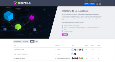 | 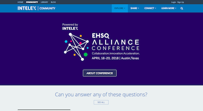 |
SecopsOnce you’ve read it, you can click ‘got it’ and the banner is hidden. You can expand it later if you need to. | IntelexYou can use a banner to make regular, big, announcements. But try not to make them quit this big. |
Showing the same banner to everybody
It make no sense to show the same banner to your first-time visitors, your newly registered members and your top community members.
The most common solution to this is to create two separate banners for members who are logged in from those who aren’t. The former focuses on activity, the latter focuses on signing up.
An even better solution is to use conditional logic to guide members to the next action they should take based upon their previous contribution to the community.
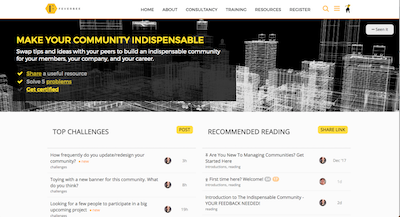
We’ve been exploring this below in our community.
 |  |
FeverBee (visitors)Visitors are shown the next action to take. | FeverBee (newcomers)Members who have registered are then shown a banner guiding them to the next contribution they need to make. |
 | 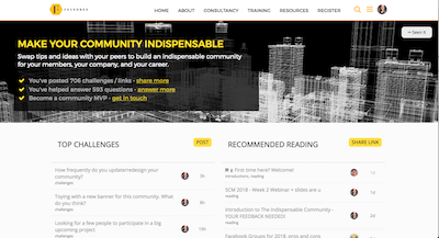 |
FeverBee (regulars)Once people become comfortable asking a question and getting a response, they’re nudged to provide more value. | FeverBee (Top members)Very top members are shown their current level of activity and how they can get more involved in the community. |
Summary
If you’re running a community, you probably should have a banner. The banner though has to drive real value.
It has to be well designed, not take up too much space, have a clear call(s) to action, allow members to hide it, and be updated frequently.
Don’t let the banner be an afterthought, it takes up the community’s most valuable real-estate.