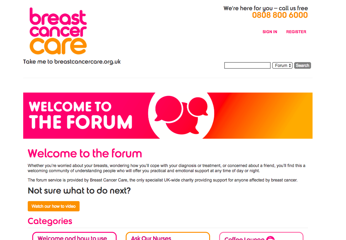
Waste Of Space
This drives me crazy.
The very top section of your community is the first thing every member sees every time they visit your community. This is the most valuable real-estate your community has to offer.
You need to fill this section with the most valuable action that members can take right now.
For most communities, this is a search box. Members begin typing a question and find the solution (or ask a question).
For others, it might be the latest discussions. Or it might be a prompt to ask a question or answer unanswered questions. Or it might be featuring a member. Or you might have the latest upcoming event or recent community creation.
Whatever you fill this with, make sure it’s not a static, useless, graphic that has no impact upon members.
Many communities (like this one) are a valuable information and support. They can change the lives of their members and support them in moments of critical need. Make sure you are tilting the scales entirely on helping as many of your members get the support they need as quickly as possible.
Don’t waste your best space.
p.s. If your community covers a sensitive topic, feature discussions on sensitive topics at the top to ensure every newcomer knows this is the place where they can ask sensitive questions.
This is an interesting case. They have all the right elements, they’re just pushed down by that extra banner.
I’d be interested to hear from the group – how much control do you have over the look/feel/structure of your communities?
This is a common problem in marketing, too. People put all the right content on their landing pages, but all the good stuff is either buried in the bullet points or below the page break. Drives me nuts!
and to answer @HAWK’s excellent question, I have very little control over the look and feel of our Facebook group other than pinned posts! aim to start experimenting with the cover photo next year.
I’m not sure I agree with Rich here. My search bar is top/center but users aren’t using. I can probably garner some engineering time to change up the CSS but part of what I hope achieve in the strategic communities class is a good way to lay out my site-- a vision that helps users best use the site. Right now, they sure aren’t themselves.
Yes, I want content above the fold, but what about 1) rules 2) guidelines 3) instructions?
I think the issue with the above example is that there is no value at all in the use of the real estate. Your issue sounds like something that can be resolved with user testing and perhaps copy tweaks.
I’d get a few people that haven’t used your site before to have a go while you watch. Check out what they do and see where it differs from what you want them to do. Ask them to perform key tasks and see where they struggle.
You never need those things above the fold. Your primary CTA should require no instructions and those other things can be kept in your primary navigation/hamburger/footer (somewhere intuitive).
Fair enough. I think it’s a layout issue, and the fact that I don’t have enough resources at my disposal to improve the layout
Anyone on here great at CSS and would want to have a quick chat about what options are available to me on my #Vanilla platform to re-organize?
@Adrian might have some suggestions for people that could help.
Have you looked at other Vanilla installs to see how they are handled?
Thanks @HAWK for the mention
@kambush, I don’t know how much work you need to do, but have you looked at our Pockets plugin? It’s a handy way to add HTML where ever you want. I also recommend this awesome theme from Kasper if you are on the open source. Really lots of great options!
Also if you are on the open source platform, there are lots of people willing to give you CSS help at http://vanillaforums.org/discussions.
If you are paying for hosting with us, we do have some options, so drop me a PM.
Hope that helps
This article, while not directly referencing community, has some interesting and relevant points.