In the past two weeks we’ve tackled Apple’s Support Community and Airbnb’s Host Community. This week we’re going to breakdown StackOverflow.
You can even watch the slideshare below (click here if it doesn’t appear), or read the breakdown below.
CONCEPT
StackOverflow was launched in 2008 as a Q&A site for programmers. It has since grown to 50 million monthly visitors and is the crown jewel of the expansive StackExchange network.
StackOverflow enforces extremely strict moderation policies designed to get great answers to great questions. It does not allow casual chatter on the main community platform. This is unique amongst most organizations.
Unlike other branded communities, StackOverflow earns direct revenue from the community via recruitment (talent), advertising (ads), and helping companies create their own private instance of StackOverflow within their organization.
OVERVIEW
The community consists of several core areas:
1) Questions. The community is entirely orientated around ‘questions’ which also appear on the landing page of the community.
2) Developer Jobs. Programmers can search and find jobs published by paying advertisers on the community.
3) Tags. These are keywords or labels that members can browse through to find relevant information.
4) Users. Members can browse through the list of users and search by keywords.
5) Developer Stories. This is where members can create their ‘online resumes’.
6) Business Solutions. For businesses who want to hire, advertise, or use StackOverflow in their work.
HOMEPAGE DESIGN
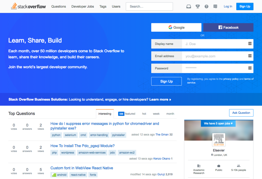
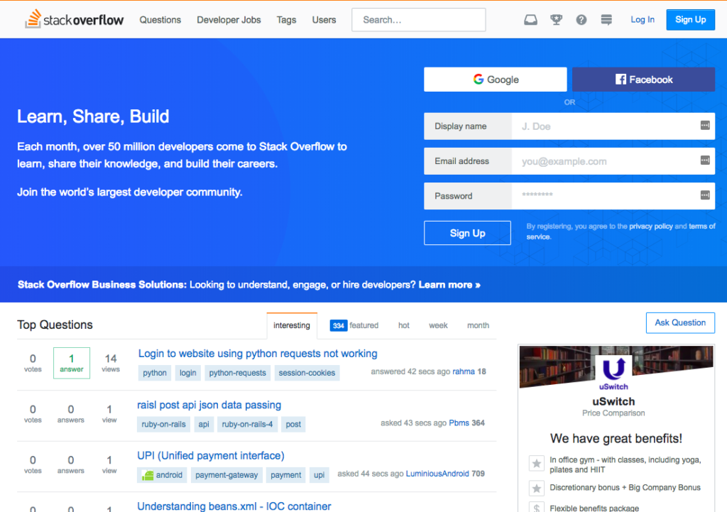
- The community has a different homepage for visitors compared with logged in members. This is really smart to do. Visitors have different needs than logged in, returning, members. The focus is more upon registration.
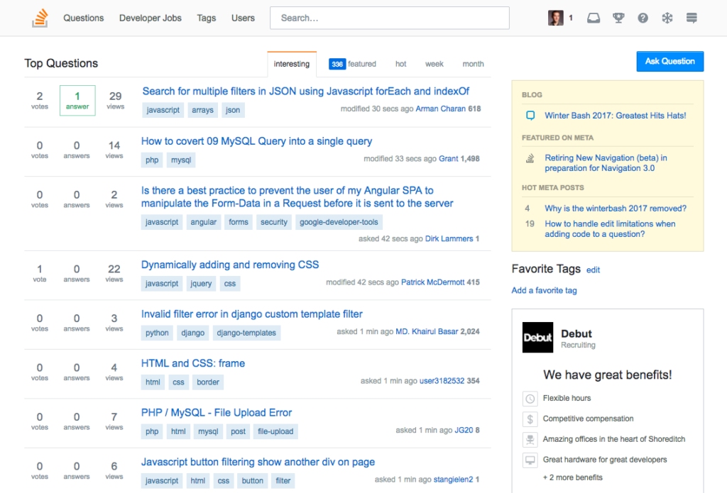
- The community is entirely focused on the latest activity. Members are expected to scroll through and find questions to answer. This is a fixed list rather than infinite scroll.
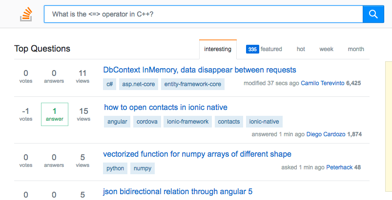
- The search box is slightly hidden, but not too hard to find at the top.
- There is a good selection of tabs. But it’s not clear what the difference between interesting and featured is. Can probably remove a few of these.
- Clear gamification features and notifications on previous posts in the top right.
- The ‘Ask Question’ button is a little hard to see.
- This is a good use of showing the popularity of questions by votes, answers, and views. People know how popular a question is without having to click the link.
- Most of the questions here seem very unpopular. This is due to the sheer ferocity of questions StackOverflow receives. Might be worthwhile showing questions which are popular but not answered yet.
- The display of tags beneath the question is excellent.
- Look out for the blog integration in the top right to show the latest news about the community here. This doesn’t intrude on the main activity, but lets people know the broader community news
- The add/edit favorite tags on the right hand side is useful.
- This advertising works. It’s not too intrusive or hurtful to the user experience.
- The ‘latest activity’ metrics show a clearly active site. This is good to show before clicking the question.
Mobile Site
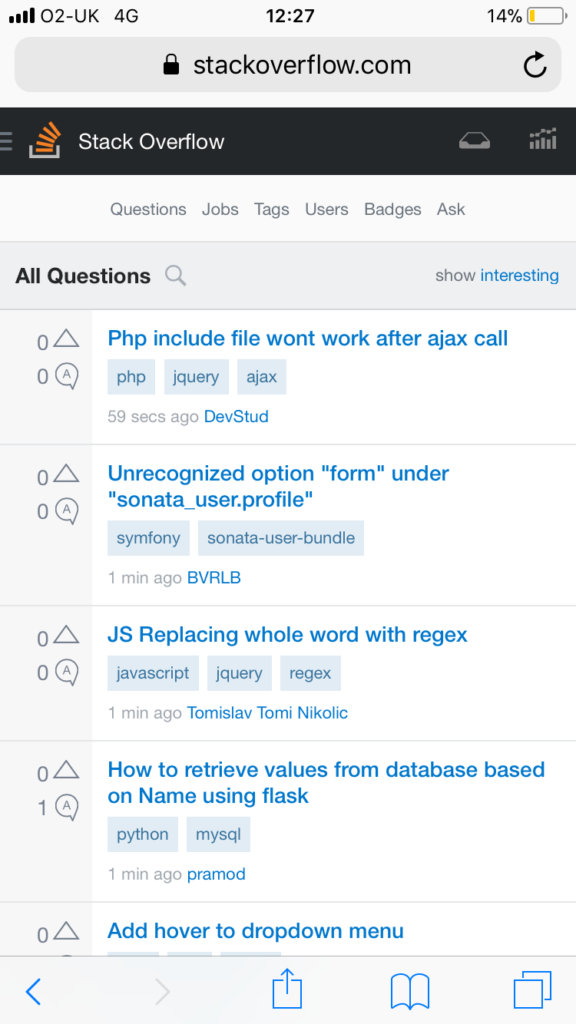
- The mobile version of the visitor homepage removes the registration form and tags. It focuses purely on showing the latest questions.
- The ‘ask question’ option has also curiously vanished.
- The slimmed down nature of the site makes it ideal for visitors looking to scroll through questions – possibly without participating.
USER EXPERIENCE AND PARTICIPATION
- StackOverflow is hosted on a custom-built site. While most main platforms have auto-complete search, StackOverflow does not. The search bar expands, but does not display the relevant questions and discussions in drop down mode.
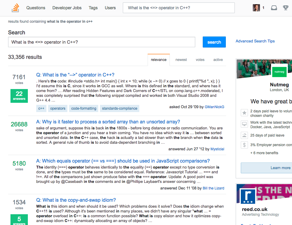
- Search works well. It shows not just relevant questions, but also the specific and highest voted answers to those questions.
- The speed of search is also faster than any other community visited.
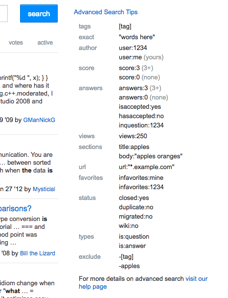
- Next to the search results are also ‘advanced search tips’. This is an incredibly useful and interesting addition to programmers. It helps people find the answer to their question even faster.
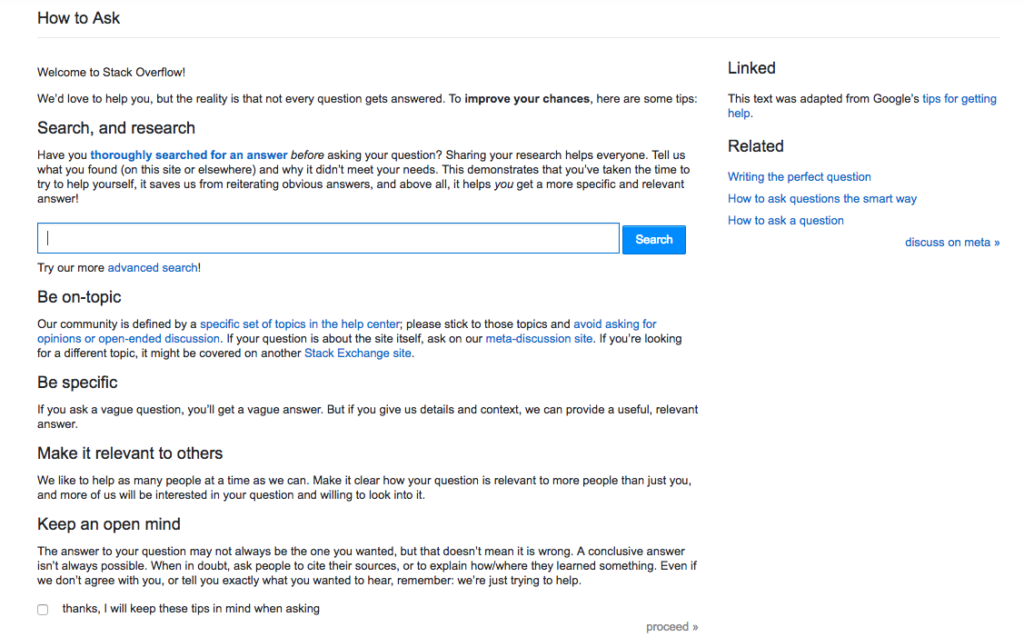
- StackOverflow tackles the ‘repeat question’ problem by forcing you to thoroughly research the answer first. This is the screen you see when you select ‘ask question’.
- The tips are good and include relevant links. Although many members probably skim right past this.
- I love this ‘tick box’ along with the ‘open mind’ text to confirm that this has been read.
- The ‘adapted from Google’ section in the top right is something other communities can easily use.
- Related links to ask a good question are also a nice touch. It might be a good idea to guide newcomers to read this before asking a question, otherwise I suspect most people will ignore this.
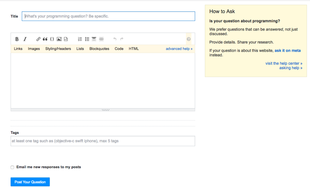
- StackOverflow continues its maniacal focus on good questions by providing prompts at each stage of asking a question. Here there is a prompt in default, the title itself to be specific along with advice on the right hand side to provide details, share research, and ask unrelated questions about the community in the meta area.
- StackOverflow also provides a relevant link to the help center. This ensures people begin questions with the right mindset and a good, specific, title.
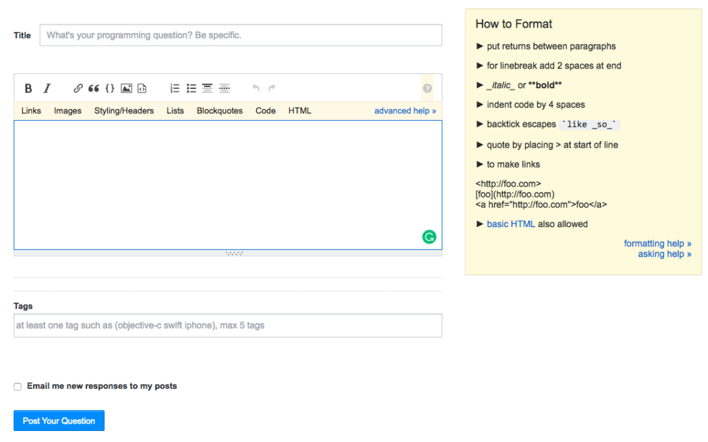
- When you click on the box to enter your question, formatting help appears on the right-hand side. These small prompts are incredibly useful. Each of the main tabs (links, images etc…) also drops down to reveal further advice as part of advanced help.
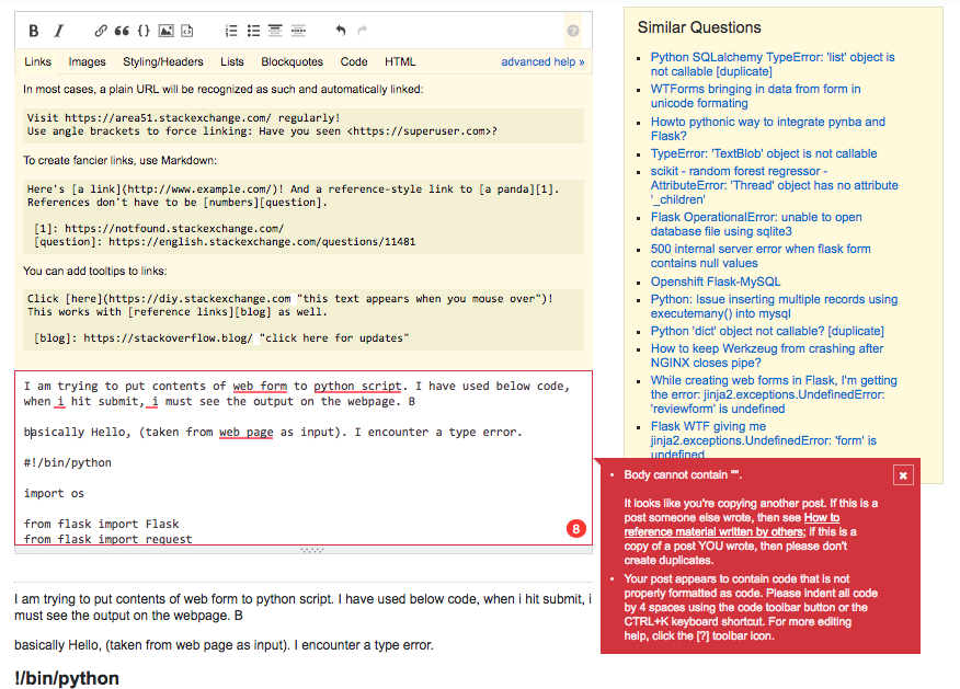
- As you begin typing the question, it appears in preview mode below so you can see exactly how the question will appear. Similar questions will also appear on the right-hand side.
- This appears complicated as you begin typing the question. However, if StackOverflow detects something which is incorrect, you receive a bright red notification. You cannot post the question until you’ve resolved this problem. This is another very neat touch.
- You can also see the advanced help above the question, the preview below, and the similar questions on the right hand side.
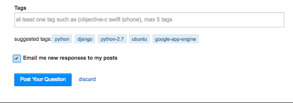
- The community shows suggested tags from those mentioned in the question or using AI from previous questions.
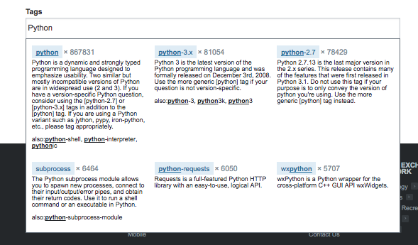
- If you begin to type your own tag, a drop-down box of relevant tags appears below along with a description. This makes tagging really easy (and enforced).
RESPONDING TO QUESTIONS
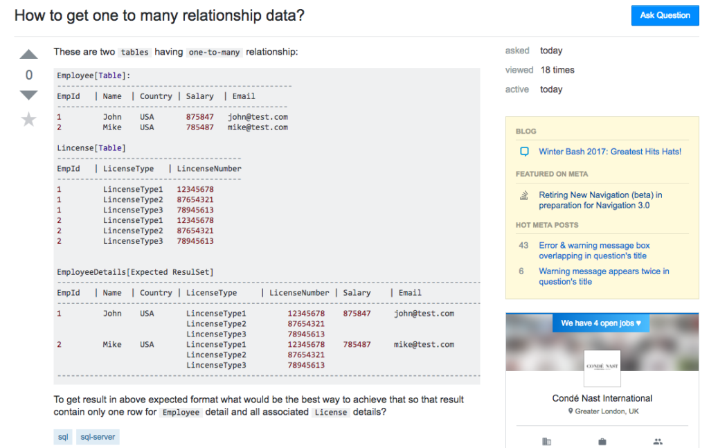
- Questions are clearly displayed with regard to the audience’s expectations. Here the coding is properly formatted and shown within the questions with simple tags.
- Members can do one of a few things. They can either vote, favourite, comment, or answer the question. However, newcomers are not allowed to vote on questions until they have a 15-point reputation score.
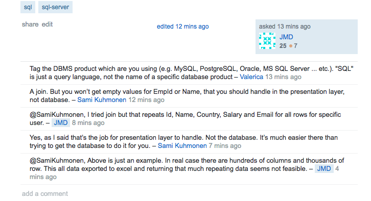
- Commenting on a question is a novel feature of StackOverflow. It’s designed to improve the quality of the question and provide feedback to the original poster as well as providing more information for people to create good answers.
- This would be distracting in most online communities, but works well when good quality answers is the overriding part of the community concept.
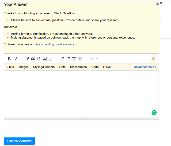
- As we can begin to expect now, answering questions contains further prompts about what to do to provide a really good answer.
- The link to further tips on writing great answers is also a great practice to observe and easy to replicate.
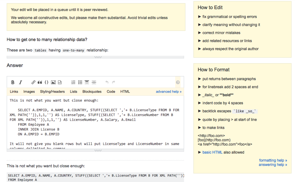
- One of the truly unique aspects of StackOverflow’s community is the ability of members to edit the questions and answers of other members. Everyone has the ability to do this, although the process is peer-reviewed.
- Edits are used to fix grammatical errors, clarify meaning, correct minor mistakes, and add related resources. Aside from Wikipedia, I haven’t seen any other community successfully implement this feature.
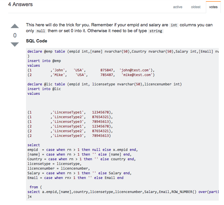
- Unlike most organisations where empathy in responses is a critical part of the response, StackOverflow is designed for an audience that only wants good, quick, answers to questions.
- Almost all questions receive a quick response. The responses are usually detailed and specific to help the person. In this case, it’s code that the programmer might like to use to resolve the problem they are facing.
REGISTRATION AND ONBOARDING
- StackOverflow doesn’t have a separate registration page, visitors are encouraged to register with the fields shown within the header at the top of the page. This also allows Google and Facebook sign on.
- Allowing people to register without having a separate registration page is a really clever feature.
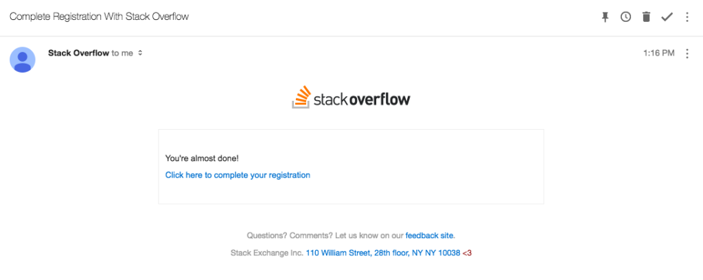
- StackOverflow has the easiest email confirmation page you will ever see. They have reduced the amount of copy to just 9 words. You can consider doing something similar with your email confirmations.
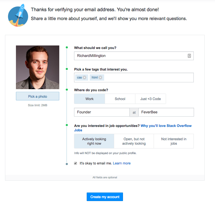
- This is really simple copy at the top to get people started. Not sure on the logo mind.
- I like the phrasing of ‘what should we call you?’
- Profile photo is easy to drag and drop into place.
- Picking a few topics of interest should be a standard feature of all players. It enables members to receive updates on topics which are relevant to them. It encourages a good use of tagging.
- Not sure why this section is relevant, possibly the only area here I’d remove.
- Most importantly here you don’t have to write detailed ‘about me’ paragraphs. You can select the key things that matter.
- Great way to merge in advertising opportunities.
- Notice the ‘all fields are optional’ – I’d move this to the top of the page.
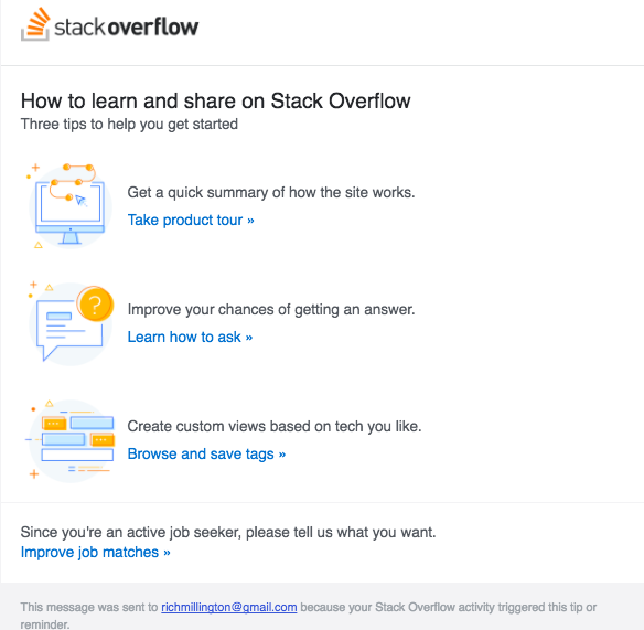
- This welcome email is triggered by participation in the community. The quick summary, learning how to write great answers, and custom views are pretty effective ways to help newcomers get started.
- I suspect there might be an opportunity for improvement here based upon tags people have selected and what the latest activity of the community is.
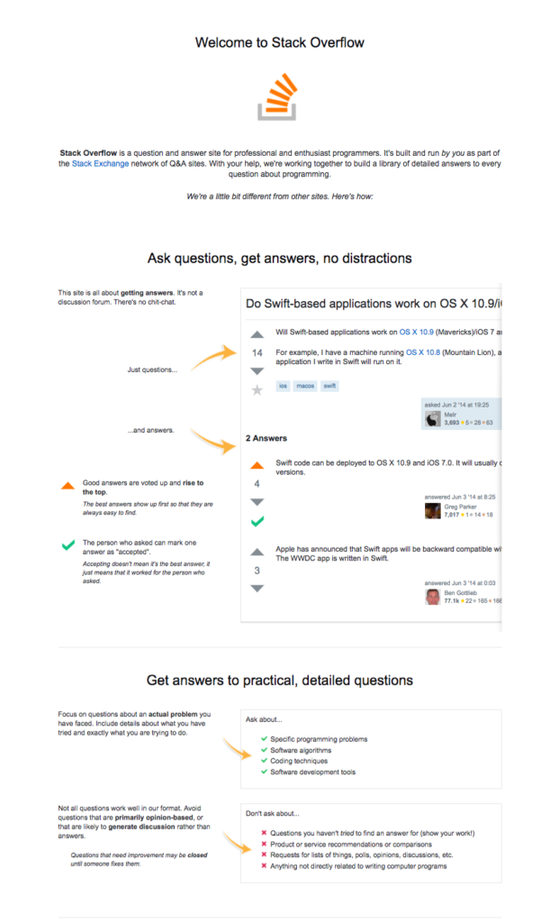
- Once you join the community you receive a notification with a link to the tutorials page.
- This tutorial page is detailed and explains each of the steps required to become a great participant of the community. The visual element is especially useful.
DEVELOPER JOBS AND STORIES
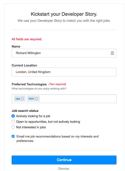
- The jobs section revolves around developer stories which members are prompted to complete in the community if they want to be open to new job offers. The forms are relatively simple to complete and all fields are required.
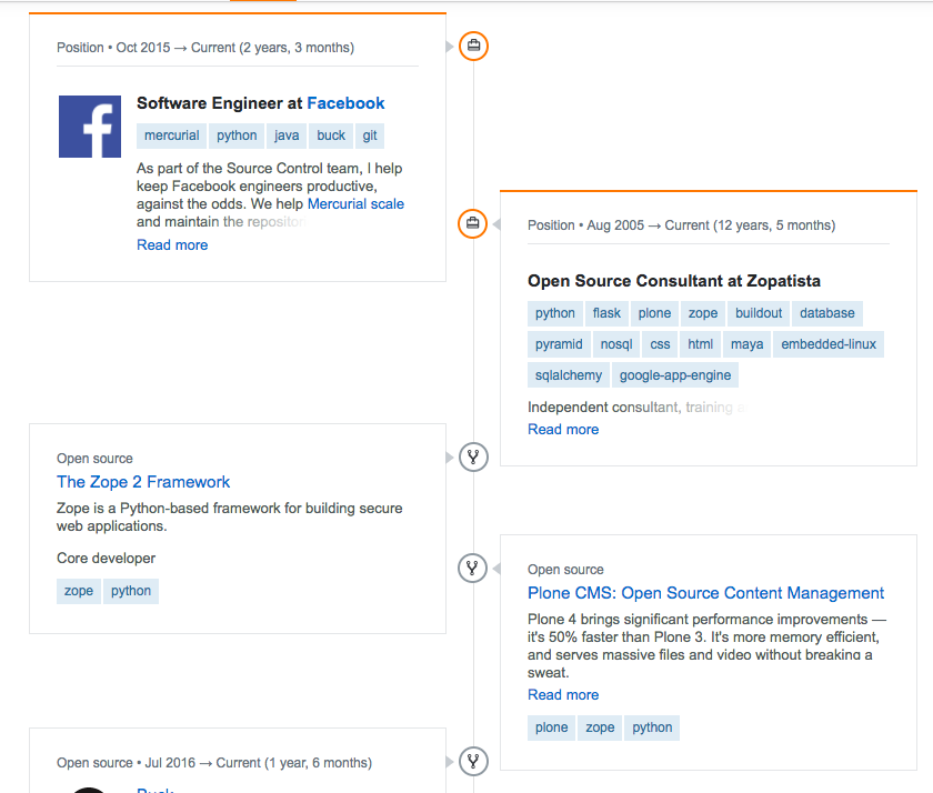
- The developer stories are presented really well, with tags at the top (not shown), and then a detailed timeline of previous jobs and experiences below.
- Most communities could adapt this idea to immediately upgrade their member profiles.
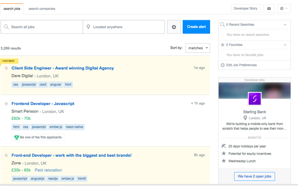
- This is a relatively standard and simple list of job adverts. With a search function and location at the top and list of ads displayed below.
- Showing the salary, tags, and ‘be one of the first applicants’ is incredibly smart.
- Letting applicants create job alerts is also extremely clever.
- Showing the previous searches and job preferences is a nice touch. Easy to edit from the front page.
- This section is a relatively simple and clean way of showing the job adverts. This might be the least innovative page of the community.
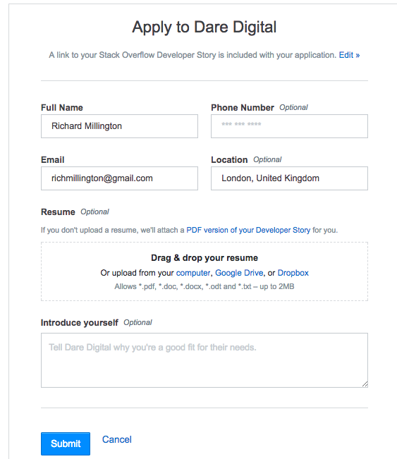
- A major innovation of the community is to enable members to apply for the job directly within the platform. This includes using their current reputation score to apply for the positions.
MEMBER PROFILES
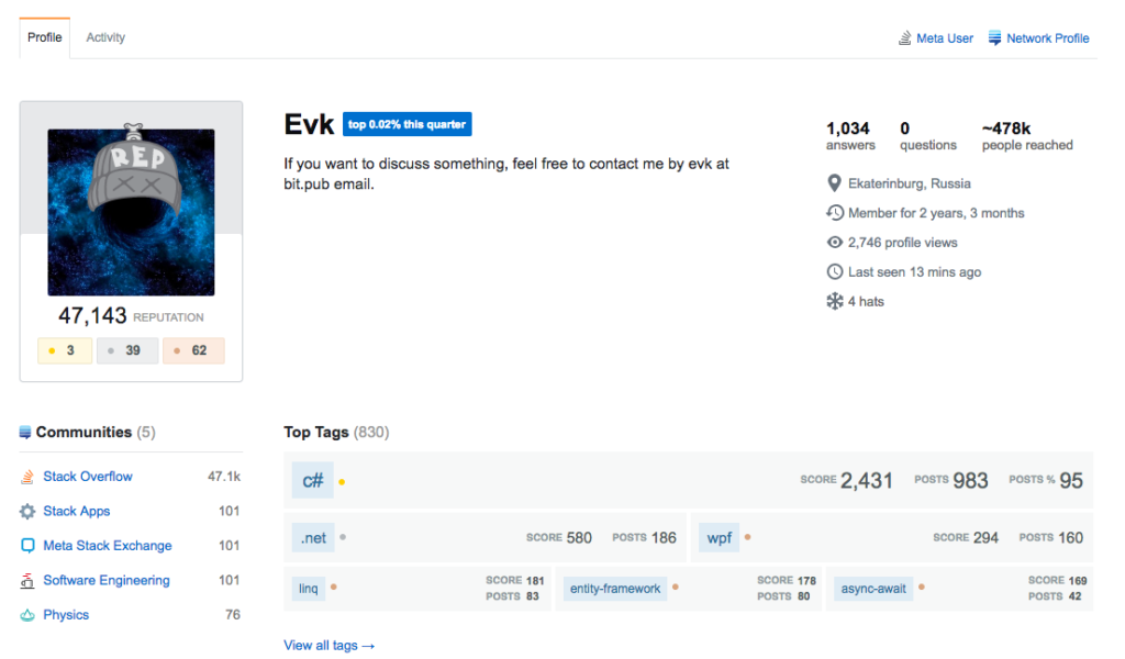
- The member profiles is one of the most advanced areas of the community.
- Showing users where they rank comparatively is a smart way to drive more participation and reward the top members.
- Number of badges and reputation points are clearly displayed.
- Other communities where the member participates in. Not relevant for most communities (or here, really)
- The ‘impact score’ in the top right is genius. A great way of showing a member’s total contribution.
- The breakdown on the right hand side of a member’s vital statistics is also useful. Not sure what ‘4 hats’ are though.
- In the bottom right is a further good breakdown of where their expertise lies. You can clearly see where this member’s real expertise is.
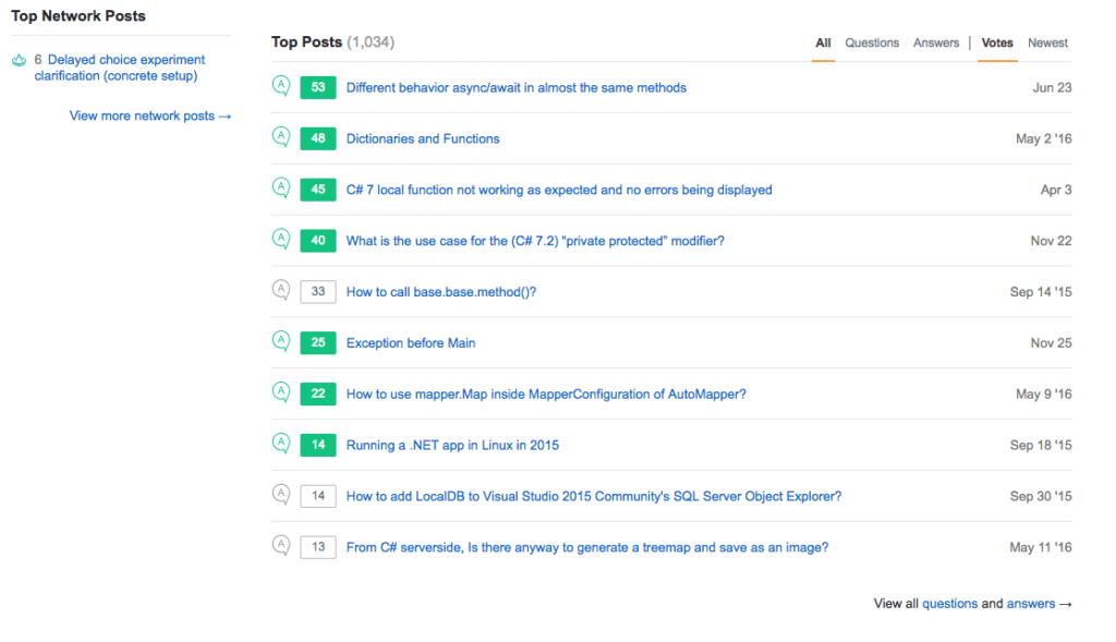
- Mid-way down the profile is a list of a member’s top posts. This is a great way of letting the member ‘show off their best work’ without looking like an ass.
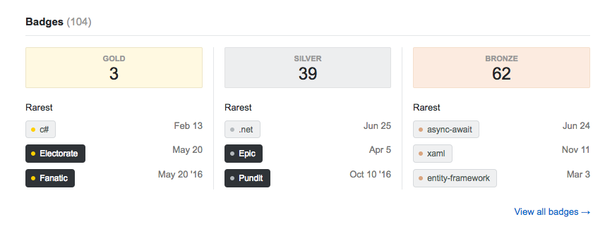
- Each member’s badges gained are displayed at the bottom, listed by date and the reason they earned the badge. This is a simple way of displaying the badges. There might be better ways of doing this.
GAMIFICATION AND REWARD SYSTEMS
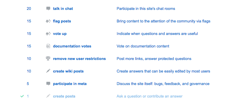
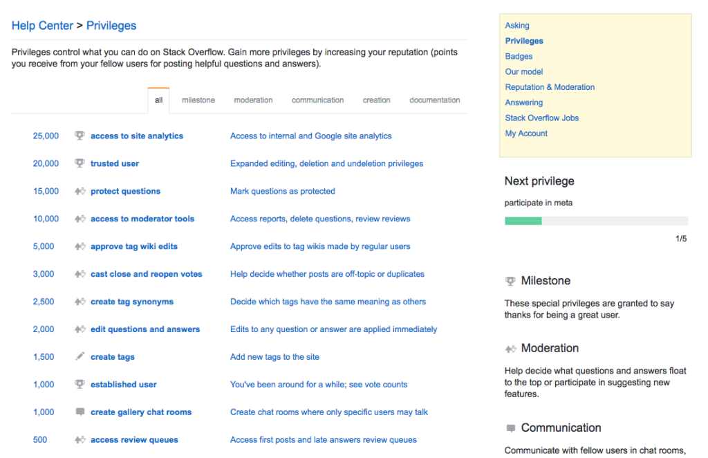
- StackOverflow also has one of the most advanced gamification systems on the web. This begins at earning privileges for taking simple actions ‘such as creating a post’ all the way up to getting access to analytics with 25,000 points.
- The ticks next to the scores is an especially nice touch.
- This the ‘Tom Sawyer’ effect in action. The more privileges you earn, the more likely you are to take on doing work for the community for free. Full privileges board encourages members to take on more work for free.
- A good menu in the top right explains what’s required to progress to the next level.
- Showing the next privilege and what’s needed to get there is also a smart idea.
- There are multiple types of privileges members can earn, as broken down here.
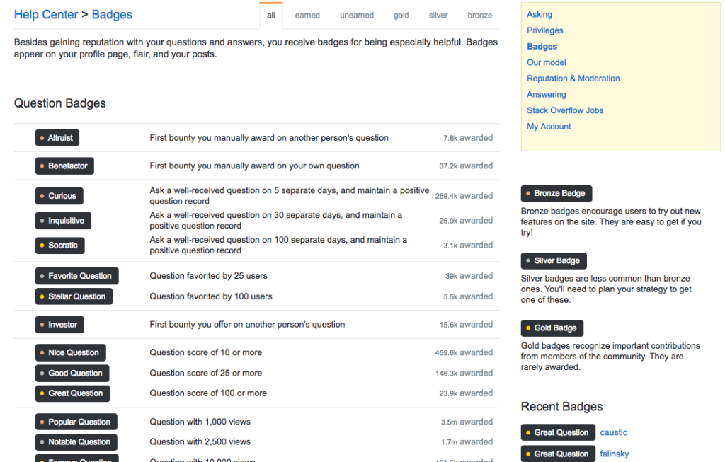
- There are a near-infinite number of badges members can earn in the StackOverflow community. These range from question, answer, participation, moderation, documentation, and ‘other’ badges.
- The diversity of badges means everyone can and almost certainly will begin collecting badges from the very early days of the community.
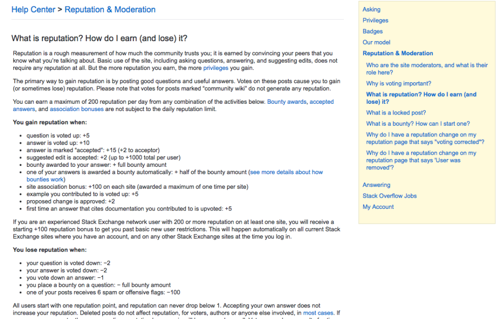
- All of the systems are fully documented and explained in detailed guides. This limits confusion and potential anger from members when they don’t get the rewards or privileges they expected. It’s usually a smart move to fully document your reward systems.
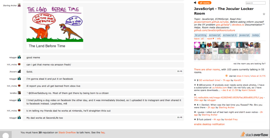
- Interestingly, StackOverflow also operates chat rooms which members with a reputation score of at least 20 are allowed to participate in. This type of interaction allows for more general discussion which would be an ill-fit for the quality-information focus of the community.
- This is a good balance between ephemeral and serious discussions which many organisations struggle with. However, they are hard to find on the community.
CONCLUSION – THE MOST ADVANCED ONLINE COMMUNITY ON THE WEB
StackOverflow, with the possible exception of Facebook, has the most advanced and sophisticated community platform on the planet. There are hundreds of tiny details which are all designed to support its core concept of getting great answers to great questions.
To support this mission, StackOverflow deliberately limits engagement in favour of quality contributions. This has the desired impact of attracting the highest quality programmers to share their best advice on the community, but it’s a tough path for others to follow.
However, platform vendors and organisations can learn plenty from StackOverflow’s homepage setup, gamification systems, onboarding systems, and job pages.
There is also plenty to learn here about creating tutorials and nudges throughout the platform to ensure that members make great contributions to the community.
Many organisations would benefit from focusing less on driving as much activity as possible and instead focusing on driving the right kind of activity within their community. This is the real frontier of our work today.
You can visit for yourself at: www.stackoverflow.com.
