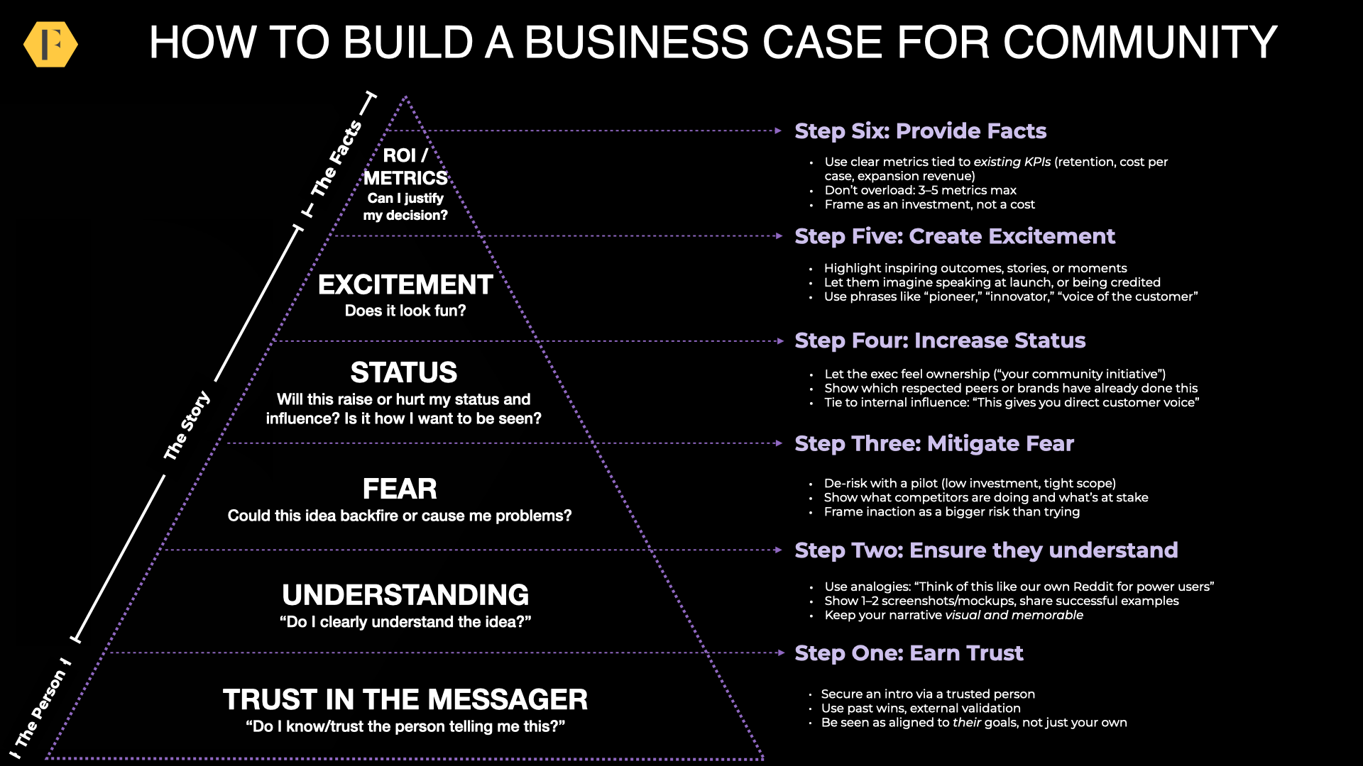
Community Website Design: Rules for The Banner
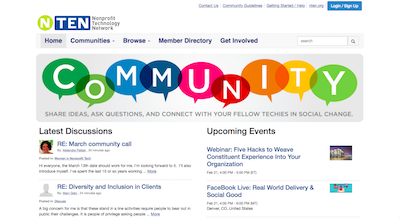
What do you notice about the following four communities?
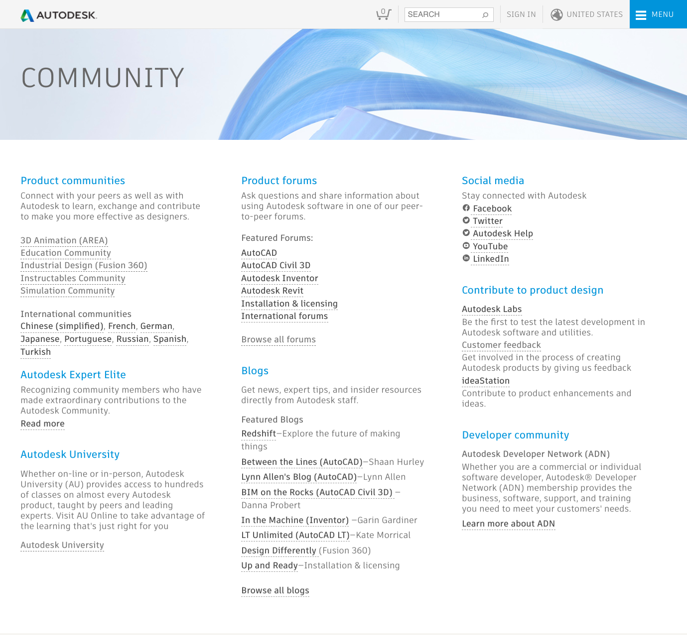
….they all have terrible banners.
Most community banners today are doing more harm than good. They’re static monstrosities filling far too much real-estate with bland messaging trying to appeal to every member segment.
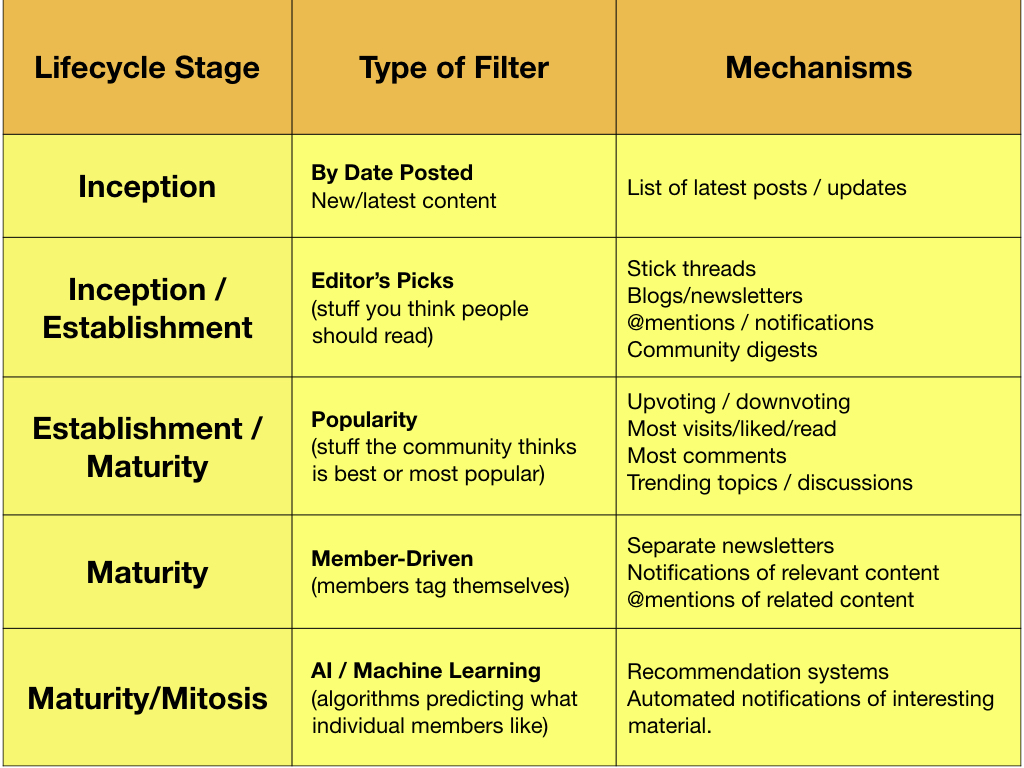
A banner is not a game-changer for any community, but it is a useful tool to drive the kind of behavior you need, help with the signal to noise problem, and set the tone for a community.
But banners come at a big cost, they push activity off the page. They make it harder for members to see who or what is new in the community. The bigger the banner, the greater the cost. Your banner comes at the direct expense of activity.